Trifold with a Twist: Physical Therapy Brochure
David Shulman wanted a brochure to communicate the dramatic pain relief that patients can experience from physical therapy. How could we demonstrate these effective treatment results in a few flaps of folded paper?
Die Cut “Cuts Away” the Pain
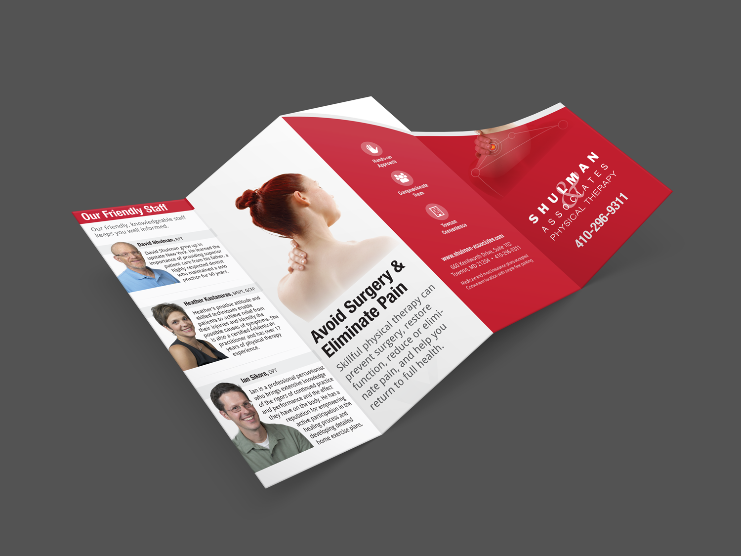
The solution was a brochure that doesn’t just tell; it shows. We designed a creative alternative to the standard trifold, with an extra die cut flap on the front. This created a “before and after” effect. First you see a patient’s back with pain points. And like in lift-a-flap books, the surprise awaits behind. Open the flap to reveal—a pain-free back! This demonstrates how the Shulman team helps you avoid surgery and eliminates pain.
Welcoming from “Nose to Toes”
The rest of the brochure introduces you to the team, shows how they can help you, and invites you to try them out.
- Striking contemporary design
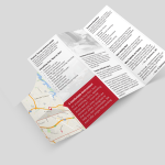
captures attention with bold red and white - Map
illustrates convenient office location for treatment - Photos
subtle and prominent images depict the staff, their hands-on approach, and the comfortable environment - Staff bios
introduce you to the friendly professionals treating you - Icons (back panel)
echoed from the website, these summarize the practice’s differentiators
Handout from the Hands-on Practitioner
David Shulman loved the new brochure and started using it immediately. When he goes to speaking events and workshops, he has a memorable marketing piece to leave with prospective patients.
One-Stop Professional Shop
Our creative team fits the message to the medium. Whether we’re creating a website, a brochure, or a video, we’ll take advantage of its unique features, conveying your message with the best language and scope for that format.
Let us know if you’re ready to put your message in print. Although we’re not the ones to relieve your physical aches, we’ll make your marketing as pain-free as possible.
