A New Landscaping Company Springs Up
This new website showcases the beauty of this landscaping team’s work.
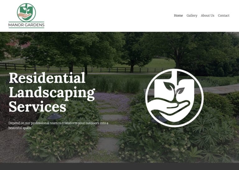
This new website showcases the beauty of this landscaping team’s work.
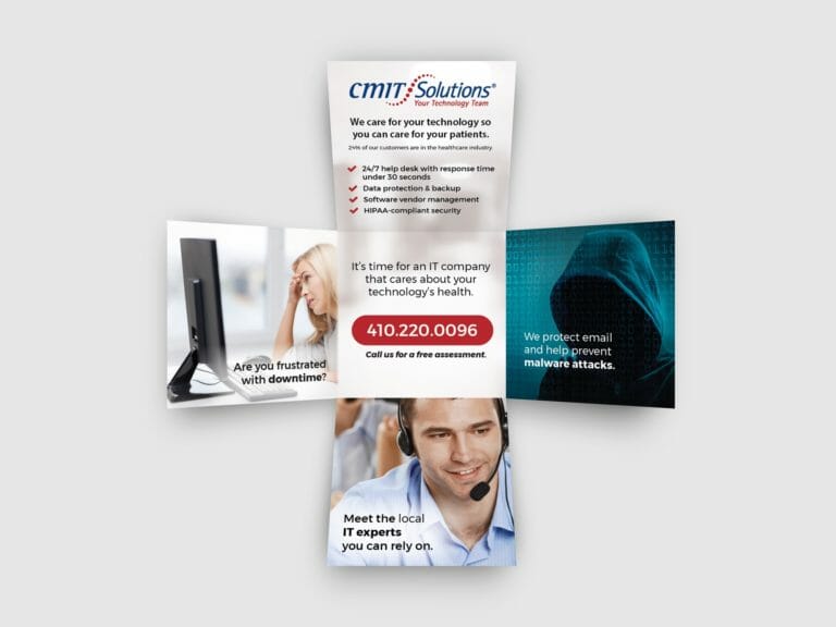
Need a brochure? Consider these creative options that aren’t trifolds.
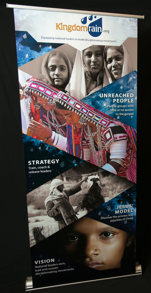
A stunning 80″ tall display banner helps a nonprofit draw in potential supporters
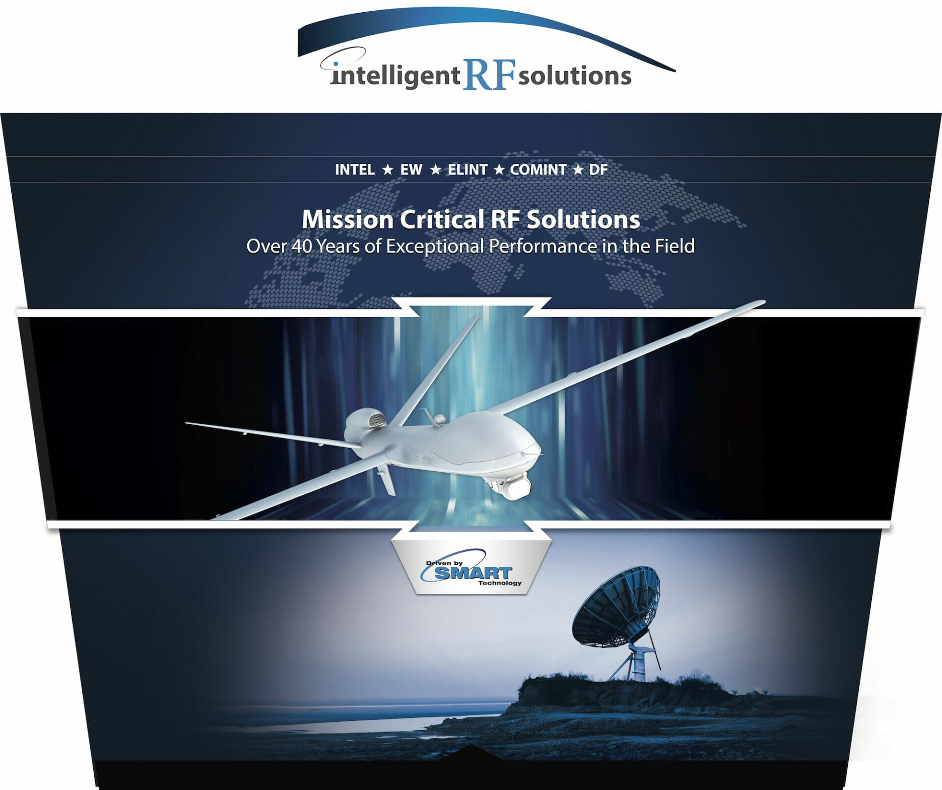
A 10-foot-tall display creates an alluring exhibition environment to draw in potential clients
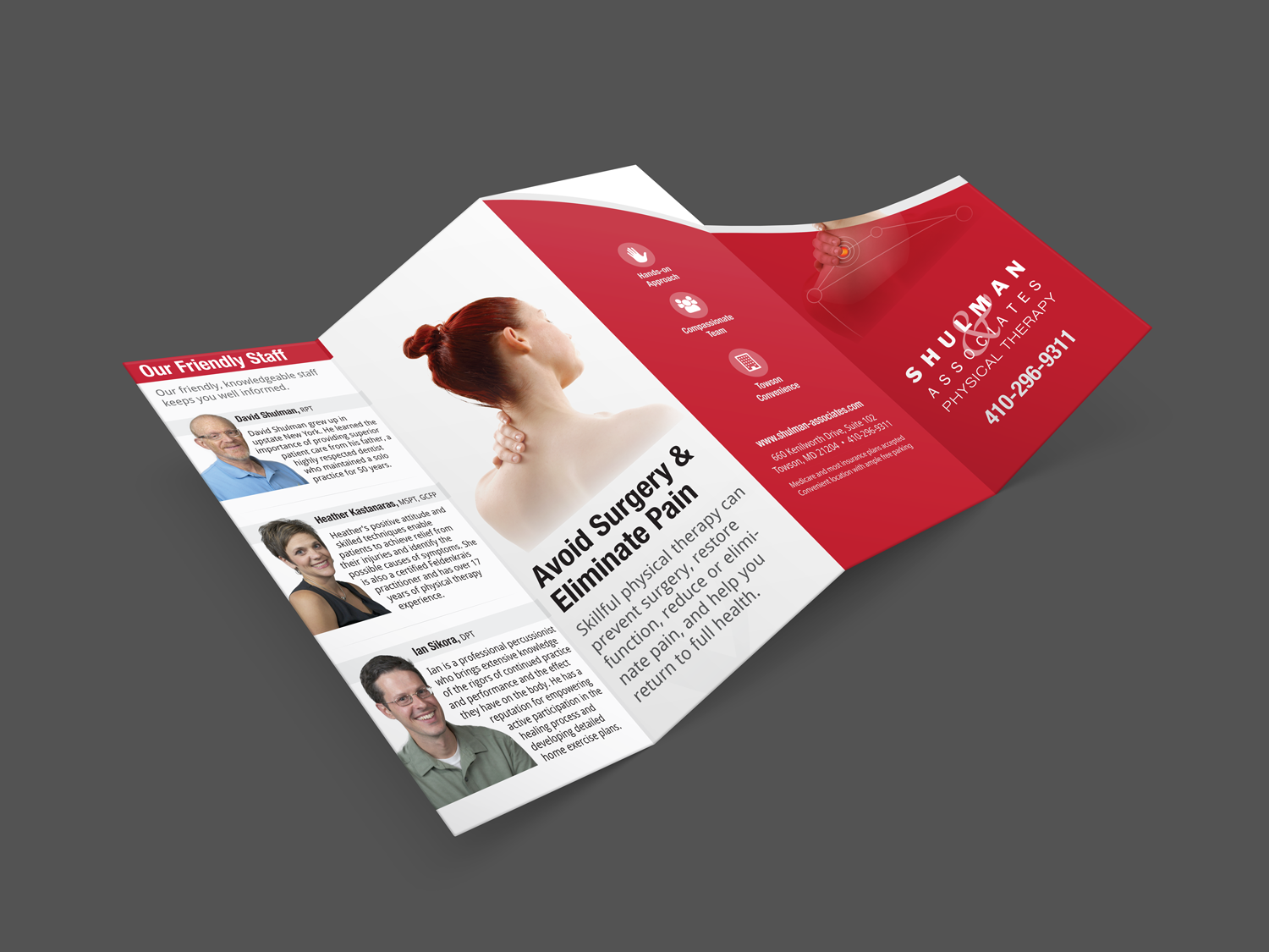
Can a brochure show how a physical therapist relieves pain and helps you avoid surgery?
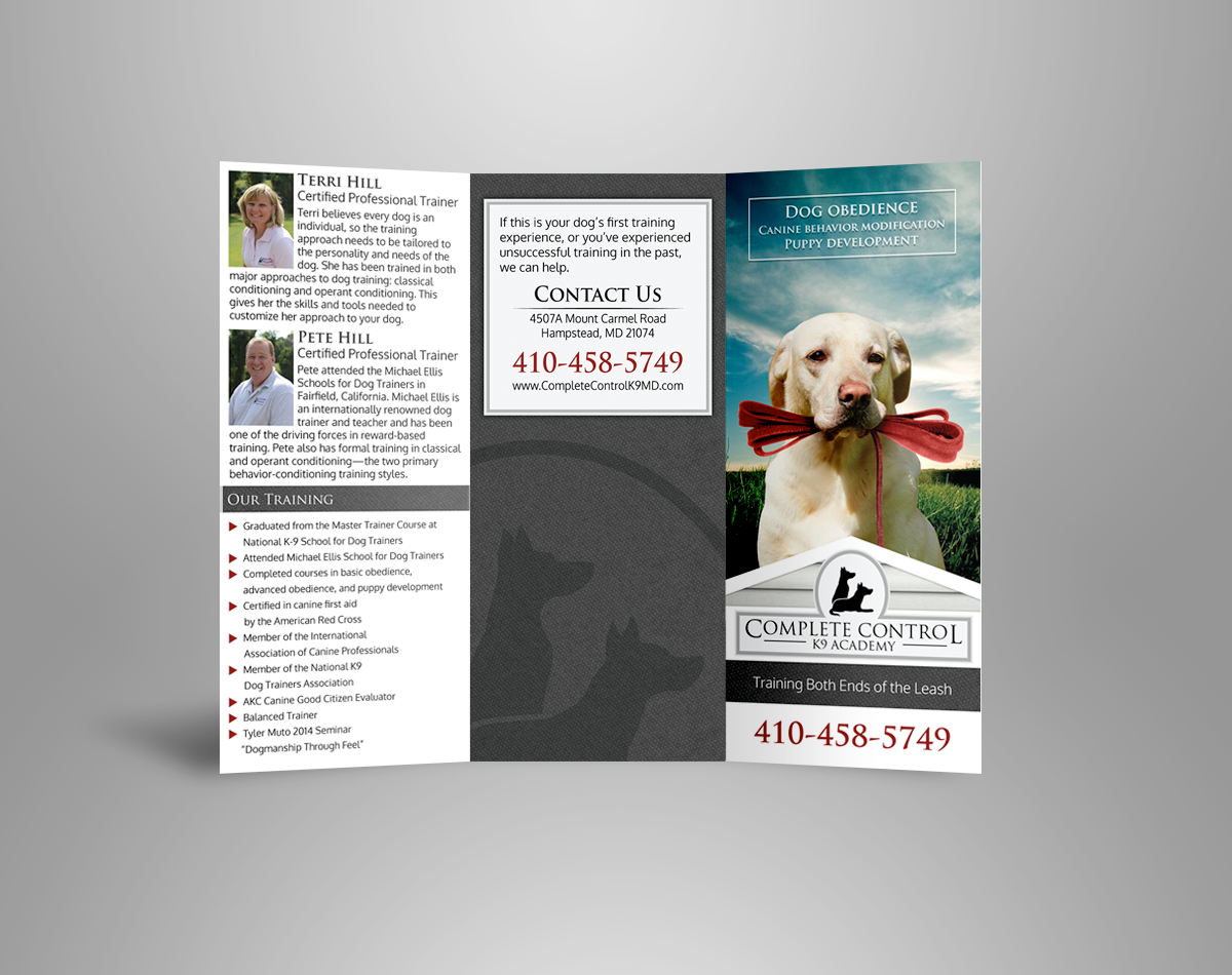
How can a brochure help leash in dog owners?
Are people actually receiving the message you are trying to send? How can the right visuals help?
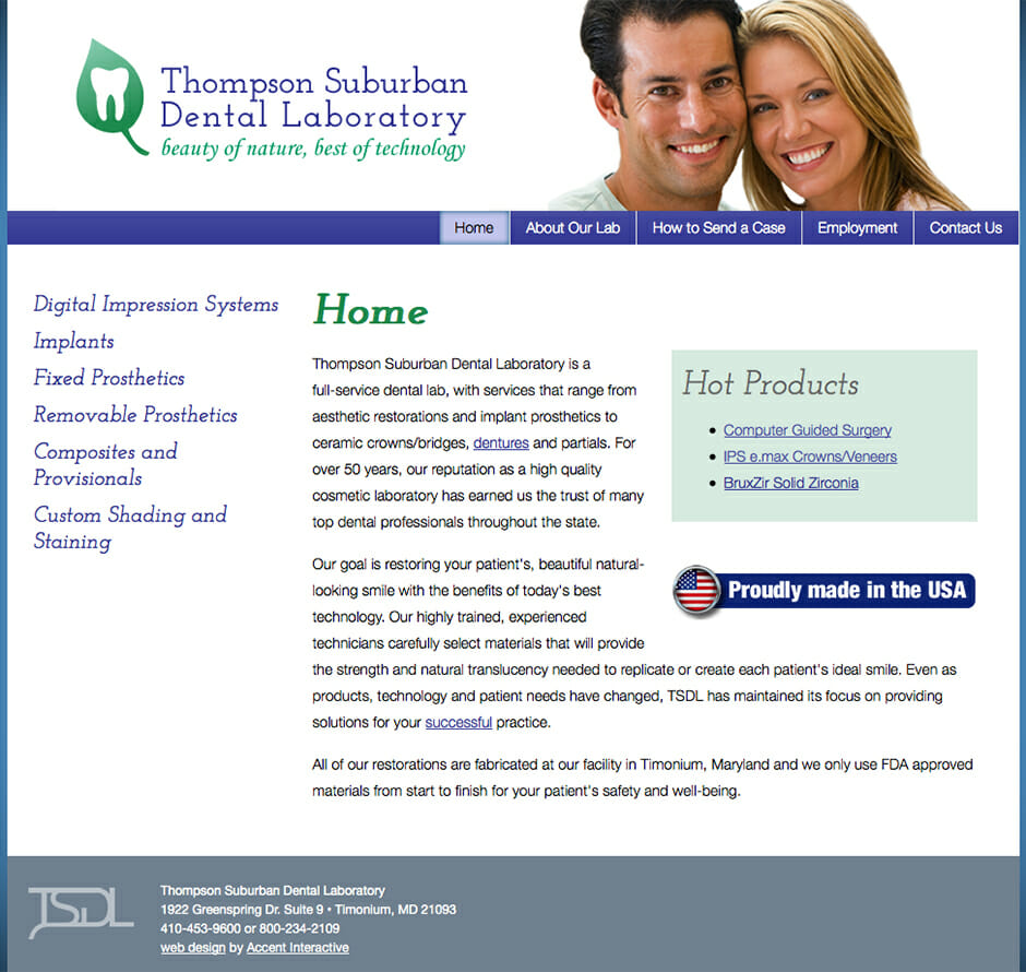
Mondrian inspires this dental lab trifold to go blocky.

The mark of a good book.

How open concept home design inspired a book cover.

The challenges of turning photographs of a dog into a children’s read-aloud eBook.
The logo that got you here may not get you there.