Every Picture Tells a Story
Bobbie, the owner of BDunn Interiors, came to us with a plea: “There are too many words! In my head and on my site. When I’m drowning in words, I can’t create. Feed my right brain with images, flow, color.”
We love it when our goal for a website is that clear from Day One. Our writer took on the challenge of making every word count—and eliminating the rest. And our designer set about creating a site where pictures told the story.
The Setting

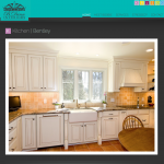
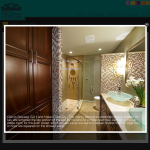
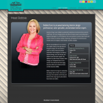
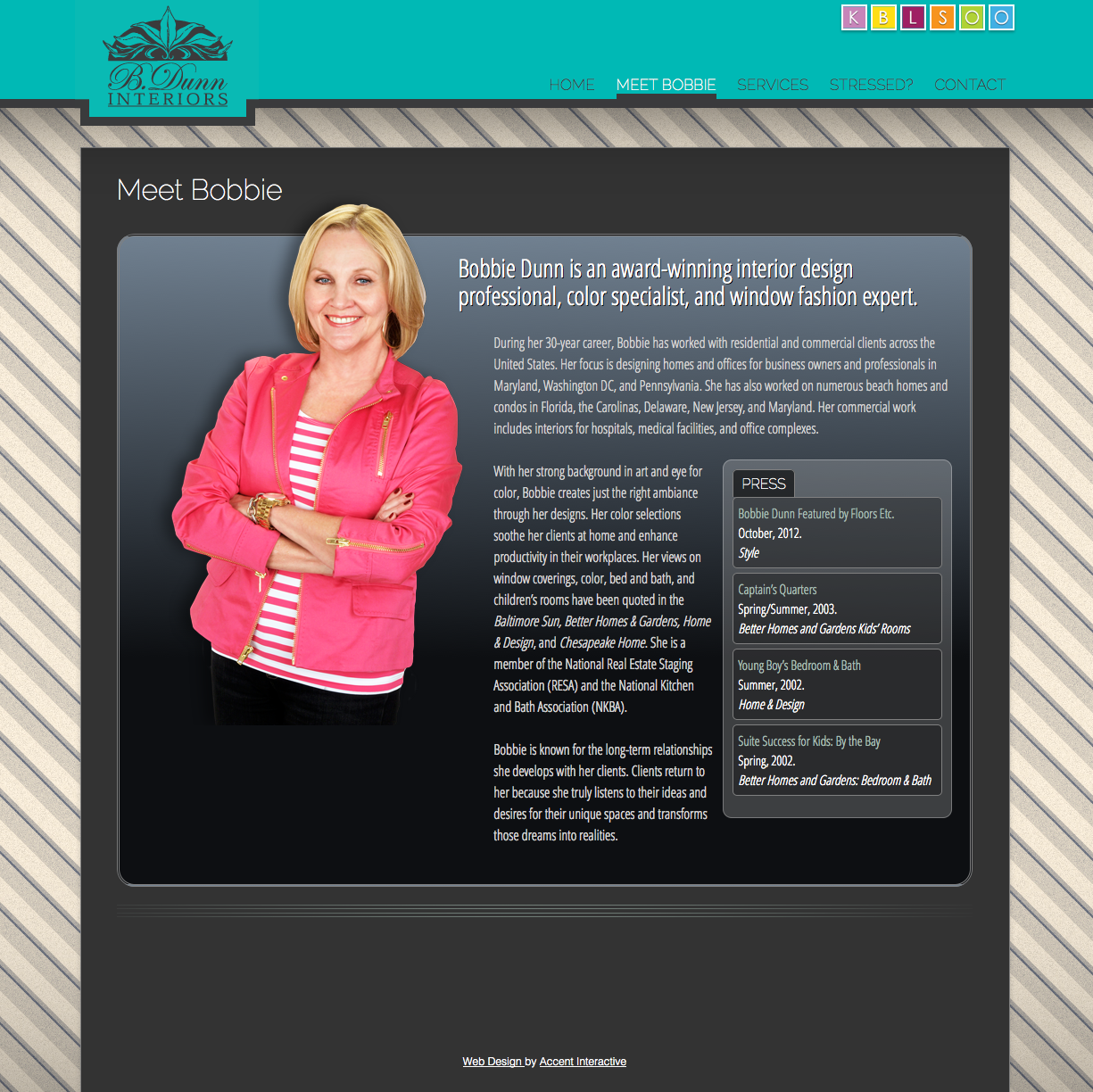
We wanted to display Bobbie’s work like we’d display fine art in a gallery. So out went the busy backgrounds and embellishments. A subtle linear background serves the same purpose as bare walls in a museum, letting the transformed rooms be the stars. Typography and color guide navigation without the clutter of too many small icons.
The Main Characters

Against that clean background, the interactive photos become the main characters. The visitor enters the story of each room, drilling deeper and deeper into the details of the redesign: the tile backsplash, the patio fire pit, the window treatments, and so on. “Before” photographs show where the story began. “After” photographs show how the story ended…happily. And in between, the site visitor gets a good sense of our client’s artistic vision and range of skills.
The Deeper Message

Our client requested a website that felt content rich without using lots of words. We ran with that goal but added to it. We wanted visitors to this site to get a feel for what Bobbie is good at, what she’s passionate about, what they will get if they hire her, and what it’s like to work with her. What do you think? Did we tell her story well?


