Mixed Messages
It’s no small matter when a client brings you 20 years of creative output and asks for publishing help. Our client had poured two decades into a print curriculum designed for training Asian leaders. He had been using this curriculum long enough to recognize something wasn’t quite right. There was a difference between what he thought he was communicating and what students were hearing. People were getting two different messages—one from the graphics and another from the words—and they didn’t quite sync.
Visual Stew
Our client understood the power of visuals in teaching and was using them liberally in his curriculum. But in contrast to his text, which was clear and precise, his visuals were sometimes hard for his students to decipher. At times, they even communicated the opposite of what he intended.
He needed some objective eyes to evaluate his visuals and help him see where they were wandering off course. Second, he needed experienced visual communicators to rework his illustrations to serve both his message and his students. He needed learner-centered design.
Back to the Drawing Board
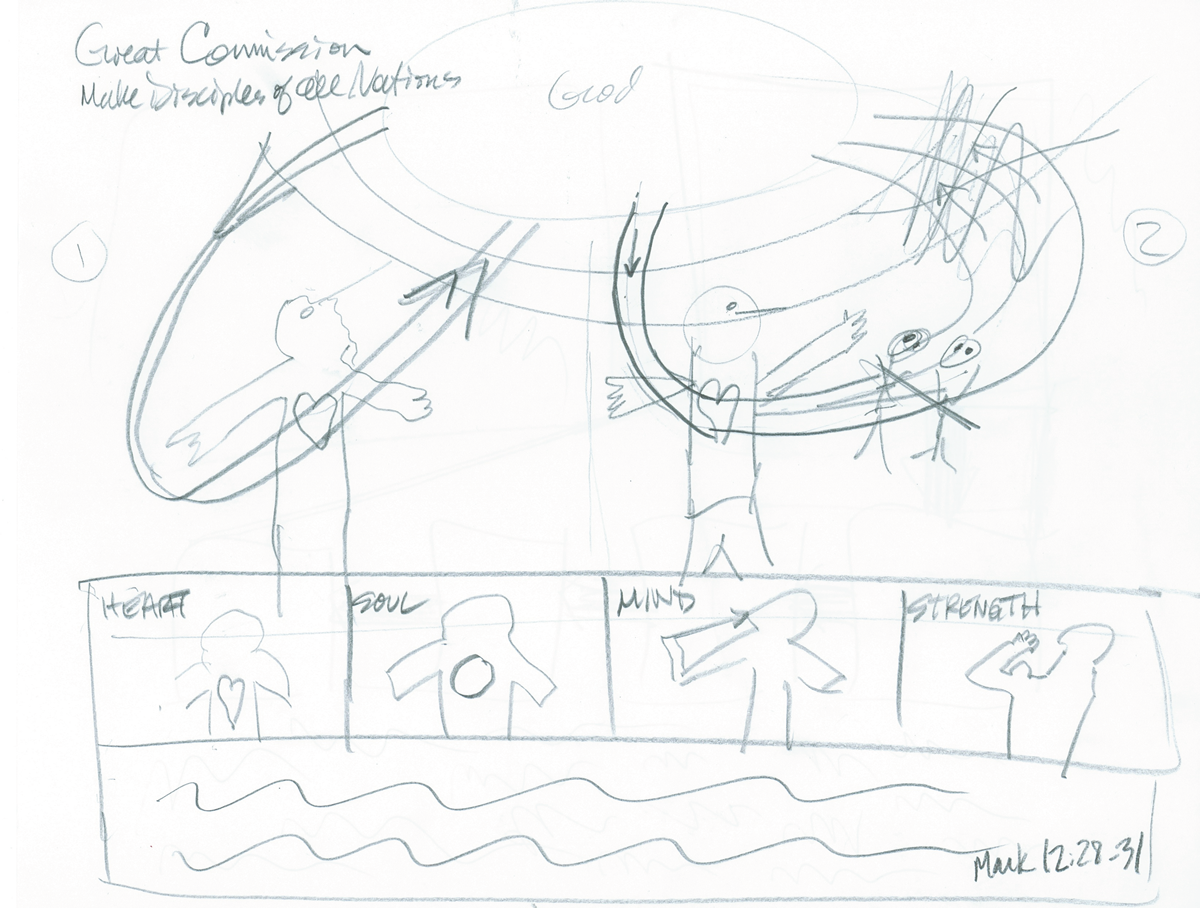
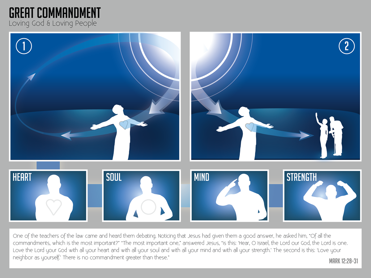
For example, our client wanted to illustrate the Great Commandment of scripture: to love God and to love your neighbor. His original “circle of arrows” illustration lost the important distinction that love always begins with God and flows from God. It left out the role of the heart, soul, mind, and strength. In fact, it left out people all together. An illustration representing perhaps the greatest words ever spoken about relationships needed to depict…relationships! Our team brought out pencils and stacks of paper and sketched until we reached that “ah ha” moment when the illustration supported and clarified the text. Then we applied the same process to three more illustrations of the overarching concepts that anchored this curriculum.
Quick Gets
Iconography is a smart way to create learner-centered design. Our client used icons in each lesson to help students identify priorities to explore and apply. The intended outcome was to create a “quick get” for students. But his original icons were photos, which don’t shrink well. Students could get hung up on what the icon was supposed to be and mean, thereby missing the real learning. The “get” was anything but quick—or clear.
We created simple, two-tone illustrations instead. The single image and spare design make it hard to miss the intended message. Learning happens!
Learner-Centered Design
It often takes an objective outsider to recognize why something isn’t working. It took our “outside eyes” to identify the problem—his visuals were sending mixed messages—and remedy it with learner-centered images. As a side benefit, our client ended up with lower production costs. His students ended up with deeper learning, free from confusion.
What message are your graphics sending? Are clients getting the message you intended?


