Small Size, Big Identity
A business card is the shortest story a business can tell about its identity. When Resolution Resources asked us to design their business card, we knew their identity: We had designed their website. Our challenge: capture that identity on 3.5” x 2” cardstock.
Milk what you’ve got.
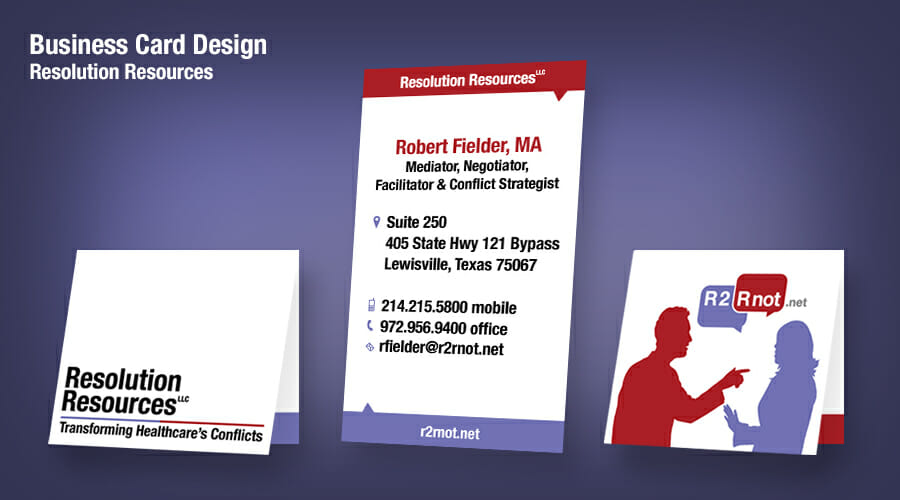
In Resolution Resources’ existing logo, two speech bubbles capture the essence of every argument: “Are too!” “Are not!” We amped up the visual impact of that logo with human silhouettes that display the posture of dispute. Strong-contrast colors capture the sense of coming from conflicting worlds.
Bend over to stand out.
Companies market to get attention. One way to get attention with business cards is to fold them. You get instant elevation with a card that can stand on its own. And you get the benefit of interactivity, something a flat piece of paper rarely allows.
Maximize the space.
A folded card offers twice as many spaces to fill while keeping to a standard size. Avoiding the temptation to clutter that space, we chose instead to keep the inside contact information simple and readable. In other words, user friendly. The outside space’s strong visuals stamp Resolution Resources’ identity on a potential client’s brain: These people can help us resolve conflicts.
See for yourself. Is the client’s identity clear? Does the card stand out in the right ways? In what ways do your marketing materials help you stand out from the competition?