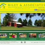
Realtor Web Design: Riley in Timonium, MD
Riley & Associates had one of those realtor websites that wasn’t working for anyone. The web design didn’t work for marketing because it was out of date, and the colors weren’t right. The technology didn’t work for the owners because it was too cumbersome to make changes. The experience didn’t work for users because they couldn’t quickly and easily get the information they needed.
Information Architecture to the Rescue
We worked on making a place for everything and co-creating a new layout that worked for everyone.
- Property Search
Home page puts property search front and center. - Local Schools
Most clients ask about local schools. Info is just a click away in the right sidebar. - Careers
Now it’s easy for outside realtors to determine if switching to Riley makes sense.
Realtor Web Design: Agent Rotation System
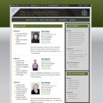
Any real estate agency needs to determine an equitable way to distribute incoming leads among their agents. It was important to the Riley owners that the website reflect this value also. So we created an agent rotation feature—each time the Agents & Staff page loads, it randomly distributes the order of the agents, so everyone has an equal opportunity to appear at the top of the page.
The Realtors in Timonium and Monkton Love It
“We like the new website so much better! Just as our customers get a feel for a house in the first impression, they were forming a first impression of our business from our website, and it wasn’t good. Now our website is today. And we love the agent rotation feature. That was really important to us.” —Cindy Riley, Riley & Associates


