Making Sense of Seafood

Sea King—a seafood market, carry-out, and caterer—is one of our long-time clients. They came to us recently to upgrade their website’s content management system. As we added CMS features for them, they realized their site’s visual design could use a fresh look. Their business was growing and invigorated, and we wanted to help capture that energy online.
Rocking the Boat
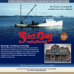
Sea King’s original home page featured a photo of a fishing boat on the bay, a classic Maryland scene. Yet the page fell short of capturing what Sea King was about.

Under the Sea
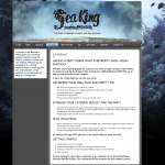
On our first pass at a redesign, we were still stuck in our nautical rut. We went deep into an underwater world. But scenes of fish in the sea only took us farther from defining Sea King. The result was certainly more artistic than the old version, but it wasn’t grabbing us.
What were we missing? What made people flock to Sea King?
Now That Makes Sense
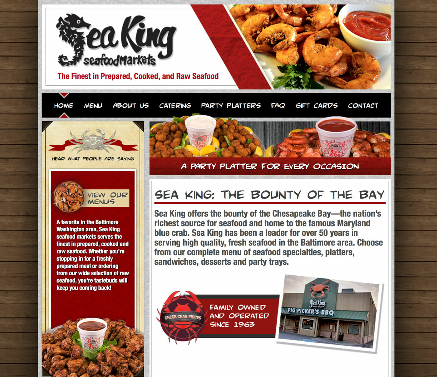
Food! When you enter Sea King’s market, you smell the sweet brinyness of the oysters, you see and feel the texture of the crab spices, you hear shrimp sizzling in the fryers. How could we capture that sensual extravaganza on their website?

From the rough wood siding in the background to the vivid photographs of food, Sea King’s new site looks more like an authentic seafood shanty. Casual. Inviting. If you’re a seafood lover—and you probably are if you’re visiting Sea King’s site—then your imagination automatically kicks in with the sound, texture, taste, and aroma of that shanty. It’s as if you are there, holding one of their party platters in your hand.
And what do you do next? You buy. And you eat. That’s how a creative appeal to all the senses can drive business!
Teachable Moment
How many of the five senses does your website appeal to? How can you access each sense to evoke a response from your customers?


