Sign or Logo?
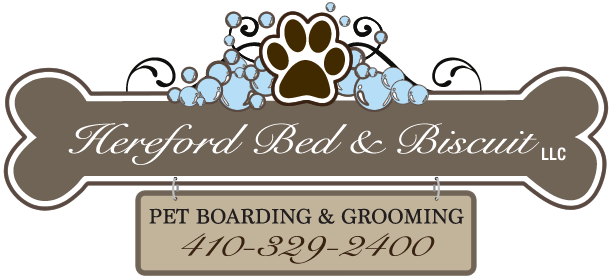
Hereford Bed & Biscuit came to us needing a sign for their newly revitalized company—a dog kennel in North Baltimore County. But if you don’t yet have a logo, how do you design the sign? What would it be like to design the logo with the sign in mind?
Common Ground
- Signs are readable whether close or far away. Likewise logos have to work equally well in high- and low-resolution environments.
- Signs and logos both need to communicate immediately the identity of the company.
- Signs and logos both use decorative or iconic type with limited information for maximum flexibility.
Differences
- Signs have “chrome” or framing making the total piece more substantial. Logos are pure symbols without a frame.
- Signs are in a place in time. They sit somewhere, giving context to the user experience. Logos are without place or time, waiting to be used anywhere.
- Signs are made of substance (wood, metal, plastic, etc.). Logos are merely graphics that can be used on anything.
Our solution blurs the line between sign and logo, creating a logo that sits like a sign wherever it goes. As such it emphasizes that a dog kennel is meaningful for its presence in place and time. Hopefully a place where your dog can have the time of his life.


