Modern Makeover for a Dentist Support Website
If you wanted to makeover your personal appearance, what would you do? Maybe you’d get an edgy new haircut, or buy a fashion statement outfit. Same you, new look. Sure to turn heads.
If you wanted to update your website’s appearance, what would you do? That was the question for The Dentist Well-Being Committee. They offer support for dentists and their families who are dealing with personal problems. However, their original website wasn’t catering to today’s dentists. The pages were crammed with text, and the website wasn’t mobile-friendly.
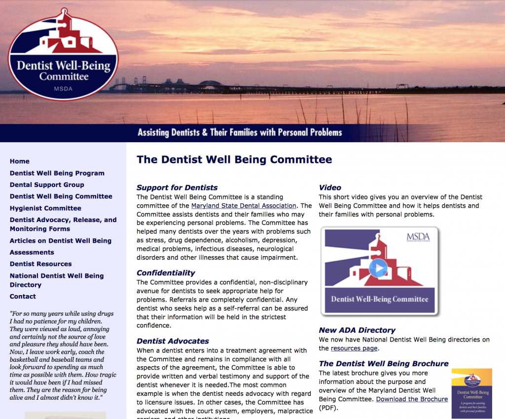
So they came to us for a fresh style. With some simple design changes, we modernized the whole website. Here’s how we worked our makeover magic.
Breathing Space
The target audience for this website is seeking a safe place for support. So we wanted the design to be as tranquil as the ocean scene on the homepage. The new website has plenty of white space.
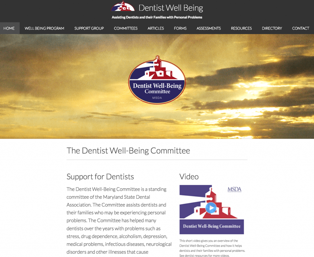
Result: Incorporating breathing room in the design encourages people to linger on the site and engage with it.
Content Re-layout
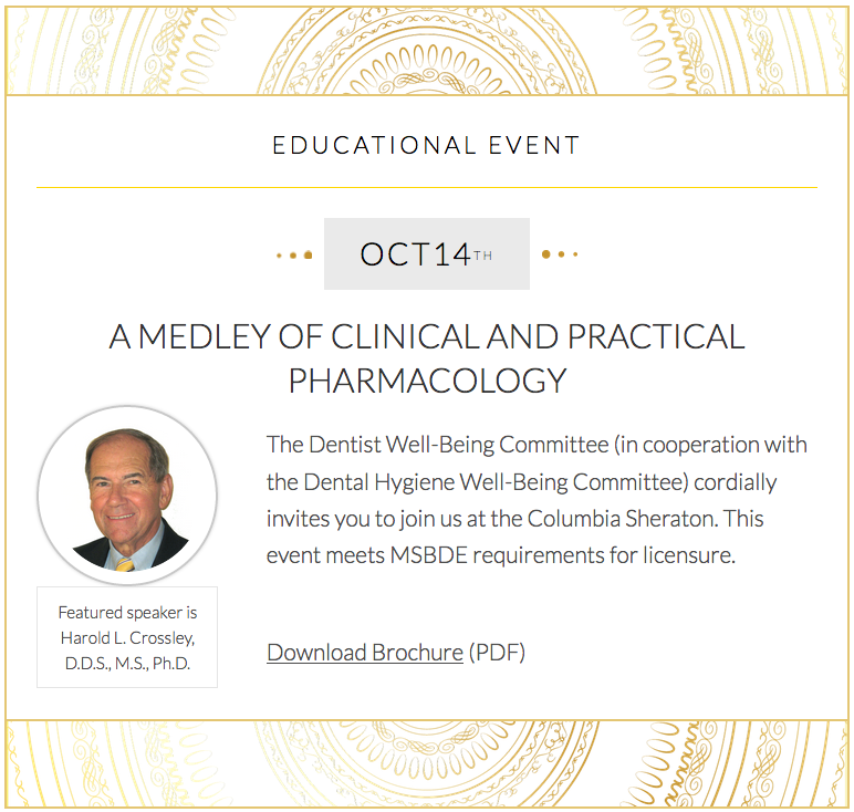
We re-arranged the content for a clean, simple look. We also treated featured content with special effects to capture interest.
Result: The webpages are easier to navigate. Instead of being overwhelmed with too much content, people know where to look.
Modern Fonts
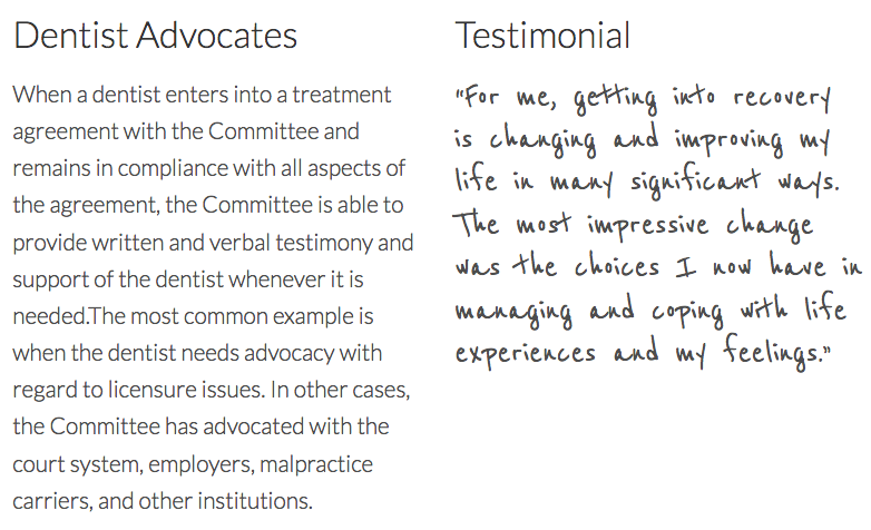
We chose a streamlined font and a larger text size. We also selected the typography based on the content. For example, the testimonials look like they’re handwritten.
Result: The text is more relatable and is easier on the eyes. People are more likely to read it—without having to squint.
Mobile Responsive
We configured the website for easy viewing on any mobile device.
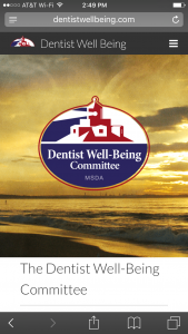
Result: On-the-go people are more likely to use the website. It’s convenient to access from anywhere, not just a desktop.
A Shining Example
As indicated by their logo, The Dentist Well-Being Committee wants to be a light in the dark. Now with their updated website they can shine all the brighter to serve their dentists.
Think about your company’s website. How could it be more relatable? What could be freshened up to attract today’s audience? If you’re ready to re-imagine the possibilities, then contact us. We’ll help you find that perfect new look for your website.


