Category Archives: Presentations

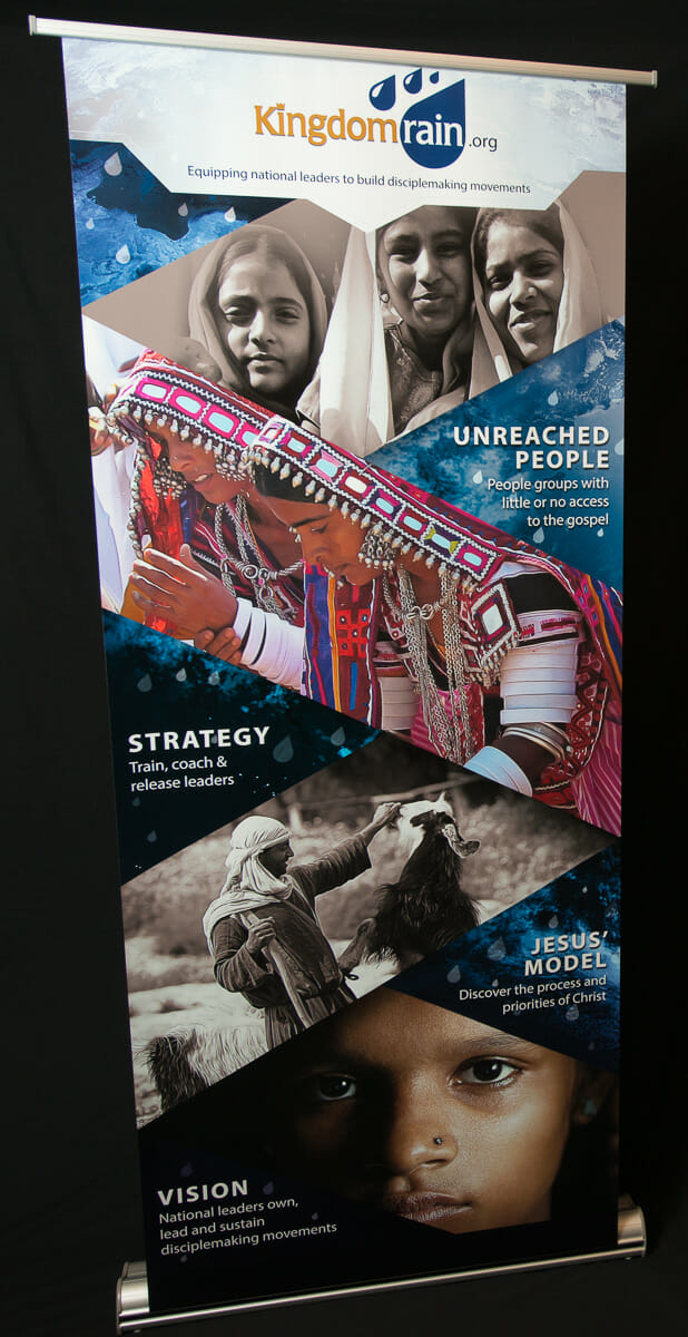
Display Banner “Rains” People In

As a nonprofit, Kingdom Rain relies on supporters to accomplish their mission—training Christian leaders in remote areas of the world. Setting up display booths at conferences can be a great opportunity to promote their ministry. But with all the other organizations that also vie for people’s attention, how could Kingdom Rain stand out?

Kingdom Rain had already seen success in the website and print materials we had created for them, so they came to us for their display banner. Our creative challenge was to design a banner that would draw people in for a closer look, demonstrate Kingdom Rain’s mission, and develop a consistent marketing brand for them.

Kingdom Rain Banner

The Banner Beckons

The 80” tall banner piques interest from afar with captivating design elements. Once you’re up close, your eye flows down the banner like rain. We achieved this through using:

  • Geometric shapes at descending angles
  • Rain drops falling down the banner
  • Sophisticated images (alternating between color and monochrome)
  • Dramatic contrasts between light and dark

Result: The banner attracts attention from a distance, draws people to the booth, and keeps them interested from close up.

Message at a Glance

We wanted to communicate the essence of Kingdom Rain’s mission with the fewest number of words. At first glance, you can tell Kingdom Rain serves outside of North America.

  • The header reflects Middle Eastern shapes
  • The photos show cultural diversity
  • The background image is a subtle world map
  • The words are concise, from the tagline at top to the blocks of simple content along the sides

Result: The message is suited to the medium of the banner, which is meant to visually show what the organization is about. This gives Kingdom Rain opportunities to talk with people who are interested in learning more.

Consistent Branding

To create a consistent marketing brand for Kingdom Rain, we repurposed some of the photos and design elements from their website and brochures.

Result: If people see Kingdom Rain’s display banner, look at their printed materials, and visit their website, they get a consistent experience that builds trust and increases the likelihood of them engaging more.

Increased Booth Traffic

Kingdom Rain loved their banner and were excited to have it at their booth. “I’ve been to a lot of conferences in my lifetime and seen a lot of banners,” said the founder of Kingdom Rain. “This is the best banner I’ve ever seen.”

If you want to attract potential clients or supporters at a conference, then it starts with having alluring display materials. We’ll help you design whatever you need to get people interested in your work.

Creative Marketing Journey: From Illustration to Costume Design

MNS Group, a managed IT service provider, has been a courageous adventurer in the land of creative marketing. They’ve scouted out different opportunities to convey their message in unique ways. And we’ve tried to be their “fairy godmother” to make their ideas reality.

We’ve seen how one successful creative marketing concept can lead to another one, like what recently happened for MNS. We turned an action figure illustration for a blog post into a baseball mascot’s costume for a promotional video.

SecurityMan-MNS

Starts with an Illustration

A few months ago, MNS asked us to illustrate an armored man in action for them, to be used for a blog post on network security. We created a character, dubbed Security Man, and his attacker. The pieces of armor on Security Man represent various layers of network security MNS suggests for their clients. This metaphor for protecting a computer network became a launch pad for another creative marketing presentation.

Opportunity Comes Knocking

As a sponsor for Ripken Baseball, MNS Group had a great marketing opportunity—they could get a short video to be shown on the big screen at Ripken Stadium. How could they use what they already had and adapt it for a video at a baseball stadium?

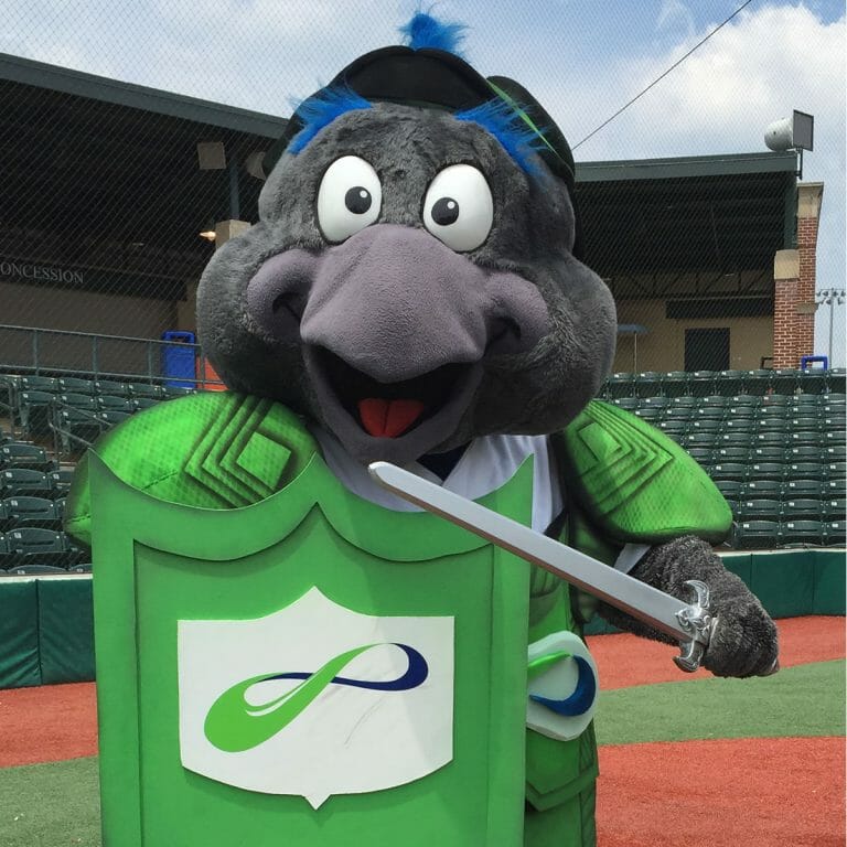
Collaborating as creatives with MNS, we brainstormed ideas. We decided to use the IronBirds’ lovable mascot, Ferrous, to act as Security Man in a video shoot the following week. This meant we had a few days to create a suit of armor for Ferrous to wear and wield.

Ferrous_May_23__12_54_39_PM

Creating a Mascot’s Costume

How could we turn an illustrated suit of armor for a human into an actual costume for an oversized bird? For one, we needed to make sure it would fit the mascot’s exaggerated features. We also needed to make sure it was functional. Ferrous would be running around the bases wearing the armor, so it needed to be lightweight and secure. And of course, we also wanted it to look professionally produced. Our design process and material selection took all this into account. Here’s a video to show how we did it.

Breastplate

Ferrous_May_23__1_14_29_PM

This breastplate for Ferrous is lightweight, flexible, and stays on even when he runs.

Helmet

Ferrous_May_23__12_45_03_PM

We created the helmet to fit snugly around Ferrous’ head, even allowing his crest feather to stick through.

Shield

Ferrous_May_23__1_19_55_PM

A sturdy shield helps Ferrous ward off attackers.

Sword

Ferrous_May_23__1_19_50_PM

A sword completes the Security Man costume.

When we delivered the mascot’s costume to MNS Group, they loved it. Their response—“Awesome!”

Taking Creative Risks

It can be risky coming up with new ideas to promote your business. We were asking questions like, “Can the illustration function as a mascot’s costume?” and “Can the video deliver this message?” Kudos to MNS Group for standing out in a crowd and putting their trust in our team and the Ripken Baseball performers and producers.

MNS has already seen the rewards of investing into special marketing messages. Their Security Man illustration was repurposed to resonate with baseball fans. MNS has developed a consistent branded message both online and on the sports field.

Get Noticed

Our creative process helped MNS maximize the potential for their marketing video opportunity by using the illustrated concept they already had. Are you ready to try something new and fun? With professional creatives by your side, you can be courageous and pioneering to make your message memorable.

We’re ready to take on any challenge to help your business succeed. Whether it means illustrating or designing mascot costumes or creating something else yet to be dreamed of, our team will collaborate with you to make it happen. Contact us, and let’s embark on a creative marketing adventure together.

Presentation That Makes a Splash

PowerPoint Presentation for Cleaning & Restoration Industry

How does graphic design liven up a dry presentation on water damage? This presentation really created a splash at the Cleaning & Restoration Magazine’s annual conference. It even featured an auto-play section timed to the music.
  • Rich, colorful background sets off images
  • Water theme integrated throughout
  • Section headings provide unity

Powerful Presentation to Johns Hopkins Medical Center

Presentation Design for Physical Therapy

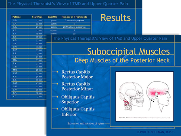
The pressure was on. Our client was about to make a big presentation to Johns Hopkins Hospital and needed a PowerPoint show that was inviting, informative, and professional looking. Accent worked closely with David Shulman, RPT, to create a presentation that garnered praise from his audience audience of respected doctors.

  • Leaf motif reinforces client’s natural approach to physical therapy
  • Soothing colors attract the eye without detracting from the message
  • Animation adds visual interest to medical illustrations

Artistry Meets PowerPoint

Presentation for Collision Repair Company

When it came time for Chesapeake Collision to revamp its PowerPoint sales presentation, the vehicle repair company came to Accent Interactive. PowerPoint is not really an artist’s tool, but they wanted a presentation with panache. The presentation reflects Chesapeake’s growing reputation for superlative service that includes vehicle pickup and rental car delivery.

  • Tasteful colors and simple design create an upscale feel
  • Custom photography brings the text to life
  • Carefully chosen graphics direct viewers’ attention