From the Floor Up: New Website for a Commercial Flooring Company
Have you ever walked the aisles of a Giant Food store? If so, then you have B.W. Hovermill Co. to thank for installing that floor.
Based in Maryland, B.W. Hovermill Co. specializes in commercial floor installation. Over the last 60 years, they have established decades-long clients, such as Giant. However, Hovermill didn’t have an online presence that featured their expert work and clientele. They came to us wanting a website that showcased their breadth of experience and longevity in the industry. Here’s how our creative team met the challenge.
Wide Variety of Experience
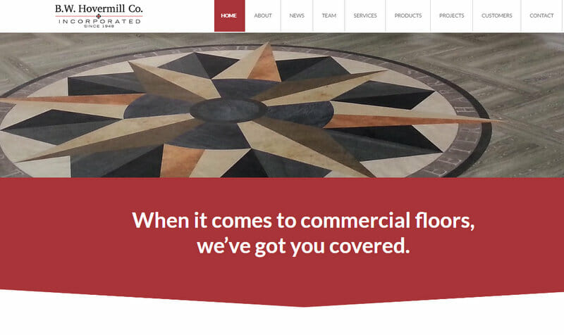
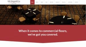
- Floors: We featured different kinds of floors on the homepage slider, including inlays and carpet from actual projects.
Result: The first impression images say it all—“We specialize in an array of flooring.”
- Services: We helped Hovermill identify which services to promote, from as standard as installation to as specialized as moisture mitigation.
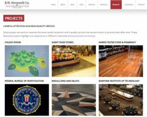
Result: Clients learn that Hovermill offers multiple flooring-related services, not just installation. - Projects: We highlighted key projects in different industries and around the community with a gallery.
Result: Web users can see at a glance the variety of work Hovermill has done and can click on the images to learn more about the specialty projects.
- Manufacturers: Hovermill is a supplier for over 40 manufacturers. We organized their logos and linked to their respective websites.
Result: Clients can conveniently see the plethora of brands all organized on one page and click for more information on each manufacturer.
Deep Roots in the Industry
- Testimonials: We included a “What Customers Say” section on the homepage and more testimonials on the Customers page.
Result: Hovermill is established as being credible, professional, and trustworthy by satisfied customers in their own words.
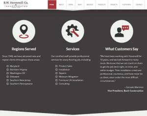
- History: We emphasized the company’s 60-year history, their multi-generation ownership, the management team’s expertise, and Hovermill’s long-term clients.
Result: Prospective clients realize that Hovermill is established, knowledgeable, and reputable. - Branding: We incorporated color and design elements from Hovermill’s logo throughout the website. We also pulled geometric angles like a carpet pattern to draw the eye down the homepage in bite-sized sections.
Result: People want to keep reading more on the website, and Hovermill’s brand is further established, building a consistent look.
Let the World See
Hovermill does world-class flooring work—and now they have a website that shows it. Our creative team was able to maximize the potential of the available photos and resources to represent Hovermill’s skilled craftsmanship.
Do you want a website your clients will be floored by? Let’s get started. We’re ready to roll out our red carpet just for you.
