Polish, Don’t Demolish: A fresh coat of paint for a PR website
Hiring a web designer doesn’t mean you have to trash your current website and start from scratch. Sometimes you can preserve some of your original investment and build on what’s already there.
Such was the case with Maroon PR, a public relations agency in Columbia, Maryland. We kept the best from their website’s original design while simplifying it and improving the user experience.
Big First Impression
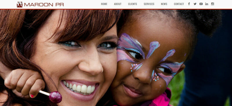
If a good photo says it all, a bigger photo says it louder. We retained the “big screen” style of the original design’s home page. A slideshow of large photos flashes recent success and makes a good first impression.
Livelier Case Studies
You want case studies to demonstrate the value your company delivers. And showing is more effective than telling.
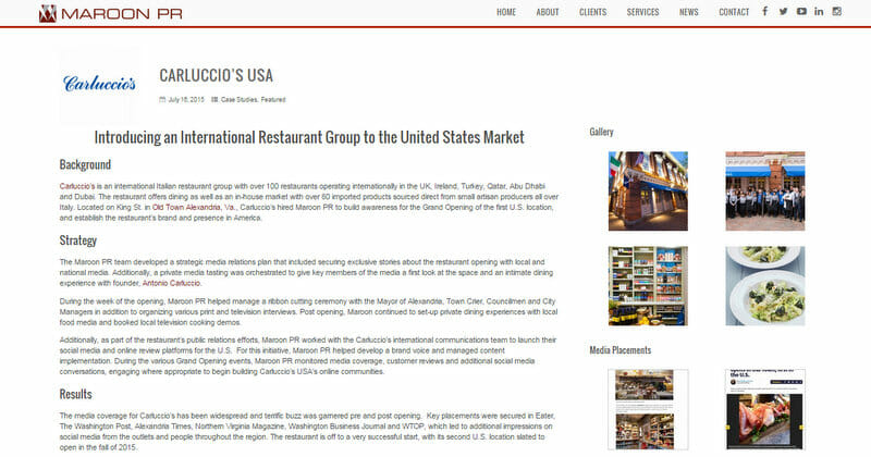
We improved Maroon PR’s case studies with these value-added features:
- Logos
In an instant, recognizing a popular brand on your client list can impress. Logos can impress potential clients by showing who has hired you in an instant of recognition. - Mixed media
Photos, screenshots, and videos bring life and interest to case studies. - Testimonials
Quoting clients in their own words is a good way to capture praise.
Renovated Information Design
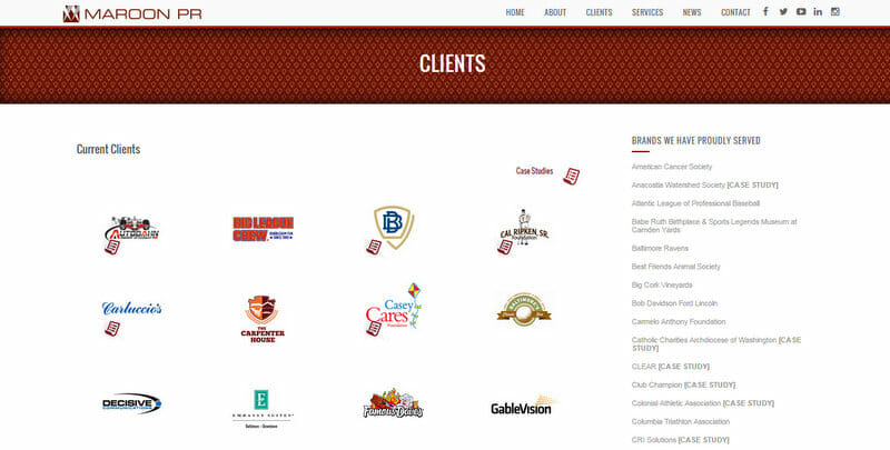
Maroon PR wanted to distinguish between current and previous clients, as well as indicate which ones were linked to case studies. We decided to present current clients in a grid of logos. We then designed a custom icon for the clients that had case studies. With their previous clients, we just listed their names in the sidebar, followed by a simple text link.
Partially New and Totally Improved
If you’d like to update your website, it may not need a complete overhaul—sometimes it just needs to be spruced up. Contact us to explore the options.
[su_quote] Working with Ken and Accent Interactive was a great experience. They are knowledgeable, responsive, and developed a highly functioning website for us in a timely manner that we are very proud to showcase. We look forward to working with Accent Interactive on more projects, and continuing to enhance MaroonPR.com, which serves as one of our most important marketing tools.[/su_quote]
—Chris Daley, Director of Brand & Business Development
