Listening

Most business consultants will tell you how important it is to listen to customers (as a recent example, note how much “listening” is mentioned into this article on what makes a great entrepreneur).

We’ve all heard that before. This week Peter Francis, principal of Clinical Laboratory Sales Training is setting an example for us by doing it.

One of Peter’s customers loves reading his articles on laboratory sales techniques, but he spends a lot of time in the car and wishes he could listen to them instead of just read them. “Maybe you could send me an audio version?” he asked. Peter took the suggestion to heart and sat down in the recording studio. Now he’s starting to offer free audio versions on his website. How generous is that?

In our next quarterly web marketing review, we’ll be tracking the analytics to see how popular they are. From there we can determine what kind of next steps to take with digital audio.

Ideas for Further Development

  • Sell CDs: maybe it’s valuable to package several articles and sell them on disc?
  • Podcast: if they like articles maybe they would like other kinds of recorded conversations?
  • Promotion: use the recordings to promote other business offerings, such as seminars, coaching, or the newsletter.

Do Something: Lessons from Peter

  1. Care about your customers more today than you did yesterday.
  2. Listen to their words and the desires behind the words.
  3. Play with options for how to give them what they want.
  4. Become a responsive, dynamic resource for customers and they will reward you.

Hitting the Jackpot

We completed a new website for The Maryland Center for Problem Gambling, a new partnership between the University of Maryland Medical School and the Maryland Council on Problem Gambling. They offer gambling prevention education, treatment, training, and evaluation.

The website features the latest research on gambling prevention, news on what’s happening in the area, and details on getting help with gambling problems.

If you know someone who struggles with gambling addiction, contact the Center for Problem Gambling. If you need someone to help market your business so it can make money the old fashioned way, contact us.

Sail Away With Me

Watermark Journey Website

A major acquisition and re-branding effort included a new website for this Annapolis touring company. The challenge here was to bring together a diverse group of services into one coherent site. Designed in collaboration with Mind Over Machines, this new website is the key component of the marketing effort. Users can get a good sense for the services and even book a cruise, while not getting confused about where to click next.

  • Video creates a nice introduction to the services
  • Montage of photos illustrates the fun people have enjoying the sites around Annapolis
  • Vibrant color scheme sets the tone for a good time

Getting to Know You…

Coaching Video

Watching him in action is a good way to get to know your potential coach. This video bridges the gap between the unknown coach and the trusted advisor.

  • Allows customers to meet Wayne anytime, anywhere
  • Saves Wayne time—no more repeating the same message to multiple prospects
  • Brings energy and life to the website.
We also designed Wayne’s website.

Engineers Get Wired

Embedded Engineering Web Design: Netrino


If you have lots of traffic coming to your website, you need good design to make the most of it. This one uses a large body of technical articles to establish Netrino as the obvious experts in the field of embedded systems engineering.

  • Video on home page highlights the Netrino vision of the embedded systems industry
  • Online quiz attracts and pre-qualifies potential employees
  • Content management system makes it easy to maintain the site

Oh…and they love it. Here’s what the president said:

“We’re thrilled with our new website. Accent Interactive exceeded all expectations and delivered real value.” —Michael Barr, President, Netrino

Dream the American Dream

Realtor Web Design: Remax

It’s not enough these days to have a good person helping you buy or sell a house. In the information age, you need information fast. And since it changes all the time, a good website really helps set Re/Max American Dream apart form the competition.

  • Vibrant red, white and blue theme
  • Search engine allows quick search so customers can easily locate houses for sale
  • Streaming video allows customers to watch recent Re/Max commercials
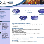
The Culver Group

Scanning Whole Websites in a Single Bound

Website for The Culver Group

The Culver Group

The Culver Group needed a whole new look: logo, business card, and website. This contemporary design carries the logo’s energy into the site content.

  • Graphics appeal to the 4 audience groups
  • Site organization clarifies the company’s offerings
  • Product-focused design helps sales

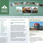
Designing Value

Website for ADW Architects

Accent Interactive found a kindred spirit in ADW—let’s use creative design to deliver value to the customer. This website shows how ADW is beating the competition with great ideas that save money.

  • Custom photos show off the finished product
  • Rollover graphics in header help celebrate the 15-year anniversary
  • Contemporary design helps customers know they’ve found the right architect

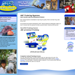
Buy Now, Get Training

Website for ABC Animal Training

Training a live animal can be difficult, unless you know what you are doing. With ABC Animal Training, you get video training that makes training as easy as ABC.

The website is the best way to order, and these store owners appreciate the convenience of an online store without the frustration of maintaining an expensive, physical store front.

  • Colorful images of a diverse collection of animals
  • Video previews show product effectiveness
  • Store is easy to maintain and expand

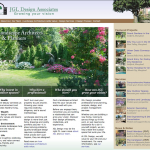
Growing Your Vision Together

Landscape Architecture Website: JGL Design Associates

Nobody has all the creative ideas. In fact, it’s fun when customers contribute ideas of their own and we work things out together. This project was one of those “creative collaborations” that we like.

The project starts with beautiful photos, which really make the difference. There is no such thing as a great website with bad photography. Lesson: don’t skimp on the images.

  • Captures the character and personality of this landscape architecture firm
  • Home page takes prospective customers through the thinking process used when hiring a professional landscape architect
  • Nice “show” and “tell” balance here
  • Grows the business by pre-filtering people who really just want to hire a landscape contractor to plant a tree