Forget Me Not
Card design for Romance of Flowers
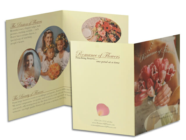
Card design for Romance of Flowers
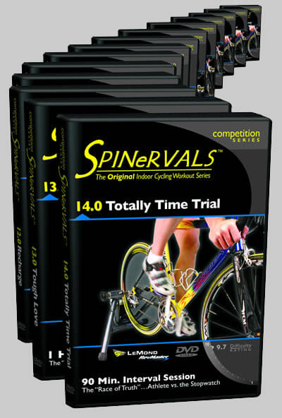
Packaging design for Coach Troy’s DVD series

Package design for “Passion” DVD
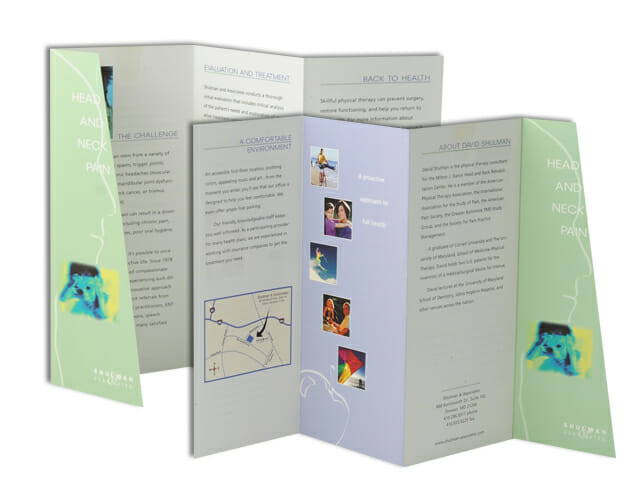
Brochure design for Shulman & Associates
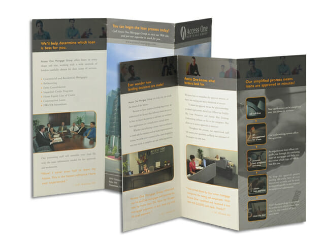
Brochure design for Access One Mortgage Company
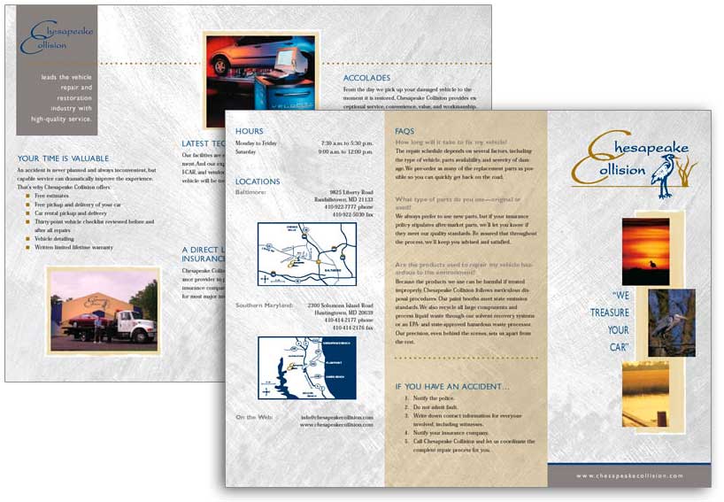
Brochure design for Chesapeake Collision, an auto repair company