Dual Branding
Is it time to market one of your services as its own brand?
Is it time to market one of your services as its own brand?

A client needed a logo that was true to herself and the people she reaches.
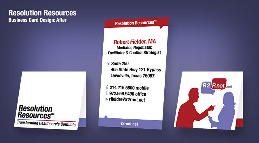
What makes a business card stand out in a crowd?

How important is it to obsess about your brand?
A kennel needed a sign. And a logo. So we did a little cross-breeding.