A Website Worth a Thousand Pictures

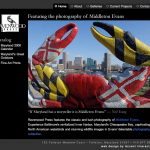
Website for Middleton Evans of Ravenwood Press

He’s been called Maryland’s greatest outdoor photographer, but without a good website Middleton Evans was destined to become Maryland’s best kept secret. This website not only puts Middleton on the map, it also showcases his vast body of work. This is Maryland and Middleton at their best.

  • Striking design allows photos to shine
  • Ordering option gives customers a way to purchase fine art prints, books and calendars
  • Gives Ravenwood Press a marketing tool with the widest possible reach

More Than a Web Project

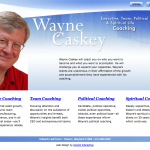
Web Design for Coach Wayne Caskey

Often redesigning your website doesn’t just improve your communications, it improves your business. In the process of reviewing his marketing materials, executive coach Wayne Caskey clarified his business offering and strengthened his business direction. The result is not just a new look on the web, but a consistent and effective business that he takes to the market with confidence.

  • Focus of the design and the business are the same—Wayne himself
  • Classical themes complement the personality-based design
  • Video helps customers get to know Wayne’s personality and style

We also produced Wayne’s video.

Customer Praise
“It’s me!” —Wayne Caskey

Drilling Down to Clean Design

Website for Maryland State Dental Association

For years the Maryland State Dental Association has offered assistance to dentists through the Dentist Well Being Committee. Now dentists have a place to learn more about the services offered before they make the first phone call.

  • Fresh, clean look matches the dentist’s environment
  • Simple navigation makes browsing easy
  • Offering forms online saves time and money

Customer Review
“Everyone loves the new site. Thanks for your expertise.” —Clinical Coordinator

Employee Assistance Made Easy

University Employee Assistance Program Web Design

The University of Maryland offers great resources in an employee assistance program, but without an effective website, how could they get this message out?

  • Home page answers the most frequently asked questions, saving phone time
  • Colorful photos highlight the diversity of the clientele
  • Staff directory puts a friendly face on this personal service

Customer Review

“Thanks for a great job on the website. We’ve had many compliments on the design.” —Director, Employee Assistance Program

Bring Metal to Life

Video Replaces PowerPoint for Tech Company SIGINT

Instead of distributing a dry PowerPoint presentation to potential customers, SIGINT decided to tell their story on this video. The result is dynamic marketing that shows and tells.

  • Music gives the presentation a professional feel
  • Narration walks people through the story, taking the place of a live presenter
  • Animated images and photos help people get the message immediately

We also designed the website.

The Intelligent Design Theory

M/A-COM SIGINT Products Website

When you are “the most trusted name in signal intelligence products,” your website needs to look as intelligent as your products. M/A-COM SIGINT Products came to Accent Interactive for a website that lives up to its company slogan.

  • Metallic theme illustrates product line
  • Animation brings microwave technology to life
  • Clear navigation makes browsing easy for user

Customer Review

“Your efforts our enhanced website are much appreciated. The site is tasteful and well-organized—it defines SIGINT Products! It makes me very proud to be part of this team. Feel free to use us as a reference any time.” —M.C., Director of Sales & Marketing

Streams of Exercise Energy

Streaming Video for Endurance Coach

What better way to sell videos online than to show previews? Coach Troy has a growing collection of workout and instructional videos that help athletes prepare for the big race. Along with this DVD introduction, Accent created the online presence and streaming video content that race sales right past the competition.

  • DVD introduction excites athletes about exercise
  • Video and audio quality are maximized for online viewing
  • Streaming allows for viewing during download
Update: Coach Troy now has a YouTube channel to promote his training series.

Jarretsville Builders

Customize Your Home (page)

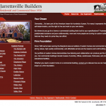
Website for Custom Home Builder: Jarrettsville Builders

Jarretsville Builders

Right at Home

Every home and commercial building they create is custom designed around the needs of the client. So they needed a website that reflected this personal touch. We created a site that meets their specifications:

  • Custom photography shows off property features
  • Our copy writing and editing help the site speak for itself
  • Simple animation makes good use of screen space

We also designed the logo and business card.

High Praise from a Happy Customer

“We have been greatly impressed by your artistic abilities and creativity, however, more so the patience you have demonstrated in working with lay people like ourselves, as you encouraged us to stretch our imagination and creativity. The professional manner in which the entire process was orchestrated speaks volumes about Accent Interactive. We highly recommend your organization and will most certainly use you for future projects.”

William Minton, President
Jarrettsville Builders, Inc.

Engineering Made Visible

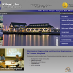
Engineering Website Design: Kibart, Inc.


A county library, a pharmaceutical laboratory, a university…all examples of Kibart engineering at work. This Towson-based firm needed a high-impact website to showcase its award-winning engineering in action. We answered with a contemporary site that turns browsers into qualified prospects.

  • Integrated photos on the home page make a distinctive first impression
  • Portfolio brings to life the abstract world of engineering
  • Color scheme fits the client’s corporate image

High Praise

“Kibart Engineers would like to thank Accent Interactive for their expert work in developing our company’s new website. We found Accent Interactive’s personnel to be artistic, creative, energetic, and responsive to our needs. We also found their fee structure to be very competitive in the marketplace. We have visited the websites of our peers and determined that our site is more attractive, better structured, and more effective.” —Kibart, Inc.

Forget Me Not

Florist Brochure

Romance of Flowers makes events special with the perfect flower arrangements for the occasion. We created a brochure to show how flowers make the occasion memorable.

  • Half-page format is easy to handle
  • Colorful images bring the brochure to life
  • Oval theme shows off the elegance of the arrangements