Going Dutch
How do you arrange blocks of text and images so that they don’t look…well…too blocky? That’s the design challenge of most trifold brochures.
[su_row][su_column size=”1/2″]
Around the Block
The creative spark for Thompson Suburban Dental Lab’s (TSDL) brochure came from one of the art world’s most adept arrangers of blocks: the 20th-century Dutch painter Mondrian. His paintings of geometric shapes and interlocking planes gave blocks a whole new beauty. You could say Mondrian did for blocks what TSDL does for smiles.
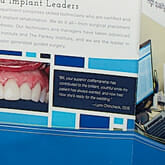
The inside center of the brochure is most Mondrianesque with its blue blocks and heavy white lines. This technique gave us lots of little spots for interesting content, like the “after” photo and testimonial.
[/su_column]
[su_column size=”1/2″]
[/su_column]
[/su_row]
Go with the Flow
The arrangement of copy in this tri-fold brochure plays with blocks too, flowing across panels instead of staying in neat little thirds of the page. This gives the design a sense of structure without being too rigid and echoes the combination of reliability and innovation that is TSDL’s trademark.
Piet Mondrian died in 1944 but he continues to influence design from high fashion to album covers to…brochures. What creative dilemma can you solve today by thinking “out of the blocks” like Mondrian?


