Educational Video for Architecture Firm

Video That Educates and Engages

Eldercare consulting firm JSR Associates came to Accent Interactive for help creating a video series to educate designers across the nation. The result is a video that makes the most of screen space by creatively integrating many graphical elements.

  • Seamless integration of video footage, photography, and text
  • Cover design echoes the video’s look and feel
  • We produced music for video transitions
  • Video counts for CEU credits for industry professionals

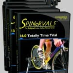
DVD Packaging Design Spinervals

Sports Coach DVD Packaging Design

Go Ahead…Judge a Video by its Cover

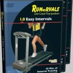
When Coach Troy needed to upgrade the packaging for his growing series of workout and instructional videos, he came to Accent for a fresh burst of creativity. We designed the packaging for Runervals, Spinervals, and the new MultiSport Instructional Series.

  • New photos provide a fresh look
  • Design enables online browsing of low-resolution images
  • Difficulty rating integrates perfectly into the design

DVD Packaging Design Spinervals

DVD Packaging Design Runervals

Rock On!

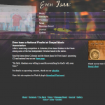
Band Website for Evan Isaac

As this acoustic rock band’s popularity grew, they needed to spend more time composing and rehearsing and less time selling CDs and sending out concert schedules.

Even Isaac came to Accent for a site that would showcase their work and connect with their growing fan base. We created a youthful, edgy site that offers fan-focused features such as a concert schedule, photo gallery, artist bios, and bulletin board.

  • Subtle animation brings a sense of energy and motion to each page
  • Contemporary colors and a photo montage accent the site
  • Users can sample the band’s music before buying online

It’s All About the Style

Hair Salon & Day Spa Web Design

Customers looking for a new hair stylist or makeup artist care most about the quality of their new look. That’s why this website focuses on beauty and style.

  • Graceful circles provide easy navigation
  • Fine photographs show off the high-quality services
  • Blue stripes enhance the salon theme

We also designed the logo:
Colours Salon Logo


Passion that Pops

Package Design for “Passion” DVD


After creating the PEP Impact DVD, we designed the packaging to make it shine. As a result, Gerry can pass out the video with confidence.

  • The simple curve integrates the content with the logo
  • Professional photography makes a great first impression
  • Featured testimonials build interest and anticipation

No More Pain in the Neck

Physical Therapy Brochure for Shulman & Associates

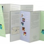
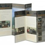
As a specialist in head and neck pain, David Shulman, RPT, needed a professional brochure for his expanding physical therapy practice. This tri-fold with an additional slanted flap creates just the impression he needed. This design has received rave reviews from customers and designers alike.

  • Purple and green color scheme set the emotional tone for a creative healing environment
  • Photos and illustrations establish a friendly theme
  • Testimonials and great copy writing establish credibility

Show Is Better Than Tell

Motivational Speaker Video

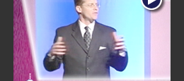
Motivational speaker Gerry Wienholt came to Accent Interactive with a communication problem: how to quickly and effectively communicate the enthusiasm and passion of his motivational keynote presentation. The solution is a promotional video that forms the backbone of his marketing effort.

  • Powerful testimonials speak highly of his work
  • His dynamic presentation style speaks for itself
  • Animated logos and exciting music engage the audience

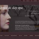
Renaissance Hair Studio Day Spa Web Design

Eye of the Beholder

Renaissance Hair Studio Day Spa Web Design

Renaissance Hair Studio Day Spa Web Design

Any business in the beauty industry deserves a website that stands out from the competition. This new site helps generate business by featuring:

  • A Renaissance theme that integrates design with the company’s branding
  • Great photography that shows impressive decor
  • Detailed menus that demonstrate a large range of services

Sleek and Unexpected

Mortgage Company Brochure

Access One Mortgage Group came to Accent with a challenge: since every company seems to have a brochure, how could they make theirs stand out from the crowd?

In response, we created a brochure that is strikingly simple. It looks good, feels good, and sounds good. Accent was responsible for every step—writing, photography, design, and production—working closely with Access One to convey the company’s energy and professionalism.

  • The brochure echoes the website’s design and content for a unified image
  • Careful balance of testimonials, photos, and text lends visual appeal
  • Custom graphics clearly illustrate the loan process

Presentation That Makes a Splash

PowerPoint Presentation for Cleaning & Restoration Industry

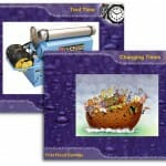
How does graphic design liven up a dry presentation on water damage? This presentation really created a splash at the Cleaning & Restoration Magazine’s annual conference. It even featured an auto-play section timed to the music.

  • Rich, colorful background sets off images
  • Water theme integrated throughout
  • Section headings provide unity