Chaos Contained: Hallaton Web Design
What happened when the design echoed the logo.
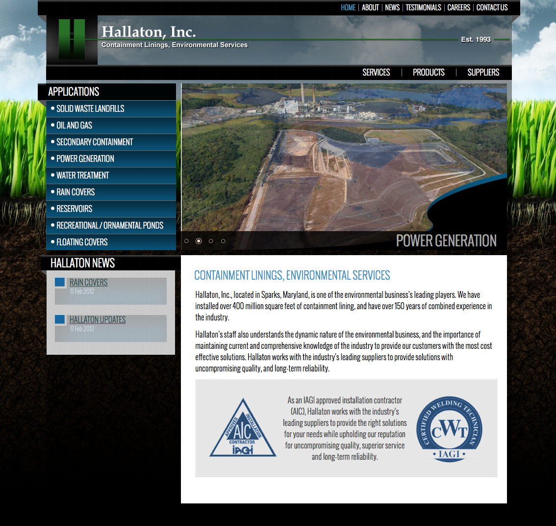
What happened when the design echoed the logo.

Colours Salon and Day Spa is not simply giving make-overs—they’re receiving one.
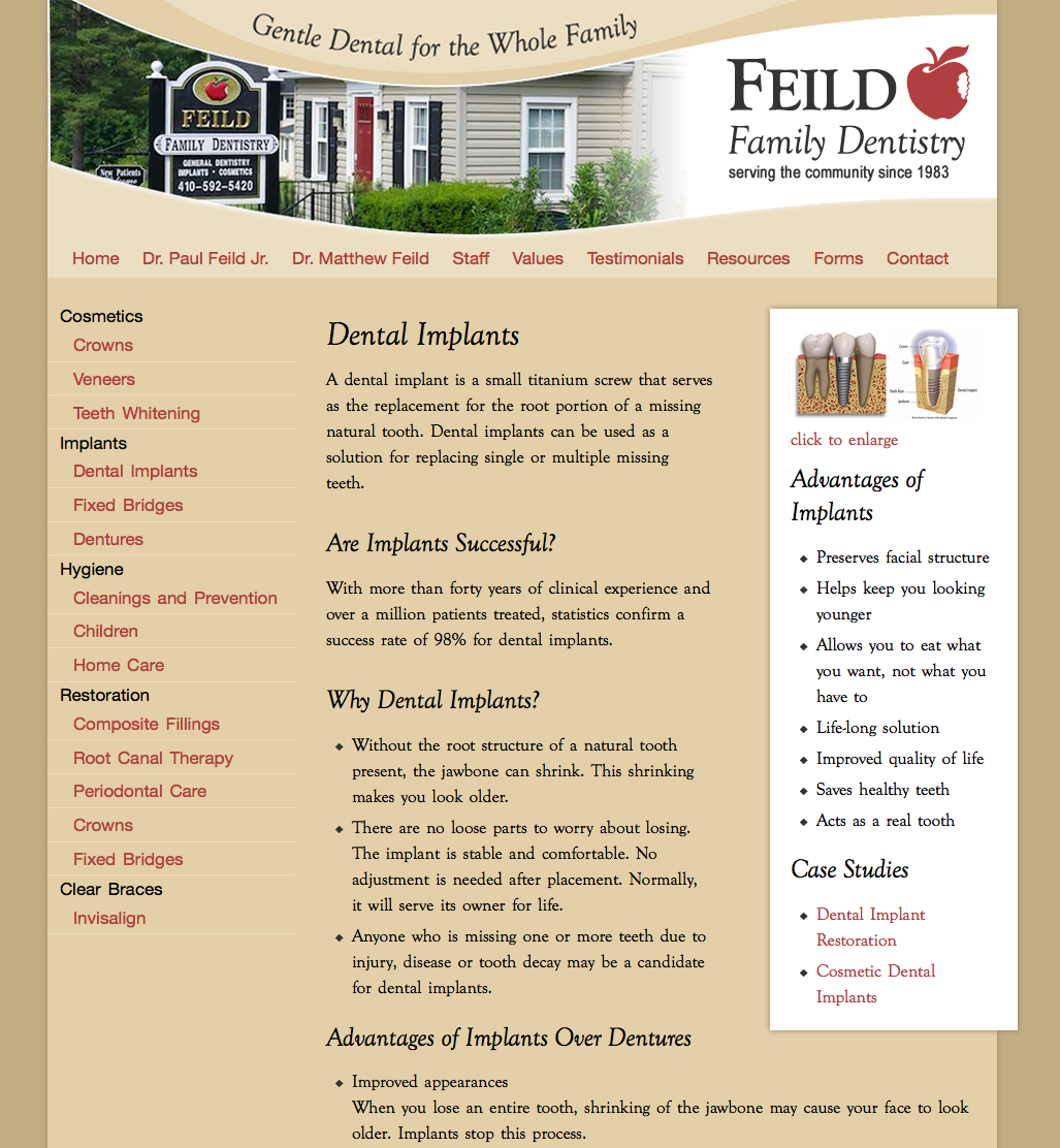
Announcing a new website for Feild Family Dentistry in Maryland

Website for interior design firm B. Dunn Interiors

Checkout this new website for Maryland Center for Problem Gambling
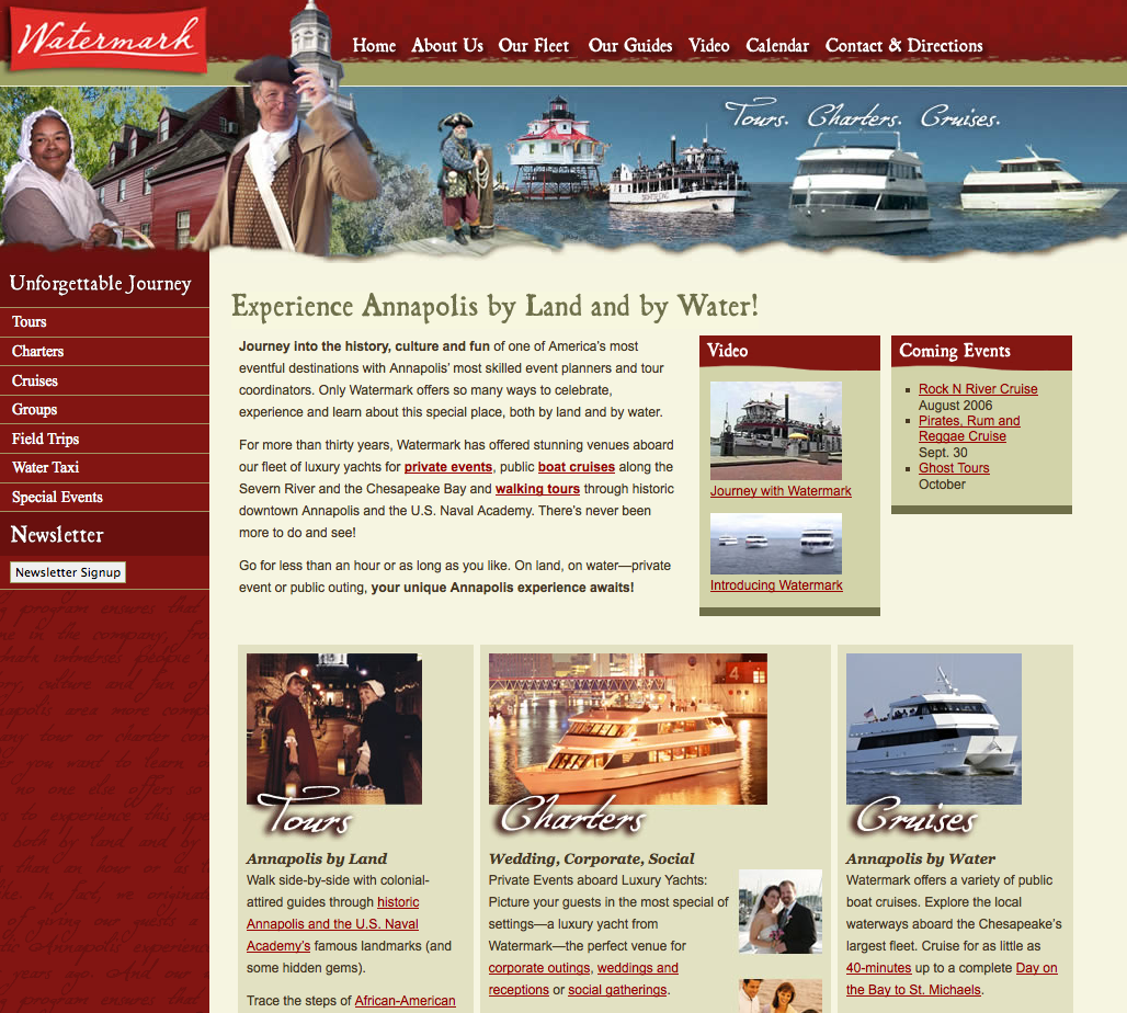
Annapolis touring company gets integrated online

Embedded Engineering Web Design: Netrino
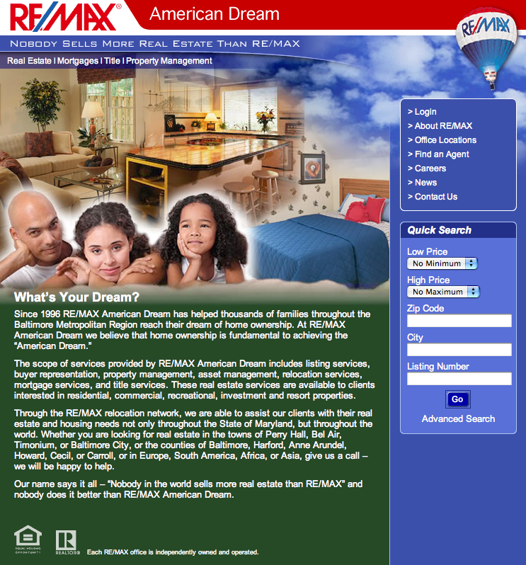
A realtor alone is not enough
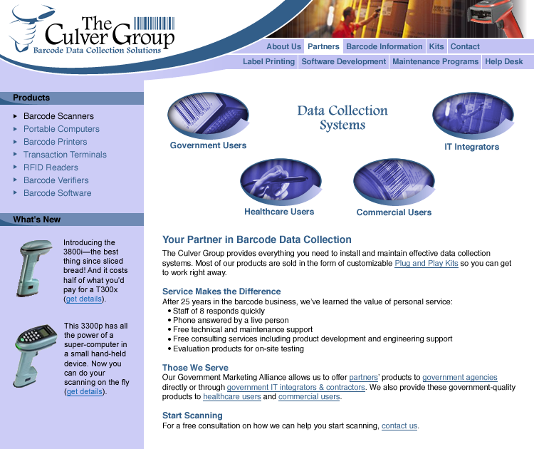
Website for The Culver Group, a barcode solutions provider

Website for ADW Architects
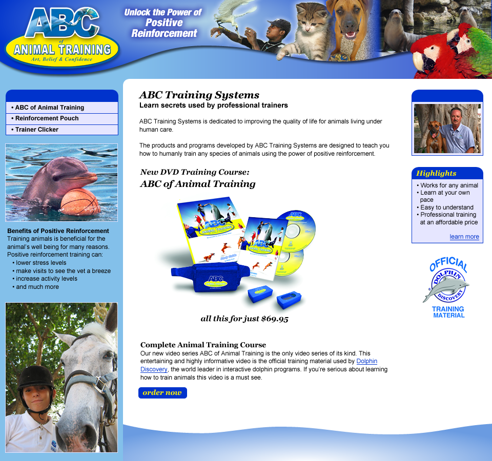
Website for ABC Animal Traning

Landscape Architecture Website: JGL Design Associates