Kindling More Business: Website for a Fire Protection Company
A full-service fire protection company shines out from their competition with this custom website
A full-service fire protection company shines out from their competition with this custom website
A niche-targeted website attracts specifically those prospective customers

A refurbished website with prominent photos, compelling case studies, and creative info architecture

This website reflects a strategic communication plan, with clear structure and an engaging video.
This new website features automated events, online store, and video previews.

Home buyers get a first impression of a house in the first 10 seconds. The same happens on the web.
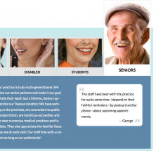
How to help your site visitors find what they want based on who they are
Sometimes a web revamp becomes the path to clarity—and customers.
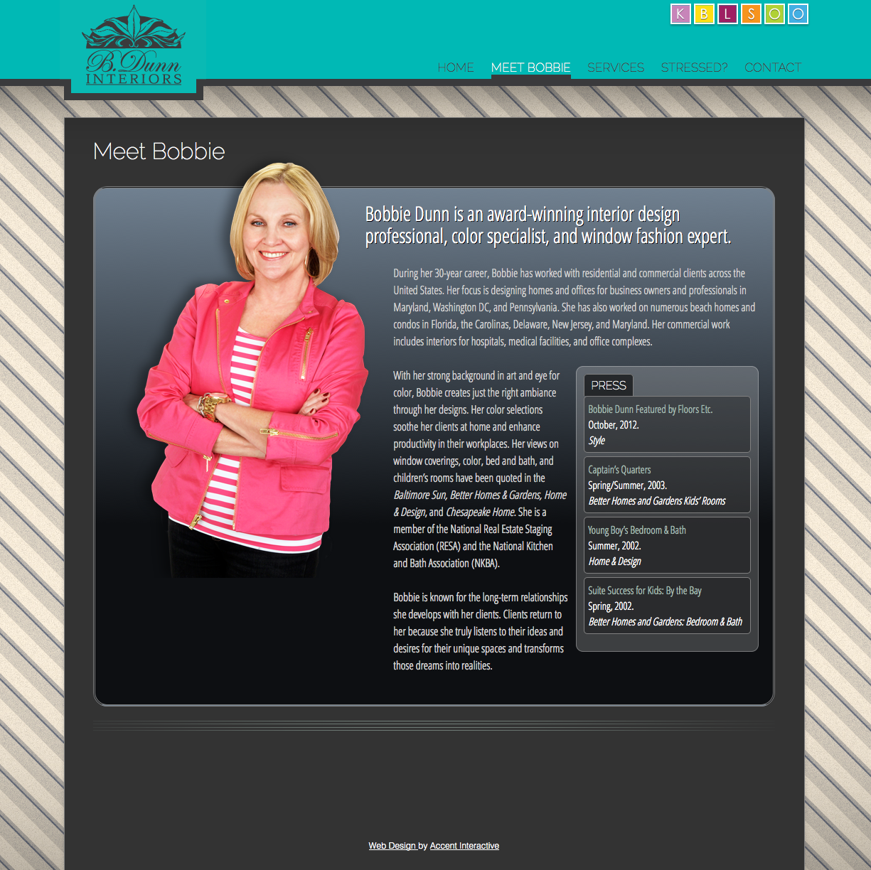
What happens when web design meets interior design?
A website that helps customers come to their senses
How a website responds to mobile devices.
The logo that got you here may not get you there.