Made From All Natural Ingredients

MJM Landscaping Website

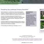
When you visit the website Accent created for this landscaping firm, you’ll probably notice some organic touches right away…the stone wall and grassy lawn meandering through the header to meet the logo, the tree extending its limbs through the navigation bar. These creative elements tie the site to the company’s business, unifying the design and content.

  • Christmas décor page helps generate off-season business
  • The customer showcase illustrates a range of projects
  • Professional look differentiates MJM from the competition

Simple Design is Good Business

Accounting Firm Web Design

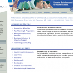
Accent worked with Naden/Lean, an accounting and business services firm, to restructure its website. We created a site plan that expanded the existing content and organized the information in a fresh way. The resulting site is intuitive and easy to navigate, even for first-time visitors.

  • Intuitive navigation makes the site a good resource for insiders and customers
  • “News and Events” section keeps the content current
  • Simple design and discreet use of graphics keeps users focused on what they came for—information

Able to sell tall buildings in a single click

Web Design for Continental Realty Corporation

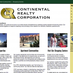
Designed in collaboration with Mind Over Machines, this information-packed site relies on simple design elements to organize the content. Rectangular shapes clarify the different sections of the page, making it easy to focus on the three categories of this real estate company’s extensive portfolio.

  • Large photos add interest and color
  • Online database keeps content fresh
  • Sells properties efficiently by making it easy to browse options

Powerful Presentation to Johns Hopkins Medical Center

Presentation Design for Physical Therapy

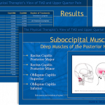
The pressure was on. Our client was about to make a big presentation to Johns Hopkins Hospital and needed a PowerPoint show that was inviting, informative, and professional looking. Accent worked closely with David Shulman, RPT, to create a presentation that garnered praise from his audience audience of respected doctors.

  • Leaf motif reinforces client’s natural approach to physical therapy
  • Soothing colors attract the eye without detracting from the message
  • Animation adds visual interest to medical illustrations

Where form elegantly meets function

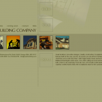
Website Design for Mark Building Company

Whether it’s for a website or a house, a good design unites form and function. So when it came time to create a design for this upscale builder’s website, we worked with Mind Over Machines to meet the challenge.

We created a clean contemporary design that seamlessly merges the artistic with the practical.

  • An ordinary floor plan becomes a striking visual element
  • Simple lines and understated colors match the client’s style
  • Custom design integrates visual and verbal content

Setting the World in Motion

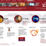
TradeRoots Website for U.S. Chamber of Commerce

Well-chosen animation doesn’t distract: it focuses. So it is with the site Accent designed for the U.S. Chamber of Commerce to publicize TradeRoots, an international trade program.

When the client decided it wanted to focus visitors’ attention on three main ideas, we created three visual focal points using animated graphics.

  • Colorful globes use subtle motion to attract readers’ attention
  • Patriotic design reflects company’s values and priorities and the project’s international scope

This site was developed in collaboration with Mind Over Machines.

Cearfoss Brothers Construction Website

Commercial Build To Order

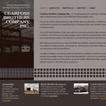
Commercial Builder Website for Cearfoss Brothers Construction

Cearfoss Brothers Construction wanted a website that would showcase its award-winning buildings and stand out from others in the construction industry. Accent offered a creative approach to the site design, creating a site with clean, contemporary lines that mirror Cearfoss’s building style.

Graphic elements such as building blocks and a color scheme suggestive of steel were chosen to visually reinforce the site content. Accent also provided copy editing services, tailoring the copy to the casual, direct style of the web.

The finished website sets Cearfoss apart and serves as a striking and effective marketing tool for the builder.

  • Portfolio offers an organized way to showcase projects
  • Engaging text explains projects in layman’s terms
  • Graphic elements allude to the artistic side of construction

Artistry Meets PowerPoint

Presentation for Collision Repair Company

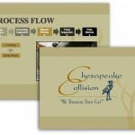
When it came time for Chesapeake Collision to revamp its PowerPoint sales presentation, the vehicle repair company came to Accent Interactive. PowerPoint is not really an artist’s tool, but they wanted a presentation with panache. The presentation reflects Chesapeake’s growing reputation for superlative service that includes vehicle pickup and rental car delivery.

  • Tasteful colors and simple design create an upscale feel
  • Custom photography brings the text to life
  • Carefully chosen graphics direct viewers’ attention

Artistic Creation for a Hollywood Composer

Film Composer Website Design

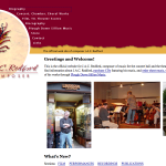
Composer J.A.C. Redford came to Accent Interactive for a redesign of his existing website. We created a more striking visual identity for the Hollywood composer and enlarged the site to include Redford’s complete repertoire, from movie soundtracks to choral arrangements. The bonus was listening to so much of his great music!

  • Bold, visually striking home page
  • Streaming audio clips of Redford’s compositions
  • Sheet music and CDs sold online

Blend of Form and Function

Collision Repair Brochure

A good brochure requires a strategic balance of information and artistry.

In the case of Chesapeake Collision, the brochure needed to serve three purposes: advertise the company, provide an accident report form, and serve as a means of tracking referrals.

We revamped the company’s existing brochure, substantially editing the text. We also created an appealing design that features a clean, modern typeface, ample white space, and a subtly textured background.

  • Two removable inserts are smoothly integrated into brochure
  • High-quality paper and printing produce an upscale look and feel
  • Carefully chosen images reinforce company’s identity