Complete Story at Six

Legend has it that Hemingway once livened up lunch at the famous Algonquin Round Table by claiming he could write a story in just six words. Not a jingle, not a headline, not a summary, but a story with a beginning, middle, and end. He challenged the other writers at the table to ante up ten dollars each and, if he was wrong, he would match their wagers. The words he quickly penned on a napkin were “For sale: baby shoes, never worn.” Presumably, Hemingway made some money that day.

The Hemingway story may be literary legend, but the six-word story stuck. In 2006, the online magazine Smith resurrected Hemingway’s challenge and asked its readers for six-word memoirs. The challenge soon exploded into books, websitescompetitions, and six-second videos. This month NPR invited listeners to submit their thoughts on race and cultural identity as six-word stories. And also this month, the Accent Interactive team took on its own six-word story challenge.

Play with a Purpose

Our first team Creativity Date took us to the flamboyant American Visionary Art Museum in Baltimore.

Our first team Creativity Date took us to the flamboyant American Visionary Art Museum in Baltimore.

We were on our first Creativity Date (our version of an Artist Date but for teams). Our destination: Baltimore’s American Visionary Art Museum, which was featuring an exhibit on storytelling.

Enroute to the museum, we’d identified four essential elements of a story:

  1. Life gets knocked out of whack.
  2. A protagonist tries to set things straight.
  3. An antagonist tries to obstruct him.
  4. Things get resolved (completely or incompletely, favorably or unfavorably).

Now we were on a treasure hunt of sorts, looking for those elements in the visual stories before us.

Tucked in a corner of the exhibit was a sign about six-word stories and a painting one woman created from her story. The challenge was irresistible: Could we possibly capture all four elements of a story in six words? We paired off, found a quiet cranny, and studied two photographs on our iPads. We had five minutes to come up with the six-word story unfolding in each of the photos before us. Click each image to see what happened.

Our team’s six-word stories for this photo included: Worm in apple cuts proposal short. / Picking apple and leaving you. / The problem with dating a fairy.This photograph inspired the following six-word stories: Dancer needs second job to survive. / Ballerina buries competitor in vacant lot. / Dirty job, holey jeans, dancing dreams.

Down to Business

Our six-word story challenge was a blast, but it wasn’t only that. It was a smart business move.

Jay Conger, the Henry R. Kravis Research Chair in Leadership Studies at Claremont McKenna College and consultant on business leadership, is an advocate of storytelling as a business tool:

“Stories have enormous power in terms of recall. If you look at statistics, or at PowerPoint, or at documents, what you discover from all the research is that there is almost no recall. What will be remembered are a few compelling stories that you share with your organization and with your team. And those will guide them when they are far away from you—which, by the way, is much of the day.”

So how might you bring freshness to your typical business functions through six-word stories?

1. Departmental reports

Imagine your department managers giving their reports in the form of six-word stories. OK, so you may want to augment those stories with P&L statements and pie charts. But a month later, the story is what will still be sticky.

2. Employee Orientation

How could you tell the story of your company in six words? Even more intriguing, what six-word story would your employees tell about your company?

3. Debriefs

What do you remember from that three-hour debriefing about last year’s product launch? What would the impact be on your team if you distilled the lessons learned into six-word stories?

No Way!

If you asked your team members to come up with six-word stories, what kind of responses might you get? Expect resistance, maybe even panic! But also expect surprisingly entertaining and effective results.

Expect, too, to be surprised by who tells the most compelling stories. Our man-of-few-words, tech wizard Tait, was crowned King of the Six-Word Story by the end of our Creativity Date. His steel-trap mind could look at a photo and capture its essence before the writerly types among us had settled on the name of the protagonist. Enjoy discovering the storytellers on your team.

Worth the Effort

It’s pretty easy to write six-word slogans or six-word goals. But stories are another matter. Incorporating the elements of story—life out of whack, protagonist, antagonist, resolution—forces you to explore meaning in what’s occurring in your business. Your gut tells you that even though the protagonist got life back in balance this time, it’s gonna get knocked out of whack again soon. And then what? What will motivate you to fight another day? Pie charts? Or stories about how you weathered that mess back in 2009?

Walking the Talk

A week after our Creative Date, our team members wrote their own six-word stories about the day. Here’s a sampling. How did we do? Can you find the essential elements of a story in them?

  • Kitschy store. Dynamic duos. Eloquent storytelling.
  • Art, food, fun fueled storytelling. Next?
  • Art invited Storytelling. A first date.
  • First date jitters—creative duos victorious.
  • Paired storymakers conquer spangled storyville—super!

Going Dutch

How do you arrange blocks of text and images so that they don’t look…well…too blocky? That’s the design challenge of most trifold brochures.

Around the Block

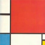
The creative spark for Thompson Suburban Dental Lab’s (TSDL) brochure came from one of the art world’s most adept arrangers of blocks: the 20th-century Dutch painter Mondrian. His paintings of geometric shapes and interlocking planes gave blocks a whole new beauty. You could say Mondrian did for blocks what TSDL does for smiles.

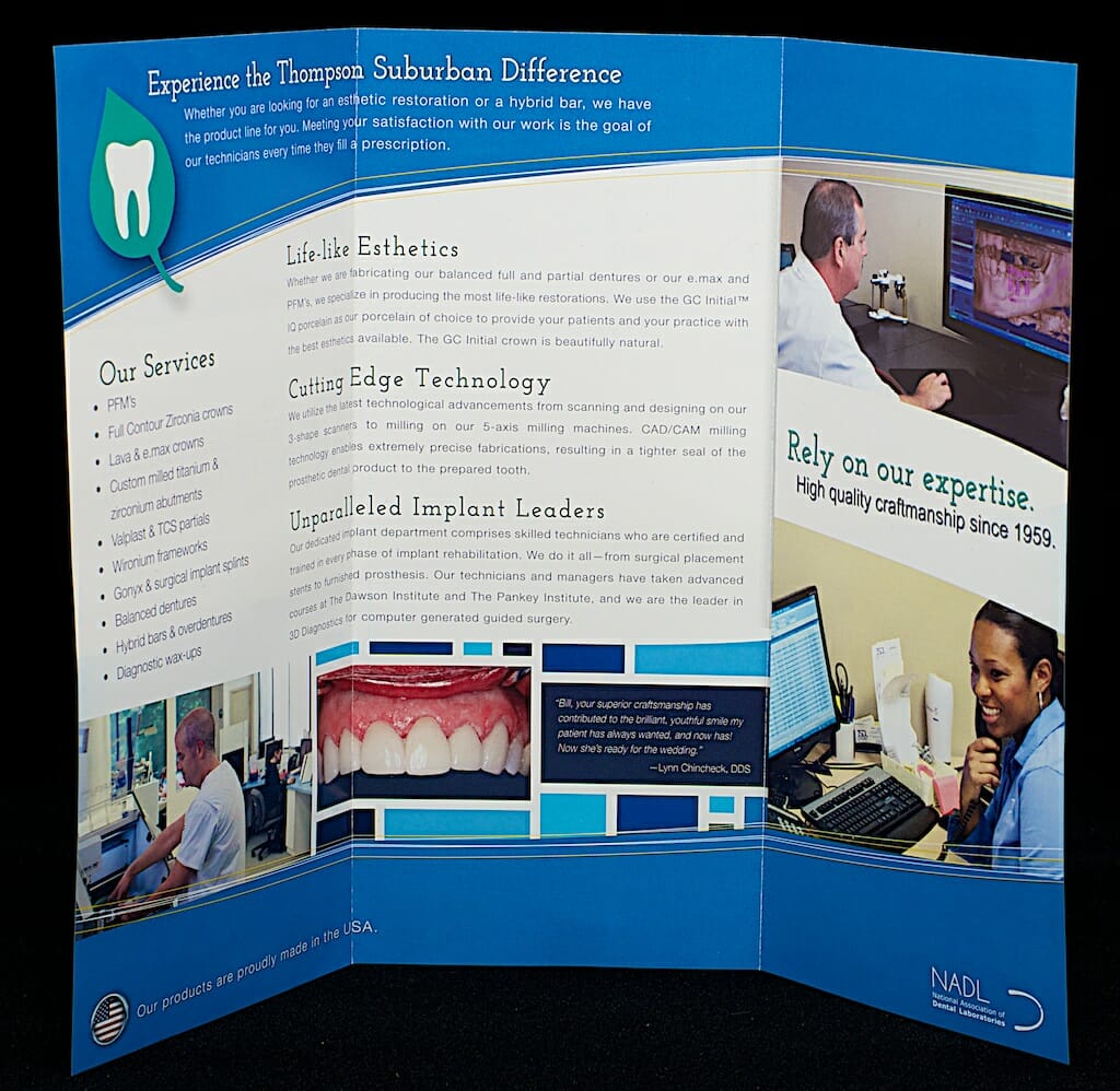
The inside center of the brochure is most Mondrianesque with its blue blocks and heavy white lines. This technique gave us lots of little spots for interesting content, like the “after” photo and testimonial.

Go with the Flow

The arrangement of copy in this tri-fold brochure plays with blocks too, flowing across panels instead of staying in neat little thirds of the page. This gives the design a sense of structure without being too rigid and echoes the combination of reliability and innovation that is TSDL’s trademark.

Piet Mondrian died in 1944 but he continues to influence design from high fashion to album covers to…brochures. What creative dilemma can you solve today by thinking “out of the blocks” like Mondrian?

Composition with Red, Blue and Yellow by Mondrian was one of the inspirations for our design on this brochure.The outside of the Thompson Suburban Dental brochure features the logo we designed in 2012.The inside of the brochure is the most Mondrianesque, with blue blocks providing boundaries for photos and a testimonial.
Maryland Center on Problem Gambling

As You Wish

Once upon a time, websites came one-size-fits-all, retaining the same appearance on all devices. But back then we could only view websites on a desktop or laptop. Now we switch comfortably all day long between tablets, smart phones, laptops, and more. Who can imagine what additional inventions will soon enter into our everyday use?

A good website will fluidly adapt to any device. It’s called responsive web design because the layout responds to whatever screen resolution the user has at the time. The result is a customized experience for each device category. A responsive website greets you with those famous words from The Princess Bride: “As you wish.”

Making a responsive website was one of our challenges when working with the University of Maryland Center of Excellence on Problem Gambling (The Center). Given the diversity of their audience, The Center needed a website that could adapt to any user’s device.

Shape Shifting

When viewed on a typical laptop, the  website is oriented horizontally, with long navigation bars and side-by-side “buckets” of information.

Switch to a narrower screen, however, and the layout shifts shape. Horizontal navigation bars become a vertical drop-down menu. The side-by-side text blocks become stacked. The result: optimal readability and usability no matter what device is employed.

MD Center on Problem Gambling website desktopMD Center on Problem Gambling website mobile

At Your Fingertips

Mobile users also appreciate certain conveniences. For example, a help-line phone number viewed on a laptop is just that—a phone number. But touch the same number on a smart phone and it will dial for you. Nice.

Beyond Surface Beauty

A well designed website is a thing of beauty. But today’s challenge is to build websites that look beautiful on a wide variety of devices and platforms. Check out mdproblemgambling.com and tell us what you think.

An Invitation to Magic

“The narrator’s voice in the Bodhi books captured the essence of childhood magic for me,” says designer Chris. “I wanted to explore and play like Bodhi.” So when asked to design promotional bookmarks for the Bodhi eBooks, Chris’s creative path was clear: a return to childhood delight.

Into the Woods

Can a paper bookmark capture the feel of a forest rich with possibilities for fun? Yes, it can—especially when a die-cut turtle’s head peers out at you, a toad poises to pounce, and a dog’s grin invites you to play. Curved lines create a sense of movement, a path to explore. Rich greens flecked with dew bring to mind the cool depths of woods on a summer day, just as they are in Bodhi & the Friendly Forest.

Wearing Many Hats

In Bodhi the Christmas Helper, a playful Bodhi turns industrious as he tackles Christmas preparations. The moment Chris saw the photograph of a worn-out Bodhi in a Santa hat, he knew that was the image he wanted to pop from the top of this bookmark. Then, because Bodhi wears many hats in this book, Chris anchored the design with Bodhi in a very different hat.

Curved lines again create a sense of movement, but the palette leaves the summery forest behind and depicts a snowy landscape. But that landscape is warmed by the glow of bonfires and Christmas lights, just as touches of gold warm the mood of this bookmark. “I wanted to create a Night Before Christmas atmosphere,” says Chris.

In the Mood

Some may view a bookmark as a mere marketing piece. Fill it with the pertinent information and move on. Chris wanted the Bodhi bookmarks to be invitations into a magical, playful world. He wanted to take us all back to childhood. Did he succeed?

Bodhi & The Freindly Forrest BookmarkBookmark: Bodhi the Christmas Helper

Download Now at iTunes

To download a free sample or purchase a copy, visit the iBookstore using the links below.

forest_link

bodhi_post_graphic_sm

Want to learn more about Bodhi? Visit Ravenwood Press and read about this charming dog you can’t help but love.

Open Concept Design: Not Just for HGTV

Across America, homeowners are swinging mallets and wielding hammers in the name of open concept design. Walls are coming down, light pouring in, and space expanding in rooms that were once admired for their coziness and intimacy.

When we were asked to “renovate” the cover of the Barr Group’s signature book on embedded systems coding, open concept home design provided our creative blueprint.

Down Came the Walls

Our first step was to remove walls. The original book cover sported a wide border. Borders confine a cover, much like a frame confines a painting—or walls confine a room. Remove the border, and the effect can be similar to what happens when you remove walls between rooms: a sense of spaciousness and a release from limits.

Bright and Light

Next, we addressed color, moving from the earthy green of the original cover to a cool, electric blue. Think of the blue of electrical arcs or the bluish glow of monitors. It’s the color that comes closest to saying “cutting edge technology.”

Color comes alive under the right lights and achieves depth. In home design, lighting also defines a room’s focus. Lighting serves the same purposes on this book cover, giving depth to the otherwise one-dimensional image and inviting the eye to focus on the book’s title.

Crossing Over

Design crosses borders. In this case, home design principles crossed over to influence book cover design. You can see the results below. What design challenge are you facing? Try crossing borders for your creative spark.

Barr Group book cover before

Barr Group book cover after

Brave New World with Bodhi

bodhi_post_graphic_sm

When nature photographer Middleton Evans asked us to turn his mountain of photographs of a dog named Bodhi into a children’s book, we faced two “never did that before” challenges.

Create Backwards

The first challenge related to the writing process. “Most children’s books start out as a story told with words, then the story gets illustrated,” says writer Sue Kline. “We were trying to do the opposite. We had years of Bodhi ‘illustrations.’ Could we find the stories hidden among them?” Sue spent hours with the photographs of Bodhi until they were as familiar to her as old family snapshots. Soon Bodhi’s personality emerged and even a voice. He was no longer a dog; he had become the audience she was writing for: a child.

“Once I saw Bodhi that way—being silly, feeling lonely, getting excited, loving adventures—I could ‘hear’ the potential stories in the photos,” Sue says. “I could look at a photo and know what he was feeling and what he would do next.”

Putting the “e” in “eBook”

The second challenge required that we enter the brave new world (for us) of digital book publishing. And because our collective enthusiasm makes it impossible merely to dip a toe in the water, we dove into the deep end. We weren’t going to produce any old eBook! No, our eBook would have sound effects (screeching eagles! rumbling snow plows! grumbling bears!). Our eBook would have narration. No, wait, our eBook would have voices for every character, not just a narrator.

Switcheroo

We set out to publish a read-aloud eBook with the just released ePub3.0 specifications. And just when we polished off our first two eBooks, Apple changed the guidelines for children’s read-aloud books in the iTunes store, requiring us to recode every page of both books (sigh).

But the result, we think, is worth the effort. Tell us what you think. The Bodhi books are available now at the iBookstore.

forest_link

bodhi_post_graphic_sm

How About You?

If there is a book in you waiting to come out, contact us to help find it and bring it to the world.

Let Go My Logo

When Thompson Suburban Dental Laboratory came to us for a web redesign, they were not the local small business they had once been. Their responsiveness to new products and breakthroughs in technology had made them a mature regional lab able to surpass their chief competitor—China—in quality, personal service, and speed of delivery to busy dentists.

Identity Crisis

We wanted our client’s website to look as current and professional as they are. Then came the rub. TSDL was reluctant to redesign their logo. Their existing logo had been with them from the beginning and was immediately recognized by their customers. Dropping it felt like dropping their identity, and that carries an emotional toll. But their identity had changed. Their logo needed to change to keep up.

Money Matters

Then there was the financial cost. TSDL’s logo was everywhere: in their office space, on their supplies and uniforms, on their marketing materials. Everywhere. Were they willing to bear the dollar cost of dropping an old, reliable logo for a new, untested one?

Smiles All Around

Once they took the leap of faith and embraced the logo redesign, they never looked back. The result is a clean and appropriate look for a business that uses technology to restore natural beauty to smiles. We are all smiling now.

Thompson Suburban Logo DesignThompson Suburban Web DesignThompson Suburban Web Design

Merry Christmas

We have worked hard all year to deliver creative solutions that expand your influence in the world. As the holidays approach we pause to look afresh at a baby born in Bethlehem who changed everything. His was the ultimate creative act—coming as an infant to a poor young woman. Artist entering art. The life He lived continues to inspire us and breathe meaning into our work…at Christmas and throughout the year. In 2013 we endeavor to be the most creative people you know, from January to December.

The Accent Team

Merry Christmas from the Accent Team

How to Shoot a Treehouse

Taking a photograph used to be about film, chemicals, and a dark room. These days it’s about megapixels, ISO sensitivity, and dynamic range. But what all photos have in common is light, and capturing the right amount of light in the right spot is one of the biggest differences between some dude with a camera and a great photographer.

Treehouse in Daylight

The daytime shot is simple enough. Just wait for the right time of day. Natural filtered light shows off the details in the rope, the wood, and even the grass. But one of the cool features of the treehouse is how it’s wired for electricity. To show how it glows in the dark we need to switch to night time.

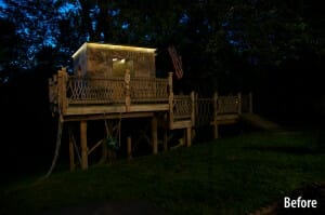
Treehouse Before

Wired with electricity, this treehouse is easy to light from the inside, but you can’t see the lights in all their glory until the sun goes down. The trouble is that when the sun goes down, you can’t see much of the exterior.

Lighting Plan

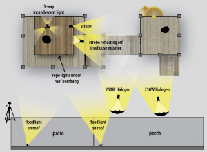
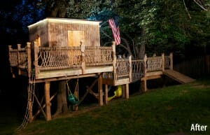
Flood lights overhead lit up the left side and some of the leaves. The modeling lights with umbrellas lit the right tree and the ramp. Then, by carefully hanging a strobe light (SB-900) from the back roof and bouncing it off the side of the treehouse we can illuminate the rope bridge and the flag. Finally, a second strobe perched on the far window sill on 1/128 power brightens the yellow turbo slide and the far tree.

Treehouse After

Now we can see the depth of the structure, the texture in the wood, and the playfulness of the entire thing.

Any kids dream!