Category Archives: Web design

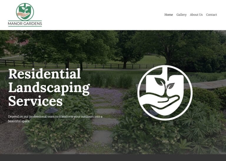
Manor Gardens Homepage

A New Landscaping Company Springs Up

Suppose you’ve been working in your industry for decades, and now you’re helping to manage a new company in that industry. How do you establish that company’s brand?

Chuck found himself in that very situation, as a manager of Manor Gardens.

Tilling the Soil for New Clients

Chuck and the landscaping team at Manor Gardens are all very experienced. But Manor Gardens itself is a relatively new brand. So, they needed their own website and marketing strategy to establish themselves in the Baltimore region.

Manor Gardens wanted to:

  1. Inform the Baltimore market that they offer residential landscaping services.
  2. Develop a strategy that includes both web and print marketing.
  3. Get the word out by springtime—when the peak landscaping season begins.

Planting Seeds Online and in the Mail

We came alongside Manor Gardens to help them meet these time-sensitive goals. We created:

1. A Website that Showcases Expertise

We wanted the website to show that Manor Garden’s team are experts in landscape design and installation. How did we do that? Through a combination of “show and tell.” 

To “show” their expertise, we designed the website to showcase the beauty and variety of their work. For example, we created a photo gallery of their featured projects. The gallery included some of our professional photos that demonstrate their high-quality work.

Manor Gardens Homepage
Manor Gardens Gallery Ashland

To “tell” about their expertise, we wrote and edited compelling content that highlights what makes them unique as a company. This included bios for both of Manor Garden’s managers, who each have 30–40 years of experience in landscaping.

Manor Gardens About

2. A Postcard that Announces Services

We designed a postcard that features a photo of their fantastic work on the front and a list of their main services on the back. This printed marketing material will be mailed directly to Baltimore residents. With this reference in hand, they can easily visit Manor Garden’s new website and call them.

Manor Gardens Postcard Outdoor Living

In Full Marketing Bloom

By mid-March, Manor Gardens had both a new website and a new postcard they could use to advertise their residential landscaping services.

Chuck said, “I really appreciated the fresh ideas that everyone from Accent Interactive contributed. I know they have expertise from working on a lot of companies’ websites, and I was able to collaborate with them to make ours unique. Plus, they were flexible with my timeline. I wanted to get our website up and running quickly, and then keep adding photos over time. So, it’s very easy to work with Accent Interactive.”

If you, like Chuck, want to establish your company’s brand and grow your business, we’d love to talk with you. Please connect with us to get the conversation started.

web design home building company home page

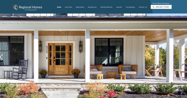
Redesigned Website for Home Building Company

Maryland Housing Market
(Source: Houzeo)

  • Mortgage rates have nearly doubled (from 3.12% in April 2021 to 6.79% in June 2023)
  • Houses take longer to sell (from an average of 11 days in 2022 to 25 days in 2023)

Steve and Chip are the owners of a custom home building company called Regional Homes of Maryland. Their company has successfully weathered all kinds of markets since its inception in 1986. However, the current, post-pandemic market has proven to be quite challenging for the housing industry.

Building a Firm Foundation Online

Steve and Chip knew they needed to take action to bring in more business. And a strong marketing foundation begins with a solid website.

Steve shared, “I knew that our website looked outdated. I saw that other successful Maryland-based businesses are using Accent Interactive to do their web marketing. So, I figured they could help us too.”

Sweeter Home Page and More

We were honored to work with Steve and Chip to redesign their whole website. After discussing their goals with them, we provided a design that:

  • Looks modern
    We introduced new colors, typography, and layout.
  • Shows instead of just tells
    We incorporated galleries of larger, edited photos to showcase their work.
  • Is simple and streamlined
    We re-organized the content and narrowed the options for an improved user experience.

Old Web Design of Home Building Company

New Web Design of Home Building Company

Tools of the Trade

Steve and Chip are thrilled with the redesigned website. Now the website is not only more attractive, but also more functional. In fact, Steve and Chip can use it as a marketing tool to get people in the door, as well as a sales tool to convert the prospects into customers.

Steve shared, “When we’re meeting with a prospect, now we can easily show them photos on our website. It’s a great way to interact and to visually emphasize our sales points.”

Who’s Next?

Feeling inspired by Steve and Chip’s story? Feel free to connect with us. We’ll be happy to talk about redesigning your website and other creative marketing strategies to grow your business.

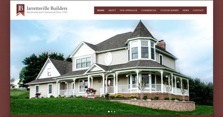
Jarrettsville Builders home page 1

Custom-Built Website for a Custom Builder

When it comes to building websites, or to building homes, there’s not a “one look fits all.” We recently helped a client that understands the value of customization—not only for the homes they build, but also for the marketing of those building services.

Celebrating 70 Years

The year 2020 was a milestone anniversary for Jarrettsville Builders. They had constructed an impressive portfolio of buildings throughout the decades. But during that time, their website had aged. It was time for some long-overdue renovations.

“Many years had passed since Accent Interactive designed our first website in 2004,” said William Minton, the president of Jarrettsville Builders. “We wanted to bring our website into the 21st century.”

Co-Active Creativity

Our creative team collaborated with Jarrettsville Builders to design and build a website for them that was updated and mobile responsive. They also wanted to feature some of their more recent projects.

“Accent Interactive encouraged us to become an integral part of the process, since no one knew our business better than we at Jarrettsville Builders,” said Mr. Minton.

The Website Makeover

We created a new design with features such as:

1. Home page slider: This shows off a representative variety of work at first glance.

Before:
Jarrettsville Builders old home page

After:
Jarrettsville Builders home page 1

2. Branded design: The color scheme and custom anniversary graphic reinforce Jarrettsville Builders’ brand.

Jarrettsville Builders home page 2

3. Professional photography: The onsite photos we took capture Jarrettsville Builders’ expertise in commercial buildings, custom homes, and community service projects.

Jarrettsville Builders custom homes

Built for Success

Now Jarrettsville Builders has a modernized website that is as attractive and solid as the buildings they construct.

“The finished product is extraordinary,” said Mr. Minton. “The Accent Interactive team possesses an abundance of talent and patience. We offer our sincerest thanks for bringing this to fruition.”

Looking for ways to give your business a unique voice in the marketplace? Our team would be happy to help you create something tailor-fit.

About Jarrettsville Builders

Jarrettsville Builders, based in Harford County, Maryland, specializes in building custom homes and commercial buildings. Since 1950, this family-owned and operated business has established a legacy of quality workmanship.

Website and Video for Healthcare Design & Construction Company

If you’ve ever lived through a home improvement project, you know how dirty, noisy, and disruptive construction work can be. Imagine what it’s like for a hospital or surgery center to undergo renovations—without shutting down their clinical operations and without contaminating the sterile environment.

Consolidated Medical Services, Inc. (CMSI), based in Hunt Valley, Maryland, excels in these kinds of projects as a specialty contractor for healthcare facilities. They needed a way to quickly demonstrate to prospective clients what sets them apart—how well they accommodate the demands of an occupied, clinical environment. This was a challenge because CMSI’s finished work can be inaccessible once the hospital starts using the renovated space.

How could we help CMSI show their expertise in the medical construction field?

Wider Reach

We wanted to present compelling stories of their project work—and we used a variety of methods to do so. We took photos. We wrote case studies. And we produced videos. This full marketing package has the potential to captivate a wider audience. For example, if you don’t like to read a lot of text online, you can just sit back and watch the video. Listening to project managers describe their work and show the details engages customers with a personal touch.

CMSI SurgCenter Towson case study

Behind the Scenes

The video takes you into spaces that would otherwise be inaccessible—like the clean room environment of an operating room, or behind the door of a high voltage area. Our team even put on bunny suits to get special footage of CMSI’s finished work. We captured the details inside and also flew a drone outside to get context shots of the project’s locale.

Show Your Story

Now CMSI has a renovated website that features their renovation expertise.

“The videos are one of our favorite things about the new website,” says Mark Kendrick, CMSI’s Vice President. “We realize they have great potential to help us with business development.”

Potential clients who want to learn more about CMSI’s work can conveniently access the videos from the home page, the video gallery page, or the respective project’s page.

CMSI website homepage

CMSI Video webpage

Interested in using video to highlight your company’s work? Let’s tell your story.

Learn more about our video production.

Putting Your Best Photos Forward

Her pictures were worth a thousand wows. As a photographer, Cricket had captured the earthiness of Africa and the emotions of its people. And with those photos, she hoped to show the compelling needs in that majestic land. How could these photo gems best promote her cause? The way we incorporated them into their website reveals a marketing lesson for us all.

Everyone Matters

Cricket and her husband John founded a non-profit ministry called God’s Economy in 2002. They partner with organizations in Africa and the United States to bring hope and life to the poorest of the poor. Their philosophy is that in God’s Economy, everyone matters. And they want that message to reach potential supporters for their mission.

Montage for African Ministry

When God’s Economy came to us, they had an old website with outdated content. Cricket’s photos were displayed simply as a slider on the homepage.

Old website:

Old Website

They needed a website that demonstrated their value of individual care. And they needed their photos to reach their fullest potential, so they could tell the story of the people they’re helping.

With our artist’s eye and personal touch, we stylized the photos with detailed attention. We enhanced their rich tones for warmth. We added texture for dimension. Then we combined them into a captivating montage. The result is a visually stunning website that showcases God’s Economy’s vision: that the world is a majestic, broken place in need of redemption.

New website:

New Website

The new website helps God’s Economy communicate their mission with heart. It shows that they care about what they do at every level, from their website design to providing education for African girls.

Be Yourself: Your Strengths Will Shine

“Often when people set out to market their company,” says Ken Kinard, “they think they have to appear better than they really are. But we find that the best marketing leverages the strengths you already have. Good marketing starts with tapping into your core beliefs, the reason you are serving the market, and the uniqueness you already possess.”

Whether you come to us with words, images, or ideas, we figure out how to leverage your assets to communicate your mission. We help you put your best work forward, to work the best for you. That’s how creativity means business.

From the Floor Up: New Website for a Commercial Flooring Company

Have you ever walked the aisles of a Giant Food store? If so, then you have B.W. Hovermill Co. to thank for installing that floor.

Based in Maryland, B.W. Hovermill Co. specializes in commercial floor installation. Over the last 60 years, they have established decades-long clients, such as Giant. However, Hovermill didn’t have an online presence that featured their expert work and clientele. They came to us wanting a website that showcased their breadth of experience and longevity in the industry. Here’s how our creative team met the challenge.

Wide Variety of Experience

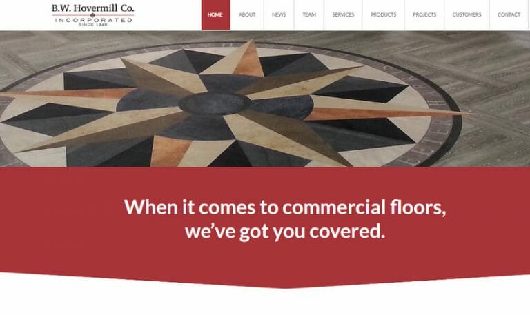
  • Floors: We featured different kinds of floors on the homepage slider, including inlays and carpet from actual projects.
    Result: The first impression images say it all—“We specialize in an array of flooring.”
     
  • Services: We helped Hovermill identify which services to promote, from as standard as installation to as specialized as moisture mitigation.
    Result: Clients learn that Hovermill offers multiple flooring-related services, not just installation.
  • Projects: We highlighted key projects in different industries and around the community with a gallery.
    Result: Web users can see at a glance the variety of work Hovermill has done and can click on the images to learn more about the specialty projects.
  • Manufacturers: Hovermill is a supplier for over 40 manufacturers. We organized their logos and linked to their respective websites.
    Result: Clients can conveniently see the plethora of brands all organized on one page and click for more information on each manufacturer.

Deep Roots in the Industry

  • Testimonials: We included a “What Customers Say” section on the homepage and more testimonials on the Customers page.
    Result: Hovermill is established as being credible, professional, and trustworthy by satisfied customers in their own words.
  • History: We emphasized the company’s 60-year history, their multi-generation ownership, the management team’s expertise, and Hovermill’s long-term clients.
    Result: Prospective clients realize that Hovermill is established, knowledgeable, and reputable.
  • Branding: We incorporated color and design elements from Hovermill’s logo throughout the website. We also pulled geometric angles like a carpet pattern to draw the eye down the homepage in bite-sized sections.
    Result: People want to keep reading more on the website, and Hovermill’s brand is further established, building a consistent look.

Let the World See

Hovermill does world-class flooring work—and now they have a website that shows it. Our creative team was able to maximize the potential of the available photos and resources to represent Hovermill’s skilled craftsmanship.

Do you want a website your clients will be floored by? Let’s get started. We’re ready to roll out our red carpet just for you.

Sleek Website for Barcode Solution Consultants

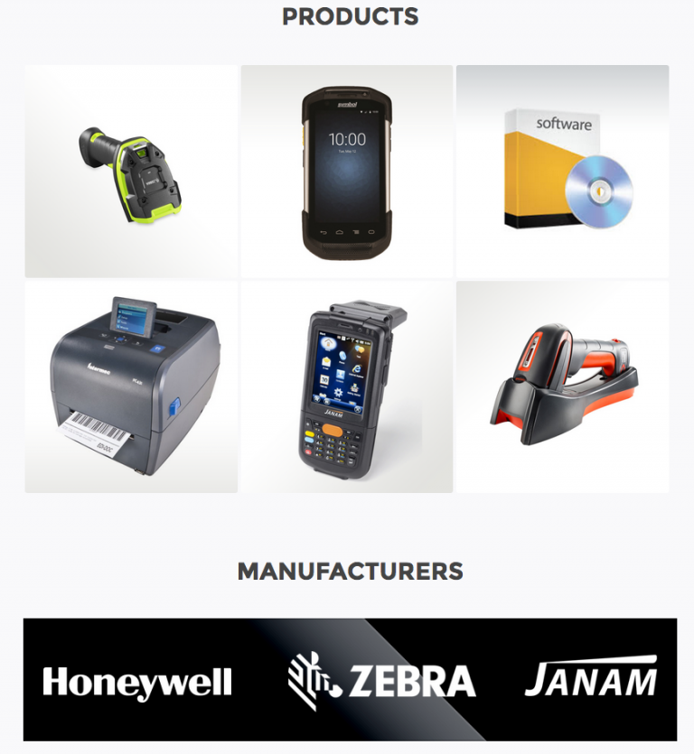
Barcode technology is all around us. You see it when you’re checking out at the store, when you’re boarding a flight, or when you’re filling a prescription. TCG is a company that specializes in this kind of automated data collection.

TCG’s original website had a defunct online store with overwhelming lists of scanners, printers, and mobile devices. They came to us wanting a new website that still featured products, but not for sale online. Our challenge was to present their new message: We’re not just retailers—we’re established consultants who advise clients, create solutions, and sell curated products.

Product Presentation

TCG had about 200 products to feature on their website. How could we present all of them in a way that was space-efficient and easy to navigate? And how much product data should we show? Too little and the products couldn’t be distinguished from each other; too much and it would be overwhelming.

Here was our solution:

  • Organize the products

    We arranged the products by product category, manufacturer, and industry.
  • Create a simple, one-phrase description
    Instead of just listing the product name (e.g., CN51), we included an informative subtitle (e.g., versatile mobile computer with large 4-inch touchscreen) and an image.
  • Depend on the data sheet to provide product details

    Why fill up the website with lots of details? Clients who want more information on a certain product can download the data sheet as a PDF.

Modern Design, Personal Touch

A company that specializes in barcode technology needs a slick, contemporary look. TCG also wanted to emphasize that they were an established team of experts with a brick-and-mortar presence.

These design features carried that message:

  • High tech look

    The products shine against a neutral page background that is finished with a glossy black. And, of course, the website is mobile friendly.
  • Photos of office and staff 

    TCG shows their high capacity warehouse and office space. We also included bios and headshots of the management team to add their personal touch and expertise.
  • Custom logo development

    We added small graphical touches to highlight TCG’s distinctives, such as 30 years of longevity and enhanced warranty protection. To show TCG’s consultative value, we included an iconic “thumbs up” on recommended products.

Migrating a Web Application

TCG used a web application for providing quotes and tracking products and sales. The application also allows client to check the warranty on the products they purchased. We helped them migrate the web application to the new site as well.

Check Us Out

Now TCG has a website that features both their products and their expertise as consultants. The next time you’re checking out at the grocery store, you very well might be using the technology provided by TCG.

If your website needs a new look, there is no need to search and scan—we’re only a click away.

Modern Makeover for a Dentist Support Website

If you wanted to makeover your personal appearance, what would you do? Maybe you’d get an edgy new haircut, or buy a fashion statement outfit. Same you, new look. Sure to turn heads.

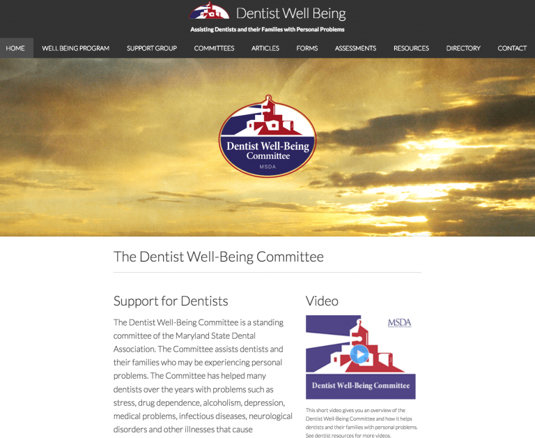
If you wanted to update your website’s appearance, what would you do? That was the question for The Dentist Well-Being Committee. They offer support for dentists and their families who are dealing with personal problems. However, their original website wasn’t catering to today’s dentists. The pages were crammed with text, and the website wasn’t mobile-friendly.

msda-old-website

The original website’s homepage

So they came to us for a fresh style. With some simple design changes, we modernized the whole website. Here’s how we worked our makeover magic.

Breathing Space

The target audience for this website is seeking a safe place for support. So we wanted the design to be as tranquil as the ocean scene on the homepage. The new website has plenty of white space.

msda-homepage

The new website’s homepage

Result: Incorporating breathing room in the design encourages people to linger on the site and engage with it.

Content Re-layout

We re-arranged the content for a clean, simple look. We also treated featured content with special effects to capture interest.

msda-event

Result: The webpages are easier to navigate. Instead of being overwhelmed with too much content, people know where to look.

Modern Fonts

We chose a streamlined font and a larger text size. We also selected the typography based on the content. For example, the testimonials look like they’re handwritten.

msda-testimonial

Result: The text is more relatable and is easier on the eyes. People are more likely to read it—without having to squint.

Mobile Responsive

We configured the website for easy viewing on any mobile device.

msda-home-mobile

Result: On-the-go people are more likely to use the website. It’s convenient to access from anywhere, not just a desktop.

A Shining Example

As indicated by their logo, The Dentist Well-Being Committee wants to be a light in the dark. Now with their updated website they can shine all the brighter to serve their dentists.

Think about your company’s website. How could it be more relatable? What could be freshened up to attract today’s audience? If you’re ready to re-imagine the possibilities, then contact us. We’ll help you find that perfect new look for your website.

Professionally Cheesy: Website for Game Show Company

Dave Ricklin certainly knows how to ham it up for his game show business. He goes by the name “Whip Cheesy.” With a background in radio and television and a passion for game shows, Whip Cheesy started his own traveling game show company called The Original Game Show Live!

Whip Cheesy needed a website that shimmered with all the glitz and glam of the show biz. Think Bob Barker. Imagine Vegas. That’s the effect we wanted.

“It’s not every day you get asked to design something that’s hokey for the sake of it!” said Chris, our multimedia artist. How could we design a cost-effective website that was intentionally over-the-top and yet still sophisticated?

Camera!

We decided to start with a photo shoot of the game show host himself, with all his ham and cheese. Whip Cheesy’s Cheshire grin and animated facial expressions said it all.

To play up the energy even more, we enhanced the photos through visual effects, making them bold and colorful.

DSC_1081-2 before after 1000

We placed his iconic “Vegas” photo on front and center stage. When prospective contestants see Whip Cheesy’s dynamic personality at the top of the homepage, they know they’re in for a good time!

Screen Shot 2016-07-22 at 2.51.25 PM

Lights!

We wanted to put the host in the spotlight and design the website with some bling. Flashy lights did the trick. Both Whip Cheesy’s image and the web pages are framed with attention-grabbing lights, bringing the theatrical feel to life. The whole website shines with promise of fun and excitement to draw in customers.

Screen Shot 2016-07-22 at 2.59.55 PM

Action!

If the hammed up photos and glimmering lights weren’t promotional enough, we also wanted website users to actually feel like they were on a game show. To create that experience, we incorporated several interactive elements throughout the site:

  • Click around and you’ll hear a game show like “ding!”
  • Roll over the menu and you’ll feel like you’re spinning a 3D block
  • Hover over the Game options to see what’s revealed behind the squares

Screen Shot 2016-07-22 at 2.55.47 PM

Just by exploring the website, you’ll already feel like a winning contestant!

Game On

Now Whip Cheesy has a website that reflects the larger-than-life personality of his game show company. By giving prospective clients a thrilling website experience, it’s a sure way to win more business!

We know not all business is fun and games, but there’s no need to let marketing challenges be a drag. Our professional team of creatives is available to collaborate with you. We want to see you smile as brightly as Whip Cheesy!

Cleared for Take-Off

Kingdom Rain is a nonprofit focused on training Christian leaders in remote areas of the world. They came to us ready to expand, planning to double their budget in the next two years. But we faced two creative challenges:

  1. Lots of information that needed to be organized and synthesized
  2. Security concerns that limited our use of specific names and places

A Conversation-Inspired Structure

How could we effectively arrange the content to tell Kingdom Rain’s message? It was the founder’s conversation style that inspired us. We wanted people to feel like he was talking with them through the website. After listening to his conversations with supporters, we noticed that his flow really worked: their strategy, people they serve, and the impact they are making in Asia.

Homepage screenshot

Full Story, Fewest Words

Often less is more. We took all of Kingdom Rain’s content and condensed the essence into powerful, summary statements. And we limited the content to just a few pages, titled by a single word. The result? It’s so concise that people might actually read it.

Stock-Specific

It’s usually more powerful to show than tell. But in this case, security issues prevented us from showing many things. How could we effectively use generic images to do the trick? By carefully selecting the right stock photos of ethnic people, world maps, and rugged landscapes, we helped users experience the ministry without revealing specific places and names.

Vision screenshot

A Greater Return

Kingdom Rain now has a website that speaks for them. They also got some bonus benefits:

  • More bang for the buck
    The graphics we designed for the website were repurposed, such as for Kingdom Rain’s newsletter. When it’s time to develop other marketing materials, much of the work is already done.
  • Focused vision
    The process of developing content for the website clarified the message they take to presentations and support-raising meetings. The result is more effective communication and more donations.
  • Integrated client management system
    We integrated online donations, supporter contact information, and email/newsletter communications into the website. Kingdom Rain can efficiently manage their network in a single location, saving hours of administrative work.

Your Turn

Reflecting on their new website, Kingdom Rain said, “Accent Interactive organized our ideas into a work of art, and it was well worth every dollar invested.”

If you’re ready to benefit like they did, then contact us. Do you have a complex message that needs to be simplified? Does your marketing communication strategy need development and direction? Bring your challenges to us, and we’ll discover creative solutions that work for you.