Facebook: Personal Connections for Your Business

Business is all about connecting well with the people you serve. While nothing can truly replace those face-to-face chats, Facebook can help keep you top of mind with clients and prospects.

Since you need a personal account before setting up a business page, it emphasizes the Facebook way: it’s all about individuals. Here are some tips to promote your company and connect with some of the 1.2 billion people who use Facebook every day.

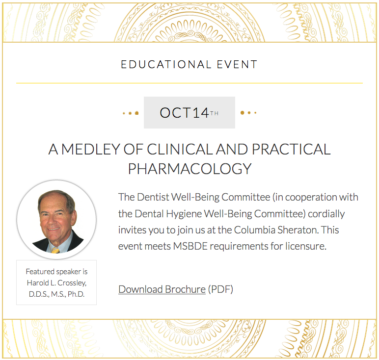
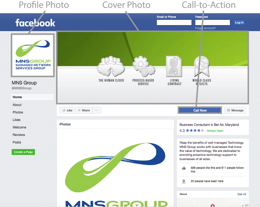
The Anatomy of a Good Business Page

  • Profile Photo
    Your company logo works well here. It’s recognizable and it’s the thumbnail image that is displayed with all your updates.
  • Cover Photo
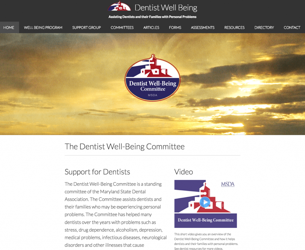
    This is one of the first things people will see on your business page, so make sure it hooks them in. Feature an engaging image that sends a message, and make sure it’s optimized for the right dimensions. We can help you polish your business page profile and design a snazzy cover photo. If we’ve already done design work for you, we can even repurpose it for Facebook, like we did for this managed IT services company:
  • Call to Action
    Take advantage of Facebook’s call-to-action button. Choose an option that will drive people to do something important for your business. For example, with one click, people can easily contact you, sign up for something, or even make a donation.
  • Posts
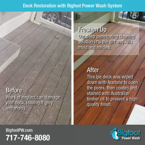
    To be effective on Facebook, you need to engage with your network on a regular basis. This is how you keep the marketing conversation going. Think of posts as tidbits that highlight your company’s services and results. Show what you do through photos and videos. And did you know you can pin your posts to feature the most successful ones? We’ll work with you to create compelling images that pique interest. Leave it up to us to schedule posts so you don’t have to worry about it. Here’s an example of what we’ve created for a power wash company:
  • Ads
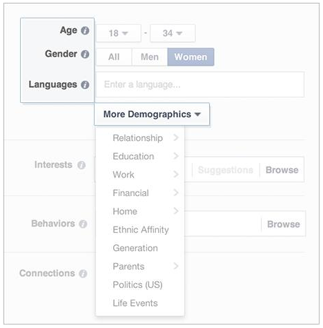
    Investing a bit of marketing budget into Facebook ads will increase your reach. You can pay to boost a post or create an ad that targets an audience by criteria, including:

      • Location such as country, state, city, and zip code.
      • Demographics such as age, gender, language, education, work, ethnic affinity, and more.
      • Interests based on their hobbies and pages they like on Facebook.
      • Behaviors such as what they purchase or where they travel.


    Are you curious about paid ads on Facebook but aren’t sure how to go about doing it? We can help you figure out the best strategy for your budget.

If you are looking to get more business using social media, especially if you market directly to consumers, ask us to help you connect your business using Facebook.

WJTL Radio Interview 2017-05

Internship and Mentoring Millennials (Radio Interview)

Want to learn more about mentoring millennials? Check out this radio interview.

Lancaster Bible College Radio Interview

Ken Kinard was featured on a WJTL talk radio show at Lancaster Bible College in Lancaster, PA. Host Oliver Lehman asked questions about how college students can learn creativity skills when they enter the marketplace. They discussed two kinds of internships and the power of internship and mentoring for millennials.

Preparing Millennials for the Workplace

Hear more of this conversation in part 2 as they discuss how Creativity Camp helps prepare millennials for the workplace.

LinkedIn on mobile device

LinkedIn: Your Digital Business Card

If you’re on LinkedIn, you’ve probably noticed their new look. In January 2017 LinkedIn released a desktop redesign, the largest overhaul since their inception. They wanted to make it easier for you to access relevant conversations, content, and opportunities, whether from a mobile app or desktop.

It’s a great time to revisit your LinkedIn profile. Like it or not, LinkedIn has become like your digital business card. And who wants to give out a sloppy business card—to 450 million people?

What Not to Do

Here are some common mistakes we see in LinkedIn profiles:

  • Unprofessional profile photo

    Save the selfies for your personal life. When it comes to business, make sure you have a professional image of yourself. It can get you up to 9x more connection requests.
  • No background image

    Don’t settle for the standard nondescript blue background. If you want to stand out from the crowd, then visually showcase your business in the header.
  • Default headline

    This is like your personal tagline. Have something more creative than just your job title and company name.
  • Uninteresting summary

    A professional bio is your chance to shine. Tell your story in a way that sticks.

Take It Further

Once you have a profile set up, are you leveraging the power of LinkedIn? Here are some other actions to consider that will promote your company.

  • Keep connecting with more people to expand your network.
  • Create a company page. This will highlight your business more than your profile can.
  • Post content that shows your expertise in the field. This will engage people on a deeper level. 94% of B2B marketers use LinkedIn to distribute content.

We Can Help

We’ll help you create a digital business card you’ll be proud of.

  • Are you confused by all of LinkedIn’s different sections? 

    We’ll help you figure out what information goes where.
  • Do you want to improve your profile, but don’t have the time to do it?
    Let our creative team craft it for you.
  • Do you need a professional photo?

    Come on over to our studio, or we’ll come to you for a photo shoot.
  • Do you want to create a company page or content to post?

    Consult with us, and we’ll strategize together.

Partner with us to develop a LinkedIn presence that will set you apart. Show the world that you want their business.

From the Floor Up: New Website for a Commercial Flooring Company

Have you ever walked the aisles of a Giant Food store? If so, then you have B.W. Hovermill Co. to thank for installing that floor.

Based in Maryland, B.W. Hovermill Co. specializes in commercial floor installation. Over the last 60 years, they have established decades-long clients, such as Giant. However, Hovermill didn’t have an online presence that featured their expert work and clientele. They came to us wanting a website that showcased their breadth of experience and longevity in the industry. Here’s how our creative team met the challenge.

Wide Variety of Experience

  • Floors: We featured different kinds of floors on the homepage slider, including inlays and carpet from actual projects.
    Result: The first impression images say it all—“We specialize in an array of flooring.”
     
  • Services: We helped Hovermill identify which services to promote, from as standard as installation to as specialized as moisture mitigation.
    Result: Clients learn that Hovermill offers multiple flooring-related services, not just installation.
  • Projects: We highlighted key projects in different industries and around the community with a gallery.
    Result: Web users can see at a glance the variety of work Hovermill has done and can click on the images to learn more about the specialty projects.
  • Manufacturers: Hovermill is a supplier for over 40 manufacturers. We organized their logos and linked to their respective websites.
    Result: Clients can conveniently see the plethora of brands all organized on one page and click for more information on each manufacturer.

Deep Roots in the Industry

  • Testimonials: We included a “What Customers Say” section on the homepage and more testimonials on the Customers page.
    Result: Hovermill is established as being credible, professional, and trustworthy by satisfied customers in their own words.
  • History: We emphasized the company’s 60-year history, their multi-generation ownership, the management team’s expertise, and Hovermill’s long-term clients.
    Result: Prospective clients realize that Hovermill is established, knowledgeable, and reputable.
  • Branding: We incorporated color and design elements from Hovermill’s logo throughout the website. We also pulled geometric angles like a carpet pattern to draw the eye down the homepage in bite-sized sections.
    Result: People want to keep reading more on the website, and Hovermill’s brand is further established, building a consistent look.

Let the World See

Hovermill does world-class flooring work—and now they have a website that shows it. Our creative team was able to maximize the potential of the available photos and resources to represent Hovermill’s skilled craftsmanship.

Do you want a website your clients will be floored by? Let’s get started. We’re ready to roll out our red carpet just for you.

Sleek Website for Barcode Solution Consultants

Barcode technology is all around us. You see it when you’re checking out at the store, when you’re boarding a flight, or when you’re filling a prescription. TCG is a company that specializes in this kind of automated data collection.

TCG’s original website had a defunct online store with overwhelming lists of scanners, printers, and mobile devices. They came to us wanting a new website that still featured products, but not for sale online. Our challenge was to present their new message: We’re not just retailers—we’re established consultants who advise clients, create solutions, and sell curated products.

Product Presentation

TCG had about 200 products to feature on their website. How could we present all of them in a way that was space-efficient and easy to navigate? And how much product data should we show? Too little and the products couldn’t be distinguished from each other; too much and it would be overwhelming.

Here was our solution:

  • Organize the products

    We arranged the products by product category, manufacturer, and industry.
  • Create a simple, one-phrase description
    Instead of just listing the product name (e.g., CN51), we included an informative subtitle (e.g., versatile mobile computer with large 4-inch touchscreen) and an image.
  • Depend on the data sheet to provide product details

    Why fill up the website with lots of details? Clients who want more information on a certain product can download the data sheet as a PDF.

Modern Design, Personal Touch

A company that specializes in barcode technology needs a slick, contemporary look. TCG also wanted to emphasize that they were an established team of experts with a brick-and-mortar presence.

These design features carried that message:

  • High tech look

    The products shine against a neutral page background that is finished with a glossy black. And, of course, the website is mobile friendly.
  • Photos of office and staff 

    TCG shows their high capacity warehouse and office space. We also included bios and headshots of the management team to add their personal touch and expertise.
  • Custom logo development

    We added small graphical touches to highlight TCG’s distinctives, such as 30 years of longevity and enhanced warranty protection. To show TCG’s consultative value, we included an iconic “thumbs up” on recommended products.

Migrating a Web Application

TCG used a web application for providing quotes and tracking products and sales. The application also allows client to check the warranty on the products they purchased. We helped them migrate the web application to the new site as well.

Check Us Out

Now TCG has a website that features both their products and their expertise as consultants. The next time you’re checking out at the grocery store, you very well might be using the technology provided by TCG.

If your website needs a new look, there is no need to search and scan—we’re only a click away.

Display Banner “Rains” People In

As a nonprofit, Kingdom Rain relies on supporters to accomplish their mission—training Christian leaders in remote areas of the world. Setting up display booths at conferences can be a great opportunity to promote their ministry. But with all the other organizations that also vie for people’s attention, how could Kingdom Rain stand out?

Kingdom Rain had already seen success in the website and print materials we had created for them, so they came to us for their display banner. Our creative challenge was to design a banner that would draw people in for a closer look, demonstrate Kingdom Rain’s mission, and develop a consistent marketing brand for them.

Kingdom Rain Banner

The Banner Beckons

The 80” tall banner piques interest from afar with captivating design elements. Once you’re up close, your eye flows down the banner like rain. We achieved this through using:

  • Geometric shapes at descending angles
  • Rain drops falling down the banner
  • Sophisticated images (alternating between color and monochrome)
  • Dramatic contrasts between light and dark

Result: The banner attracts attention from a distance, draws people to the booth, and keeps them interested from close up.

Message at a Glance

We wanted to communicate the essence of Kingdom Rain’s mission with the fewest number of words. At first glance, you can tell Kingdom Rain serves outside of North America.

  • The header reflects Middle Eastern shapes
  • The photos show cultural diversity
  • The background image is a subtle world map
  • The words are concise, from the tagline at top to the blocks of simple content along the sides

Result: The message is suited to the medium of the banner, which is meant to visually show what the organization is about. This gives Kingdom Rain opportunities to talk with people who are interested in learning more.

Consistent Branding

To create a consistent marketing brand for Kingdom Rain, we repurposed some of the photos and design elements from their website and brochures.

Result: If people see Kingdom Rain’s display banner, look at their printed materials, and visit their website, they get a consistent experience that builds trust and increases the likelihood of them engaging more.

Increased Booth Traffic

Kingdom Rain loved their banner and were excited to have it at their booth. “I’ve been to a lot of conferences in my lifetime and seen a lot of banners,” said the founder of Kingdom Rain. “This is the best banner I’ve ever seen.”

If you want to attract potential clients or supporters at a conference, then it starts with having alluring display materials. We’ll help you design whatever you need to get people interested in your work.

Modern Makeover for a Dentist Support Website

If you wanted to makeover your personal appearance, what would you do? Maybe you’d get an edgy new haircut, or buy a fashion statement outfit. Same you, new look. Sure to turn heads.

If you wanted to update your website’s appearance, what would you do? That was the question for The Dentist Well-Being Committee. They offer support for dentists and their families who are dealing with personal problems. However, their original website wasn’t catering to today’s dentists. The pages were crammed with text, and the website wasn’t mobile-friendly.

msda-old-website

The original website’s homepage

So they came to us for a fresh style. With some simple design changes, we modernized the whole website. Here’s how we worked our makeover magic.

Breathing Space

The target audience for this website is seeking a safe place for support. So we wanted the design to be as tranquil as the ocean scene on the homepage. The new website has plenty of white space.

msda-homepage

The new website’s homepage

Result: Incorporating breathing room in the design encourages people to linger on the site and engage with it.

Content Re-layout

We re-arranged the content for a clean, simple look. We also treated featured content with special effects to capture interest.

msda-event

Result: The webpages are easier to navigate. Instead of being overwhelmed with too much content, people know where to look.

Modern Fonts

We chose a streamlined font and a larger text size. We also selected the typography based on the content. For example, the testimonials look like they’re handwritten.

msda-testimonial

Result: The text is more relatable and is easier on the eyes. People are more likely to read it—without having to squint.

Mobile Responsive

We configured the website for easy viewing on any mobile device.

msda-home-mobile

Result: On-the-go people are more likely to use the website. It’s convenient to access from anywhere, not just a desktop.

A Shining Example

As indicated by their logo, The Dentist Well-Being Committee wants to be a light in the dark. Now with their updated website they can shine all the brighter to serve their dentists.

Think about your company’s website. How could it be more relatable? What could be freshened up to attract today’s audience? If you’re ready to re-imagine the possibilities, then contact us. We’ll help you find that perfect new look for your website.

Professionally Cheesy: Website for Game Show Company

Dave Ricklin certainly knows how to ham it up for his game show business. He goes by the name “Whip Cheesy.” With a background in radio and television and a passion for game shows, Whip Cheesy started his own traveling game show company called The Original Game Show Live!

Whip Cheesy needed a website that shimmered with all the glitz and glam of the show biz. Think Bob Barker. Imagine Vegas. That’s the effect we wanted.

“It’s not every day you get asked to design something that’s hokey for the sake of it!” said Chris, our multimedia artist. How could we design a cost-effective website that was intentionally over-the-top and yet still sophisticated?

Camera!

We decided to start with a photo shoot of the game show host himself, with all his ham and cheese. Whip Cheesy’s Cheshire grin and animated facial expressions said it all.

To play up the energy even more, we enhanced the photos through visual effects, making them bold and colorful.

DSC_1081-2 before after 1000

We placed his iconic “Vegas” photo on front and center stage. When prospective contestants see Whip Cheesy’s dynamic personality at the top of the homepage, they know they’re in for a good time!

Screen Shot 2016-07-22 at 2.51.25 PM

Lights!

We wanted to put the host in the spotlight and design the website with some bling. Flashy lights did the trick. Both Whip Cheesy’s image and the web pages are framed with attention-grabbing lights, bringing the theatrical feel to life. The whole website shines with promise of fun and excitement to draw in customers.

Screen Shot 2016-07-22 at 2.59.55 PM

Action!

If the hammed up photos and glimmering lights weren’t promotional enough, we also wanted website users to actually feel like they were on a game show. To create that experience, we incorporated several interactive elements throughout the site:

  • Click around and you’ll hear a game show like “ding!”
  • Roll over the menu and you’ll feel like you’re spinning a 3D block
  • Hover over the Game options to see what’s revealed behind the squares

Screen Shot 2016-07-22 at 2.55.47 PM

Just by exploring the website, you’ll already feel like a winning contestant!

Game On

Now Whip Cheesy has a website that reflects the larger-than-life personality of his game show company. By giving prospective clients a thrilling website experience, it’s a sure way to win more business!

We know not all business is fun and games, but there’s no need to let marketing challenges be a drag. Our professional team of creatives is available to collaborate with you. We want to see you smile as brightly as Whip Cheesy!