Creative Marketing Journey: From Illustration to Costume Design

MNS Group, a managed IT service provider, has been a courageous adventurer in the land of creative marketing. They’ve scouted out different opportunities to convey their message in unique ways. And we’ve tried to be their “fairy godmother” to make their ideas reality.

We’ve seen how one successful creative marketing concept can lead to another one, like what recently happened for MNS. We turned an action figure illustration for a blog post into a baseball mascot’s costume for a promotional video.

SecurityMan-MNS

Starts with an Illustration

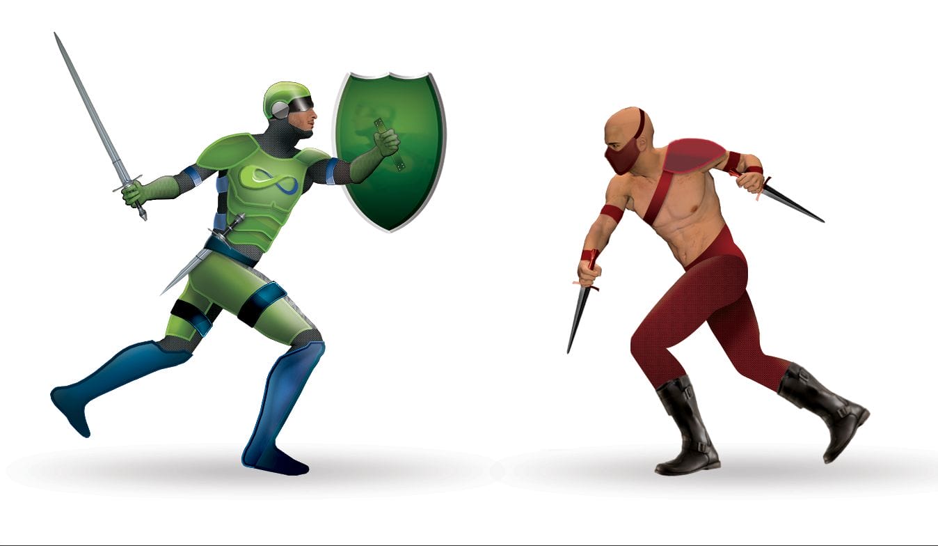
A few months ago, MNS asked us to illustrate an armored man in action for them, to be used for a blog post on network security. We created a character, dubbed Security Man, and his attacker. The pieces of armor on Security Man represent various layers of network security MNS suggests for their clients. This metaphor for protecting a computer network became a launch pad for another creative marketing presentation.

Opportunity Comes Knocking

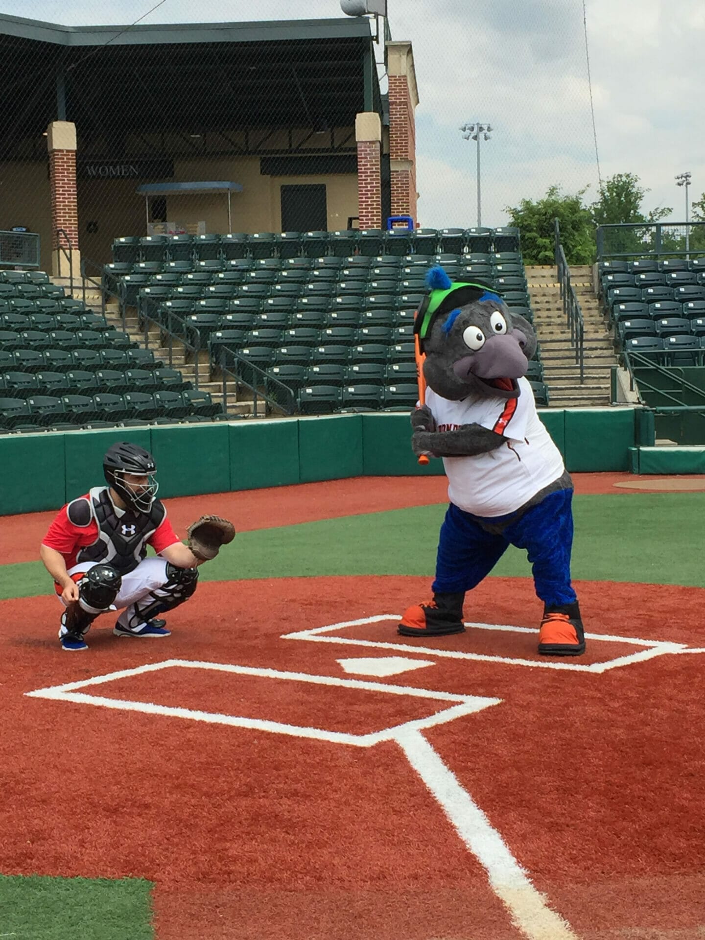
As a sponsor for Ripken Baseball, MNS Group had a great marketing opportunity—they could get a short video to be shown on the big screen at Ripken Stadium. How could they use what they already had and adapt it for a video at a baseball stadium?

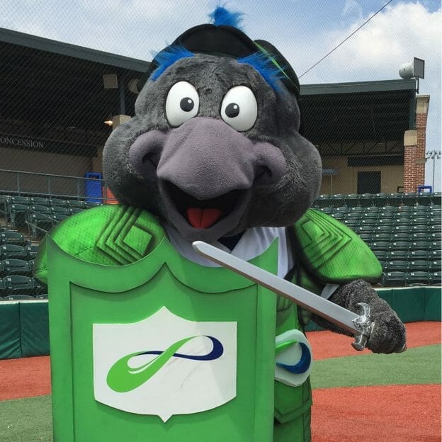
Collaborating as creatives with MNS, we brainstormed ideas. We decided to use the IronBirds’ lovable mascot, Ferrous, to act as Security Man in a video shoot the following week. This meant we had a few days to create a suit of armor for Ferrous to wear and wield.

Ferrous_May_23__12_54_39_PM

Creating a Mascot’s Costume

How could we turn an illustrated suit of armor for a human into an actual costume for an oversized bird? For one, we needed to make sure it would fit the mascot’s exaggerated features. We also needed to make sure it was functional. Ferrous would be running around the bases wearing the armor, so it needed to be lightweight and secure. And of course, we also wanted it to look professionally produced. Our design process and material selection took all this into account. Here’s a video to show how we did it.

Breastplate

Ferrous_May_23__1_14_29_PM

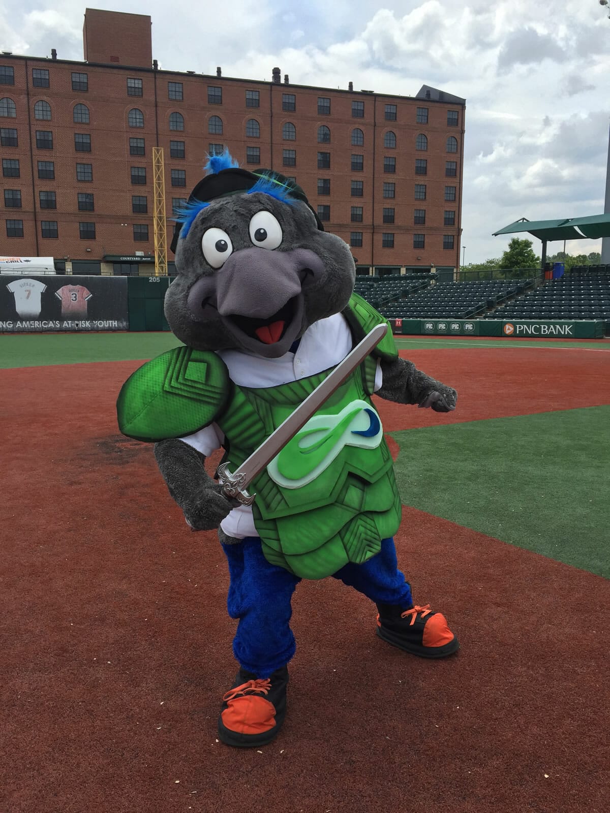
This breastplate for Ferrous is lightweight, flexible, and stays on even when he runs.

Helmet

Ferrous_May_23__12_45_03_PM

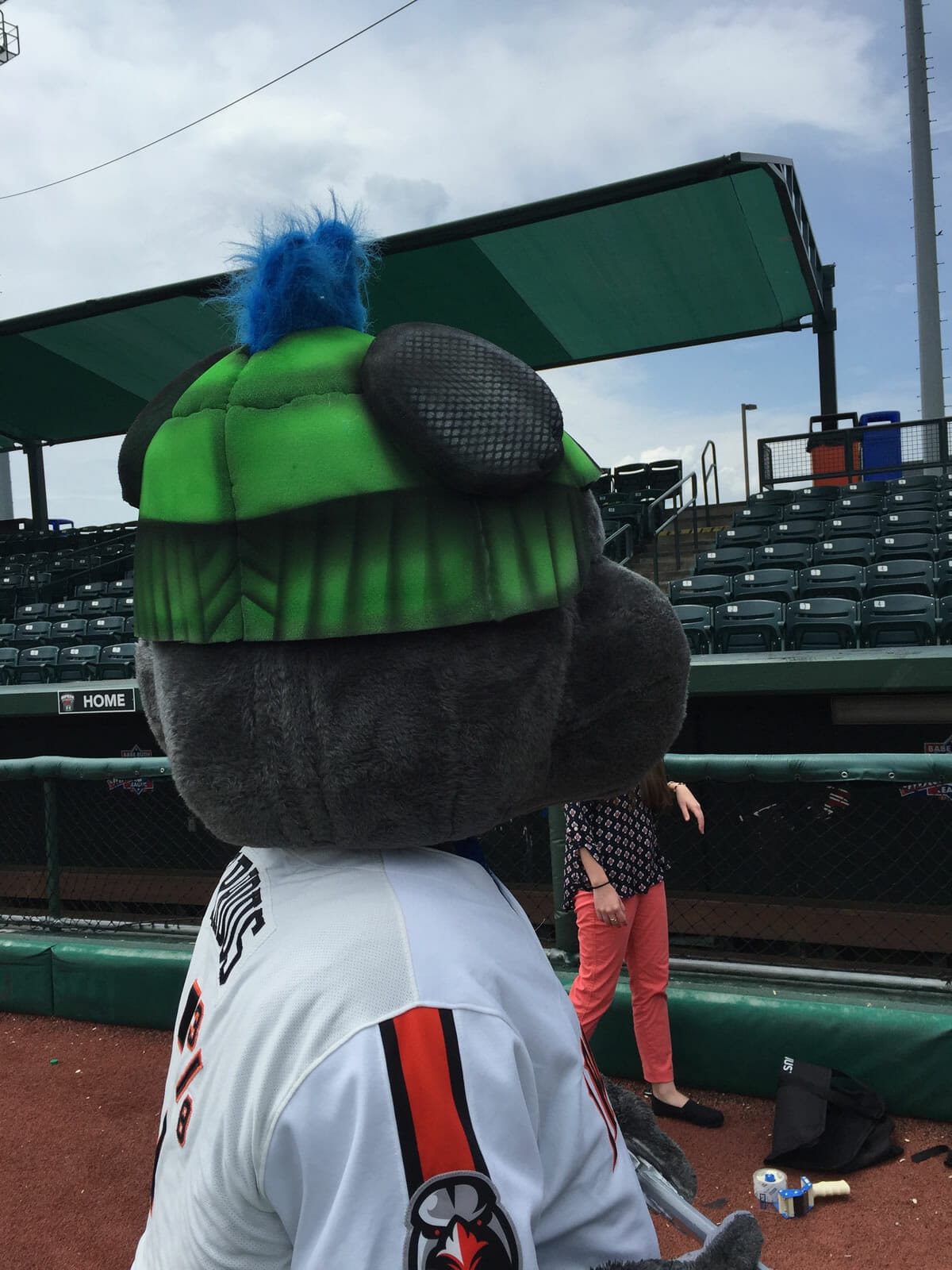
We created the helmet to fit snugly around Ferrous’ head, even allowing his crest feather to stick through.

Shield

Ferrous_May_23__1_19_55_PM

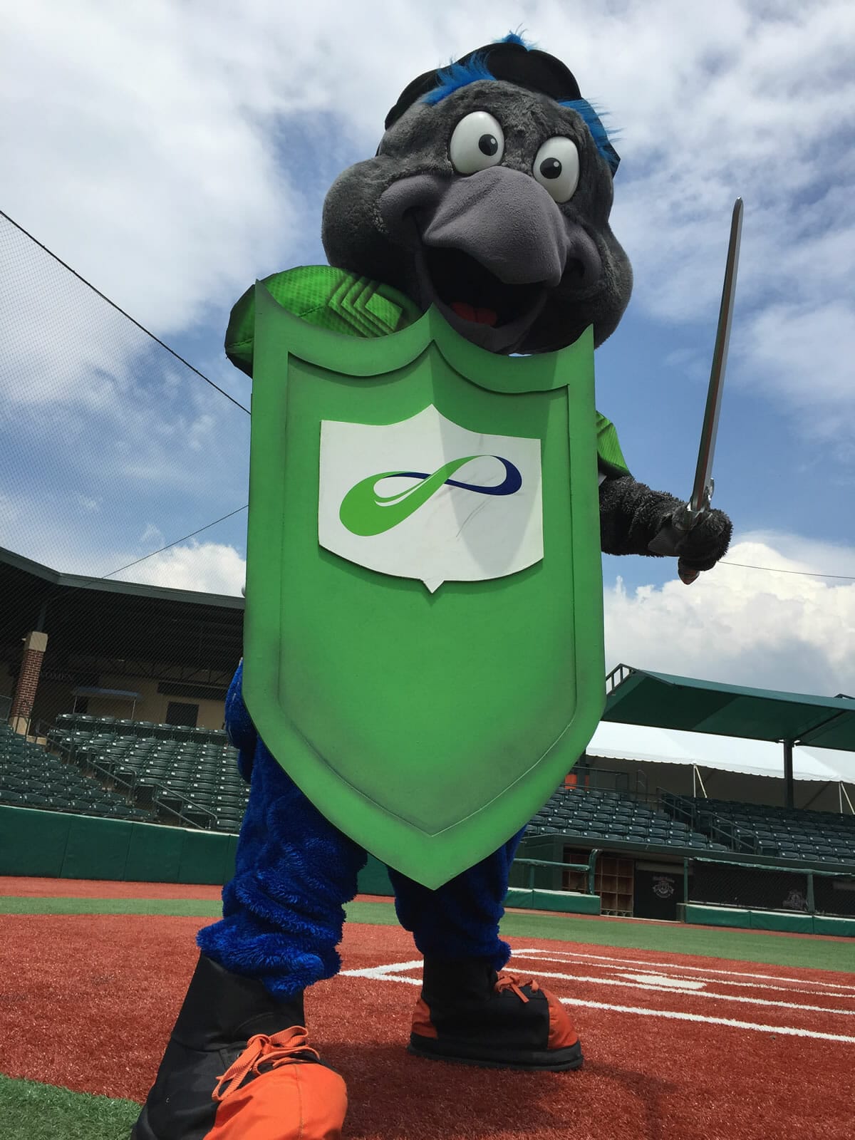
A sturdy shield helps Ferrous ward off attackers.

Sword

Ferrous_May_23__1_19_50_PM

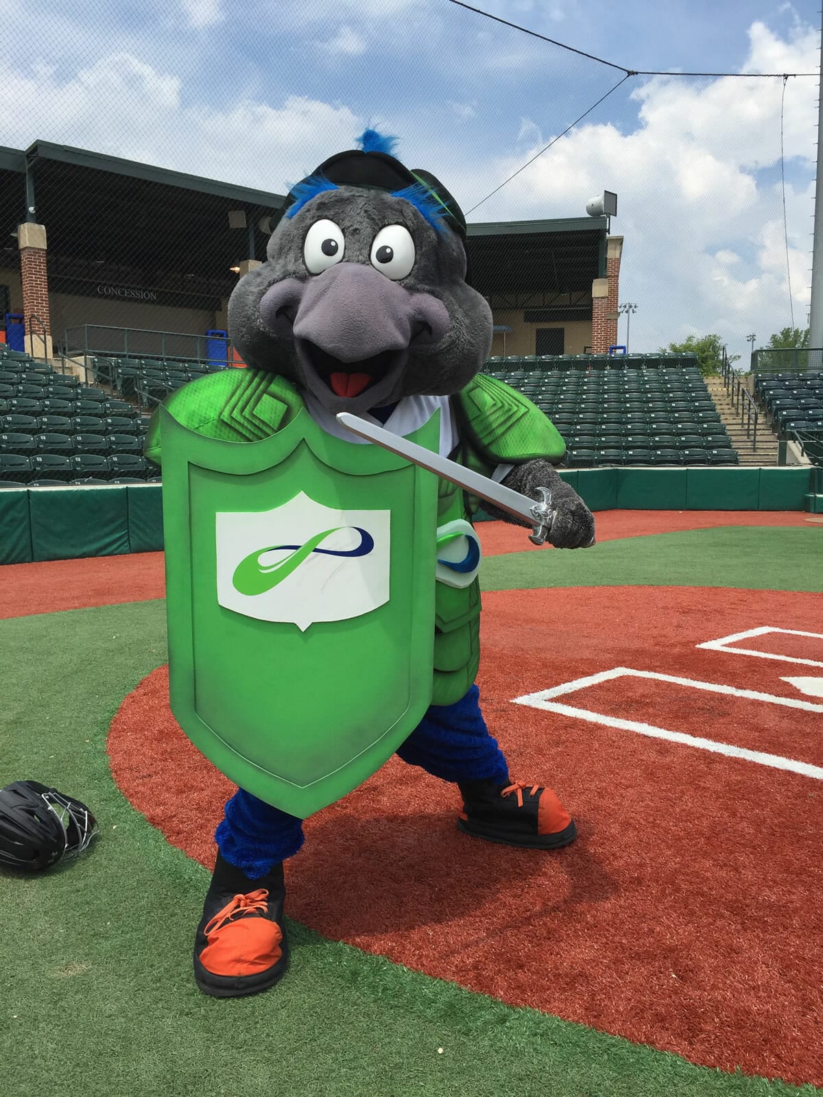
A sword completes the Security Man costume.

When we delivered the mascot’s costume to MNS Group, they loved it. Their response—“Awesome!”

Taking Creative Risks

It can be risky coming up with new ideas to promote your business. We were asking questions like, “Can the illustration function as a mascot’s costume?” and “Can the video deliver this message?” Kudos to MNS Group for standing out in a crowd and putting their trust in our team and the Ripken Baseball performers and producers.

MNS has already seen the rewards of investing into special marketing messages. Their Security Man illustration was repurposed to resonate with baseball fans. MNS has developed a consistent branded message both online and on the sports field.

Get Noticed

Our creative process helped MNS maximize the potential for their marketing video opportunity by using the illustrated concept they already had. Are you ready to try something new and fun? With professional creatives by your side, you can be courageous and pioneering to make your message memorable.

We’re ready to take on any challenge to help your business succeed. Whether it means illustrating or designing mascot costumes or creating something else yet to be dreamed of, our team will collaborate with you to make it happen. Contact us, and let’s embark on a creative marketing adventure together.

Where Comics Means Business

MNS Group, an IT service provider, wanted to help computer users create stronger, more memorable passwords. And they wanted to communicate in a fresh, creative way. Inspired by a comic they saw, they decided to create their own version. We helped them develop this bold graphic with a new style.

comic-with-logo_v2

Creating the Comic Look

One challenge was to create a 3D appearance in a 2D plane. Our multimedia artist Chris explained how he achieved this effect. “I used different weights of stroke. The greater the variance in stroke weights, the greater the perceived depth.”

Another challenge was matching the character’s facial expression with his thoughts. “I wanted you to see what the guy was thinking even without the thought bubble,” said Chris. He drew and tweaked the character’s face to capture just the right emotion.

Super Effects

People are hopefully more likely to change their password after reading the comic, as compared to just reading an article. The comic is a powerful medium because of these advantages:

  • Clearly depicts contrast
    At a glimpse you can compare common practice with better practice.
  • Memorable
    The strong message sticks with you.
  • Information dense
    The graphic concisely shows a lot of information in a small amount of space.
  • It is the message
    It’s a visual to help people visualize their passwords.
  • Entertaining
    It’s appealing because it’s fun and interesting.
  • Shareable
    It stands alone as a shareable resource for social media.

Illustrate the Message

Think about your own business. What important marketing messages could you communicate in a special way? Creating something iconic that is shareable, educational, and entertaining will help your message really stand out.

If you are trying to make a bigger impact with your marketing, let’s connect. We can show you how creativity means business.

Cleared for Take-Off

Kingdom Rain is a nonprofit focused on training Christian leaders in remote areas of the world. They came to us ready to expand, planning to double their budget in the next two years. But we faced two creative challenges:

  1. Lots of information that needed to be organized and synthesized
  2. Security concerns that limited our use of specific names and places

A Conversation-Inspired Structure

How could we effectively arrange the content to tell Kingdom Rain’s message? It was the founder’s conversation style that inspired us. We wanted people to feel like he was talking with them through the website. After listening to his conversations with supporters, we noticed that his flow really worked: their strategy, people they serve, and the impact they are making in Asia.

Homepage screenshot

Full Story, Fewest Words

Often less is more. We took all of Kingdom Rain’s content and condensed the essence into powerful, summary statements. And we limited the content to just a few pages, titled by a single word. The result? It’s so concise that people might actually read it.

Stock-Specific

It’s usually more powerful to show than tell. But in this case, security issues prevented us from showing many things. How could we effectively use generic images to do the trick? By carefully selecting the right stock photos of ethnic people, world maps, and rugged landscapes, we helped users experience the ministry without revealing specific places and names.

Vision screenshot

A Greater Return

Kingdom Rain now has a website that speaks for them. They also got some bonus benefits:

  • More bang for the buck
    The graphics we designed for the website were repurposed, such as for Kingdom Rain’s newsletter. When it’s time to develop other marketing materials, much of the work is already done.
  • Focused vision
    The process of developing content for the website clarified the message they take to presentations and support-raising meetings. The result is more effective communication and more donations.
  • Integrated client management system
    We integrated online donations, supporter contact information, and email/newsletter communications into the website. Kingdom Rain can efficiently manage their network in a single location, saving hours of administrative work.

Your Turn

Reflecting on their new website, Kingdom Rain said, “Accent Interactive organized our ideas into a work of art, and it was well worth every dollar invested.”

If you’re ready to benefit like they did, then contact us. Do you have a complex message that needs to be simplified? Does your marketing communication strategy need development and direction? Bring your challenges to us, and we’ll discover creative solutions that work for you.

How Secure is Your Website?

It used to be that only e-commerce websites were concerned about security. Not anymore. Now there is a push—especially from Google—for everyone to get SSL certificates.

No More Excuses

  1. “It’s too expensive.”
    The cost of an SSL has come down in the last few years. We’ve been installing certificates in under 4 hours for most websites.
  2. “It will slow down the browsing experience for users.”
    Due to recent improvements, speed is no longer an issue. This is good news for web publishers who care about security.

Security for Everyone

All companies should install SSL certificates on their websites. Here’s why:

  1. Improves Google search engine ranking
    Google now considers security a factor in your search engine ranking. If you rank the same as other websites, then security level is going to be the deciding factor.
  2. Let’s people know your website is secure
    Here’s how they can tell:

    • HTTP becomes HTTPS
    • Green padlock icon indicates secure connection between the browser and host website
      Secure website connection
  3. Shows that you care about your users
    If prospective or current clients visit your website, they’ll see that you want to protect them and have their best interests in mind.
  4. Demonstrates you have a modern approach to technology
    Eventually, adding security to websites will be the new default. By adding security to your website now, you’ll stay up-to-date on technology developments.

We’re Your Help Center

How do you know which level of security to choose? Which SSL certificate is best for your website and situation? If the world of encryption and website security seems complicated and confusing, we’re here to advise. Contact us, and we’ll take care of the technical installation process for you. Then you—and your website—can rest secure.

Planting Home Roots: Real Estate Website

There’s a new real estate brokerage in town. Professional Realtors Chris Streett and Tim Hopkins joined forces to start a company called Streett Hopkins Real Estate. But before they opened their doors for business in Bel Air, Maryland, they came to us for a custom website. These local guys wanted to emphasize their deep Maryland heritage, their wealth of experience, and their intent to be a full-service company. Our job was to create “curb appeal” online for all they have to offer.

Old Roots, New Branches

When it comes to real estate, you have to know the lay of the land. Both Tim and Chris can trace their Maryland ancestors several generations back. They wanted their clients to know that they have strong roots in Harford County and the surrounding area, and they can help others develop their own roots here too. The Streett Hopkins tree logo illustrates this idea. So we decided to plant their logo on top of a homepage slider that showcases beautiful Maryland scenes. And to ground the homepage we created an “Our Heritage” section linking directly to their history. This shows clients at first glance where Streett Hopkins calls home.

Streett Hopkins homepage

Been Around the Block

Although the company itself is new, Chris and Tim are certainly not greenhorns in their field. We wanted clients to see how professional, experienced, and well-connected these Realtors are.

Here are some ways we highlighted their expertise:

  1. List of distinctives
    We listed their qualifications in sections throughout the website called “Why Choose Us?” Leaves demarcate each bulleted list item, further developing their tree theme.
    Why Choose Us
  2. Proof of success
    A gallery of photos with addresses and sold prices shows how Chris and Tim have been successful with a variety of property transactions.
    Residential Past Sales Commercial Past Sales
  3. Testimonials
    Nothing is more genuine than the complimentary words straight from a client’s mouth.
    Testimonials
  4. Helpful resources
    Clients can easily access blog posts on various topics of interest in the sidebar. Buyers can also search directly within the website for available properties with the multiple list service (MLS) plug-in we installed.
    Blog

Take Your Pick

Streett Hopkins wants to be a one-stop shop for all your real estate needs, whether you’re in residential or commercial, a buyer or a seller, a landlord or a tenant. To organize the content for all those areas, we decided to categorize first by residential or commercial. Then we created sub-categories for buyers or sellers. On the homepage we also listed out various services that link to more details. With this information architecture, website users can easily navigate within the wide range of offerings to their particular interest.

Home Page

We also provided photography services for the website.

About Us

A New Leaf

Whether you’re just starting out or you’ve been around for decades, discover how a fresh website can sprout business for you. Let’s leave it to the Realtors to sell your house. Leave it to us to market your company.

Big and Tall: Display Booth for Trade Show

Go Big or Go Homeland Security

Intelligent RF Solutions (iRF) wanted to make a big impression at an upcoming industry trade show in Washington DC. They design custom signal intelligence products for military and other government agencies, including Homeland Security, CIA, and FBI. iRF needed to attract potential clients to their booth, even from across the exhibit hall. So they came to us with a large-scale design challenge—visually promote their services using a display that is over 10 feet tall.

10ft_lrg

Near and Far

When designing for such a large scale, we considered what would deliver the strongest visual impact, both from up close and at a distance. The towering banner had to draw people in, to make them feel like they’re experiencing what iRF can offer in a larger-than-life way. So we incorporated images that could capture attention from afar, and were meaningful enough to facilitate marketing conversations at the booth.

Hone in on the Drone

A central part of our design is a massive drone. Zooming across the whole width of the backdrop, this recognizable technology attracts industry partners who are curious about the latest surveillance equipment. They gravitate to the booth, where they are surrounded by a blue expanse, as if flying with the drone. The result is a perfect environment for discovering the benefits of working with iRF.

IRF-Solutions-Display-Print v6

Expansive Display, Specific Features

Other aspects of the design illustrate iRF’s message in a simple, cohesive way that is also visually appealing. The range of blues merged throughout the banner weaves an integrated experience from soaring in space to landing on the coast. Pairing the drone with a satellite emphasizes iRF’s specialty in communications. The design incorporates a container for the SMART Technology logo, providing a visual reference for promoting their modular approach.

Upscale Design, Modest Budget

Creating a banner this huge can get expensive, especially when purchasing images at very high resolution. A single photo could cost $500 or more. Using professional design techniques we were able to minimize the cost of stock photography and still maximize the visual impact of the design.

IMAX in Print

If you want to make a lasting impression with your display materials, it pays to partner with professionals. Our creative marketing team understands the unique challenges of handling large, high resolution files and designing within a budget. Getting a custom design with high-impact images means you’ll make a good first impression even from across the room.

Update: The trade show was in December. We are looking forward to getting some good photos of this soon.

Kindling More Business: Website for a Fire Protection Company

Advanced Fire Protection Systems (AFPS) wanted a website they could get fired up about. They didn’t want to settle for the lackluster, made-from-template kind of websites their competitors used. So they came to us for a distinct website that captured their unique services and experiences as life safety system experts. Our challenge was to demonstrate their complete range of services and attract the customers that would benefit from a one-stop shop.

Full-Service Company

Most of AFPS’ competitors are not full-service. For example, they might only focus on the electrical part of fire alarm installation. Or they subcontract a lot of the project. In contrast, AFPS performs most of the work themselves as general contractors. This distinctive enables them to offer customers higher quality work for less time, money, and administrative overhead than their competitors.

Services at a Glance

AFPS offers at least 8 different services as a single source company. To highlight the variety, we created a homepage slider with an illustration for each of the high profile services. This gives customers a quick glance at how AFPS can help.

AFPS slider

Hometown Pros

Unlike many of their competitors, AFPS has deep roots in the area. The founder is a well-established technician with over 30 years of experience. Their certified staff can handle large-scope projects without needing to outsource. We emphasized their expertise with local landmark projects featured on the homepage.

AFPS projects

Interesting and Informative

Installing life safety systems is serious work, but we also wanted to add in a little fun. A “Did You Know?” section adds some human interest to the website. And customers can even learn about different kinds of fire extinguishers. AFPS doesn’t just train their team—they also educate the public.

AFPS Fun facts 2

Let the Words Flow

When it comes to content development strategy, every client is unique. Some want to create a first draft themselves, and ask us to edit for publication. Others know what they want to say, but feel more comfortable talking than writing. For AFPS, we started with conversations about their work. Our probing questions prompted enough ideas for us to write a first draft—and it fueled the content that emerged on the website.

Fan the Business Flame

While AFPS works hard to prevent fires, their new website is stoking up their business. If you want innovative marketing solutions for your company, then discover what our creativity can spark.

Trifold with a Twist: Physical Therapy Brochure

David Shulman wanted a brochure to communicate the dramatic pain relief that patients can experience from physical therapy. How could we demonstrate these effective treatment results in a few flaps of folded paper?

Die Cut “Cuts Away” the Pain

The solution was a brochure that doesn’t just tell; it shows. We designed a creative alternative to the standard trifold, with an extra die cut flap on the front. This created a “before and after” effect. First you see a patient’s back with pain points. And like in lift-a-flap books, the surprise awaits behind. Open the flap to reveal—a pain-free back! This demonstrates how the Shulman team helps you avoid surgery and eliminates pain.

Shulman-Brochure-MockupShulman-Brochure-Mockup-Inside

Welcoming from “Nose to Toes”

The rest of the brochure introduces you to the team, shows how they can help you, and invites you to try them out.

  • Striking contemporary design
    captures attention with bold red and white
  • Map
    illustrates convenient office location for treatment
  • Photos
    subtle and prominent images depict the staff, their hands-on approach, and the comfortable environment
  • Staff bios
    introduce you to the friendly professionals treating you
  • Icons (back panel)
    echoed from the website, these summarize the practice’s differentiators

Handout from the Hands-on Practitioner

David Shulman loved the new brochure and started using it immediately. When he goes to speaking events and workshops, he has a memorable marketing piece to leave with prospective patients.

One-Stop Professional Shop

Our creative team fits the message to the medium. Whether we’re creating a website, a brochure, or a video, we’ll take advantage of its unique features, conveying your message with the best language and scope for that format.

Let us know if you’re ready to put your message in print. Although we’re not the ones to relieve your physical aches, we’ll make your marketing as pain-free as possible.

Photography Website with Laser Focus: a single product line

Lenox Laser is all about small holes. They specialize in microdrilling holes with lasers for any kind of material. Their pioneering work has applications in various industries, such as aerospace, medical, pharmaceutical…and photography.

Just for Them

Lenox Laser apertures are perfect for the re-emerging art of pinhole photography. But with all the other products and services in their catalog, Lenox Laser wanted a way to make their camera caps distinct. So they created a product line for pinhole photography called Daystar Laser.

Our job was to create a website just for Daystar Laser products. Creating a website that clearly focused on just one aspect of the Lenox Laser business proved advantageous in several ways.

If your business has multiple aspects to it, how could you benefit from creating a website focused on just one part?
  1. Targeting a distinct audience with specific, relevant content
    Why direct a NASA scientist and an aspiring pinhole photographer to the same place? Instead of trying to create a website that would cater to all of Lenox Laser’s prospective clients, we focused on photographers with the Daystar Laser website. And to be even more precise—on pinhole photographers. These parameters gave us a clear direction for the website content. For example, we included the history of pinhole photography and showcased a gallery of artistic photos for inspiration. We wanted to focus on not just the products themselves, but on showing a niche audience how they were used.

    Pinhole Photography Primer

  2. Cohesive design
    Focusing on photographers enabled us to design the website to attract them in particular. Camera equipment is highlighted on the home page slide. Hints of a photography studio fade into the background. Examples of pinhole images pique creative interest.

    Daystar Laser homepage

  3. Optimizing the check-out process
    The original Daystar Laser website didn’t have an option to purchase products online.  Catering to the modern photographer, we made the new website mobile responsive and created a secure online shopping cart. This conveniently gives customers an “express” online check-out. They don’t need to wade through other Lenox Laser products to get to what they want.

Streamlined Results

If creating a website for your entire, multi-faceted business seems overwhelming, then limiting the website’s scope can make it more manageable and effective. We’ll help you develop a marketing strategy so the website content and design appeal to your target market. That’s creativity that means business.

Polish, Don’t Demolish: A fresh coat of paint for a PR website

Hiring a web designer doesn’t mean you have to trash your current website and start from scratch. Sometimes you can preserve some of your original investment and build on what’s already there.

Such was the case with Maroon PR, a public relations agency in Columbia, Maryland. We kept the best from their website’s original design while simplifying it and improving the user experience.

Big First Impression

If a good photo says it all, a bigger photo says it louder. We retained the “big screen” style of the original design’s home page. A slideshow of large photos flashes recent success and makes a good first impression.

Maroon PR

Livelier Case Studies

You want case studies to demonstrate the value your company delivers. And showing is more effective than telling.

We improved Maroon PR’s case studies with these value-added features:

  1. Logos
    In an instant, recognizing a popular brand on your client list can impress. Logos can impress potential clients by showing who has hired you in an instant of recognition.
  2. Mixed media
    Photos, screenshots, and videos bring life and interest to case studies.
  3. Testimonials
    Quoting clients in their own words is a good way to capture praise.

Maroon PR case study

Renovated Information Design

Maroon PR wanted to distinguish between current and previous clients, as well as indicate which ones were linked to case studies. We decided to present current clients in a grid of logos. We then designed a custom icon for the clients that had case studies. With their previous clients, we just listed their names in the sidebar, followed by a simple text link.

Maroon PR clients

Partially New and Totally Improved

If you’d like to update your website, it may not need a complete overhaul—sometimes it just needs to be spruced up. Contact us to explore the options.

Working with Ken and Accent Interactive was a great experience. They are knowledgeable, responsive, and developed a highly functioning website for us in a timely manner that we are very proud to showcase. We look forward to working with Accent Interactive on more projects, and continuing to enhance MaroonPR.com, which serves as one of our most important marketing tools.

—Chris Daley, Director of Brand & Business Development