Resolving Marketing Communication Conflict

Robert Fielder specializes in conflict resolution, but his company, Resolution Resources, was experiencing its own kind of conflict—in marketing communications. His story reveals essential lessons for marketers and business owners.

Receiving Feedback

One thing a website doesn’t tell you is how well it resonates with the target audience. For this, you need feedback from people. When Robert talked to trusted people in his network, he realized he had a communication problem.

They thought of him as a resource for specific situations such as contract negotiation and mediation. But what they didn’t perceive was how helpful he could be with the big picture, the strategic planning and facilitation that address systemic issues in organizations.

The irony is that this strategic level is where Robert offers the best value, but even people close to him didn’t understand that he offered this. Though he described all the services included in this category, the words “strategic planning and facilitation” were not prominently listed on his website!

A Branding Problem

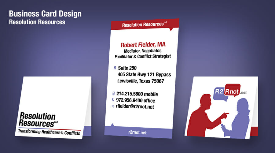
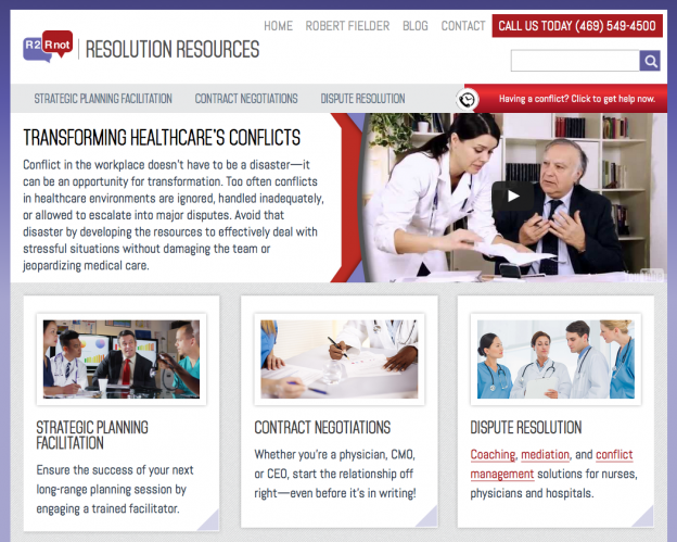
This kind of communication breakdown really bothers us. He was losing business not because he wasn’t the man for the job, but because the marketing message wasn’t a true reflection of his services. We partnered with him to fix this.

How often have you checked with your market to see how well your message is landing? Is it time to look at your service menu and refine the message?

Simple Solutions

We decided to restructure the services he provides, simplifying the menu into just three categories. Then we created a new page for this higher-level service (strategic facilitation) and he started writing some content for it.

r2rnot-web-home

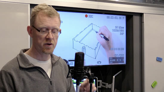
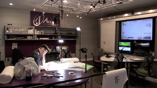
Motion and Light: A New Video

After Robert drafted the strategic facilitation content, he had the same idea that we did. It sounded like a video script! “Your writing sounds like your speaking,” observed Ken. Agreeing that this message would be more compelling when spoken, Robert wanted to make a video for his redesigned website.

Speaking in front of the camera can sometimes be stressful. Before the video shoot, Robert felt pressure to perform and get it just right. But once he got in front of the camera, he realized it felt just like public speaking, which he already knew how to do.

In the end, Robert was pleased with how the video turned out. “It was a good way to take advantage of my presentation skills,” he observed. “It brought motion and light to my message.” We think it’s smart to engage customers in a way that text alone can’t.

Co-Creative Communication

Robert also experienced the benefits of collaborating with a creative team. Take the video script, for example. “If we had taped what I originally wrote, the video would have lasted 20 minutes,” Robert observed. “But you helped me get it down to 3 minutes, without losing the passion.”

Robert knew that as the subject matter expert, he played a key role in the process. Even though it seemed overwhelming at first, his job was to start generating content.

“What made it easier was realizing I already had parts of the content in various places. I just needed to find it,” mentioned Robert. He started looking for the messages he had already written—buried in emails, brochures, and letters. Simply copying and pasting from those sources got the ball rolling.

Robert’s early drafts were rough, but his objective was just to get all the stuff out. “I realized my writing didn’t have to be perfect,” reflected Robert. “Writing a first draft is mud on the wall. It’s a mind dump. It’s more important to be comprehensive than refined.”

“I wasn’t surrendering control by collaborating,” shared Robert. “I was really being freed up to just focus on what I wanted to say, not getting distracted about how I was saying it.”

Collaborating with a Coach

Robert also pointed out the advantages of working on a website with a professional coach. “Creating content for a website is an introspective exercise,” said Robert. “It’s not easy. But working with a coach, who is trained in listening skills and asking good questions, helped me uncover what I really needed to communicate.”

Ready for Opportunity

“What’s the return on investment with a website redesign? It can be challenging to determine,” said Robert. “There’s no guarantee it will attract new customers.” But making the investment, he realized how well it prepared him for new opportunities. In fact, just a few weeks after the website launch, one such opportunity emerged.

“I had the chance to become a preferred provider for a statewide healthcare organization,” Robert recounted. “As I was being evaluated, having the website and video ready added real substance and strengthened the case for my selection.”

Summary

Sharing what he learned about marketing communication, Robert explained, “You have to continue to look at your website with a critical eye—what you’re saying and how you’re saying it.” The key was listening to his network and adjusting his marketing message based on their feedback.

And with a wise word to other business owners, Robert advises, “Prepare for success before the opportunity comes!”

Improve Your Marketing Message

If you’re thinking about how to market your business more effectively, our team is ready to help. Whether it means creating a video, editing your early drafts, redesigning a website, or even re-thinking the entire marketing strategy, we enjoy the challenge of resolving communication problems and growing your business.

Artfully Presenting the Message

As a painter, author, and speaker, Elizabeth Cockey has a message as beautiful as her artistic work: make a positive difference in other people’s lives, right where you are.

Over the years as an art therapist, Elizabeth has seen residents in long-term care facilities improve remarkably. And the lessons she’s learned through her experiences, she wants to pass on to all of us through books, painting, and public speaking.

Designing a New Website

Elizabeth’s inspiring story was getting obscured in an outdated website. And her speaking events were just statically posted, adding to the cost of maintenance. There was no good way to evaluate her content or style as a public speaker. Her books were available online, but the checkout process was cumbersome for users. It was time for an upgrade. Here’s what we did.

website-thepaintedword-home-1000

1. Video Trailers

Elizabeth’s compelling presentations could speak for themselves. So we promoted them with video excerpts. The audience gets to directly experience her content, voice, and style.

The Painted Word Video Excerpt

2. Event Promotion

Users may want to see Elizabeth in person. We used a WordPress event plug-in to publicize events in an automated, user-friendly way. Users can click on dates to view the full details with a colorful photo and interact with the map to locate the event. When the event is past, the plug-in will automatically delete it from the website (no maintenance required).

The Painted Word Event

3. Selling Products

We also wanted the new website to feature Elizabeth’s books. We set up the website so customers can buy her products directly via PayPal. With low setup costs, this is an ideal way for small, low budget stores to sell online.

4. Book Previews

Elizabeth is currently writing a memoir. We’re using the blog to offer serial previews as she finishes a chapter. This engages readers and builds expectation for the upcoming release.

5. Painting the Message

Elizabeth conveys her message beautifully through artwork, writing, and talks. Now her website is a gallery that prominently features her message, her products, and her art.

The Painted Word Gallery

How is Your Website?

Does this spark any improvements you’d like to make on your website? We enjoy the challenge of engaging your customers online to grow your business. Let us know how we can help you.

Drawing a Video

A Sharpie Sharpens the Message

Protect Your Data

MNS Group, an IT service provider, wanted to give the clarion call to businesses—protect your data! To properly protect their networks from hackers, mistakes, and acts of God, businesses today need a layered approach. These threats are more than a typical in-house IT department can handle.

MNS Group asked us to communicate this message to a non-technical audience: their potential customers.

mns-video-drawing-left

Medieval Metaphor

We brainstormed and collaborated with MNS Group—until a creative idea came trotting along like a knight in shining armor! What if we thought of a business as a medieval castle, where the data was like treasure they were trying to protect? And how about those network security threats? Virus attacks that breached firewalls could be represented by flame-breathing dragons. Hackers would sneak around like hooded bandits. And the way those marketers target businesses? Just like archers.

mns-video-audio-production

Drawing Up Plans

Video was the perfect medium for a message so imaginative and visual. So we decided to try a story telling technique that was new for us—hand-sketched art. First we developed a script and a series of sketches. After more collaboration with MNS Group, we then moved on to video production with voiceover. After editing, the finished video was ready to engage business leaders about network security.

mns-video-drawing-right

Creativity Leads to Victory

MNS Group liked the video so much, they featured it on their new homepage. Other clients were also impressed at how this drawing video enlivens the message. Making this video was a creative, effective way to help MNS Group draw in their business audience. Here’s a look at the published video:

If you are looking for a way to expand your marketing message or engage your audience in a fresh way, let us know. We’ll bring our Sharpie.

A Brochure that Barks

Terri and Pete are certified professional dog trainers, business owners of Complete Control K9 Academy. They know how to leash in the dogs, but to grow a new business they also needed to leash in the dog owners! Terri and Pete didn’t have any kind of print marketing materials to promote their professional services. They wanted to expand their business and continue establishing a reputation in the field of dog training.

Head to Tail

We created a catchy brochure that promotes CCK9 from beginning to end. It starts with an irresistible dog photo on the front and prominently displays the company’s contact information on both sides of the brochure for easy accessibility. Echoing the designs from the website, the color, style, imagery, and texture further extend the company’s online branding.

Top Dogs

Terri and Pete are highly qualified trainers, and we wanted to highlight their expertise. The brochure clearly displays Terri and Pete’s credentials, reliability, and professionalism.

ID Tags

To visually capture the uniqueness of each training package, we suggested custom icons for each one. This suggestion was unexpected, but after agreeing to it, they saw how these unique illustrations gave each package an identity. They are now considering using these as badges or on graduation certificates.

Ready to Go

Now CCK9 has a brochure that really barks – it captures attention and informs prospects how CCK9 is a right fit for them. And it’s so portable that even a dog walk in the park can become a serendipitous marketing opportunity. With their new brochure, Terri and Pete have confidence to bring in both ends of the leash!

We also designed their new website.

Update

Three months after we created this brochure, CCK9 completely filled up their schedule. The brochure was the key marketing piece that helped bring in the customers.

CCK9 Academy Brochure: OutsideCCK9 Academy Brochure: Inside

Realtor Web Design: Riley in Timonium, MD

Riley & Associates had one of those realtor websites that wasn’t working for anyone. The web design didn’t work for marketing because it was out of date, and the colors weren’t right. The technology didn’t work for the owners because it was too cumbersome to make changes. The experience didn’t work for users because they couldn’t quickly and easily get the information they needed.

Information Architecture to the Rescue

We worked on making a place for everything and co-creating a new layout that worked for everyone.

  • Property Search

    Home page puts property search front and center.
  • Local Schools
    Most clients ask about local schools. Info is just a click away in the right sidebar.
  • Careers
    Now it’s easy for outside realtors to determine if switching to Riley makes sense.

Realtor Web Design: Agent Rotation System

Any real estate agency needs to determine an equitable way to distribute incoming leads among their agents. It was important to the Riley owners that the website reflect this value also. So we created an agent rotation feature—each time the Agents & Staff page loads, it randomly distributes the order of the agents, so everyone has an equal opportunity to appear at the top of the page.

BEFORE: Riley & Associates website had glaring color issues, broken content containers, and very little useful information. AFTER: The new home page with contemporary design, property search, and office locations. AFTER: The agents rotate so everyone has an equal opportunity to be on top.

The Realtors in Timonium and Monkton Love It

“We like the new website so much better! Just as our customers get a feel for a house in the first impression, they were forming a first impression of our business from our website, and it wasn’t good. Now our website is today. And we love the agent rotation feature. That was really important to us.” —Cindy Riley, Riley & Associates

A Logo Grows Up

Kim’s original logo was created when her non-profit was newly formed. Once women had gathered in Kim’s living room for talk, study, and encouragement; now they were gathering across the United States in homes, churches, and offices. Once Kim had spread her message with weekly emails; now she had published several books and booklets and was in the process of digitizing her curriculum series for U.S. distribution. This organization had indeed grown up.

That’s Not Me!

But its logo had not. It had a Barbie-look about it that didn’t match our client, who radiated elegance, warmth, and authenticity. Neither did it match the women serving alongside Kim. These were active, roll-up-your-sleeves, get-real women. Kim needed a logo that was true to herself and the people she was reaching.

Surprised by Strength

The name of Kim’s ministry—Roses and Rainbows—was soft and girly. Yet Kim’s core message was anything but. She helped women move from shame and defeat to strength and confidence. We decided to capture that transformation with strong typography. Then we tempered the strength a notch by playing with opposites: upper case versus lower case letters, strong type versus delicate filigree.

Not Every Picture Tells a Story

Words like roses and rainbows almost demand to be illustrated. We had to ask, “What will a picture of a rose or a rainbow add to the message of the logo?” The answer was, “Nothing.” The words alone get the job done. The filigree subtly mimics roses without overcomplicating the logo. Simplicity wins the day.

But Can It Scale?

Logos today are never used in just one medium and just one size. An effective logo must look good on letterhead and business cards, in a web banner, on video, on social media, and more. An aspect of creating a more mature, sophisticated logo was to ensure it worked in different sizes, different applications, and different colors (black and white, for instance). It seemed to us that if Kim could do it all, then her logo needed to be able to do it all too!

A Logo for All Seasons

Our client had outgrown one logo. We didn’t want her to outgrow this new one for a long, long time. By creating a logo that is true in tone and style to Kim’s essence, and by keeping it simple and versatile, we gave her a logo almost as timeless as her message.

The original logo

The original logo

The new logo reflects a mature, more confident sense of identity.

The new logo reflects a mature, more confident sense of identity.

Everything in Its Place – Dentist Web Design in Towson, MD

Drs. Shelton and Yeoumans are busy, well-liked, trusted dentists in Towson. They have relied on repeat business from their faithful patients since 1973, and saw no need for a website. Until recently.

Name Your Niche

Dentistry, like many professions, is changing. Consumers want “boutique” services. They want a professional who understands their unique needs and requirements. For example, many young parents take their children to pediatric dental specialists instead of to general practitioners. And where are they finding these specialists? On the web.

Drs. Shelton and Yeoumans realized that if they want to attract new clients—and they do—they need online visibility. And they need a clear message about the niches they serve.

The Architectural Solution

With the dentists’ help, we identified five client groups in their practice: children, busy professionals, people with disabilities, students, and seniors. Next, we identified what a site visitor would want to know about his or her niche. That provided the message for the web design of their site.

To determine the structure, we asked:

  • What would help a site visitor easily recognize his or her niche?
  • What’s the clearest way to organize the content for each niche?
  • Where should all this go on the site?

Questions like these determine a site’s architecture, and it’s where we always start, with every website we produce. It’s about doing the right thing in the right order. Information architecture (the structure) defines the path a site visitor will take to get to the message he or she needs. Design makes that path inviting and easy to navigate.

Preferred Placement

The “who we serve” message plays a starring role on the home page. Appealing visuals and concise descriptions of each niche help visitors self-identify and show that these dentists “get” them.

When parents visit the site, for instance, they immediately see a smiling child and discover how Integrity Dental’s care philosophy and environment create the best possible experience for a young patient. A student can click on his niche and discover the dentists are referral partners with nearby colleges and universities. Professionals learn about convenient evening hours. And so on. The result: a place for everything, and everything in its place. That’s always a good way to begin—and end—a project.

In this view of the home page web design, the attention is on children.

In this view of the home page, the attention is on children.

This close-up of the "who we serve" web design section highlights senior patients.

This close-up of the “who we serve” section highlights senior patients.

A Quest for Clarity

iRF Solutions stood at a crossroads. A restructuring required a new name, logo, and website. Under an old name, they had a rich legacy and strong reputation. Under their new name, no one knew who they were.

At a Loss for Words

As we met with their leadership team, their conversation was heavy on who they had been, and light on who they were becoming. They could tell us who they weren’t—“We aren’t just a vendor”—but they struggled to articulate their new identity.

For weeks we asked questions and listened hard. One piece at a time, often in passing comments, the identity of today’s iRF Solutions emerged: They were skilled engineers; they loved collaboration and customization; problem-solving was their adrenaline; their reach was global; and they had an new modular design process to unveil. Once we got that, the website’s architecture, words, and design came together.

Clarity = Customers

iRF’s new message described a company of seasoned professionals (legacy!) with a deep understanding of the signal intelligence sector and the agility to respond to ever-changing customer needs. That clarity was a byproduct of working through a website revamp. Because it’s now clear who they are and what they offer, they’re attracting the right customers to their site.

iRF's new home page highlights their customizable, modular design capabilities. A timeline pays homage to iRF's rich legacy.

Let Us Help

If you feel your identity is getting muddled—or if you’re not attracting the right kinds of clients—call on us. We’ll help you bring clarity to your marketing strategy.

Mixed Messages

It’s no small matter when a client brings you 20 years of creative output and asks for publishing help. Our client had poured two decades into a print curriculum designed for training Asian leaders. He had been using this curriculum long enough to recognize something wasn’t quite right. There was a difference between what he thought he was communicating and what students were hearing. People were getting two different messages—one from the graphics and another from the words—and they didn’t quite sync.

Visual Stew

Our client understood the power of visuals in teaching and was using them liberally in his curriculum. But in contrast to his text, which was clear and precise, his visuals were sometimes hard for his students to decipher. At times, they even communicated the opposite of what he intended.

He needed some objective eyes to evaluate his visuals and help him see where they were wandering off course. Second, he needed experienced visual communicators to rework his illustrations to serve both his message and his students. He needed learner-centered design.

Back to the Drawing Board

For example, our client wanted to illustrate the Great Commandment of scripture: to love God and to love your neighbor. His original “circle of arrows” illustration lost the important distinction that love always begins with God and flows from God. It left out the role of the heart, soul, mind, and strength. In fact, it left out people all together. An illustration representing perhaps the greatest words ever spoken about relationships needed to depict…relationships! Our team brought out pencils and stacks of paper and sketched until we reached that “ah ha” moment when the illustration supported and clarified the text. Then we applied the same process to three more illustrations of the overarching concepts that anchored this curriculum.

Great Commandment BeforeGreat Commandment SketchGreat Commandment After

Quick Gets

Iconography is a smart way to create learner-centered design. Our client used icons in each lesson to help students identify priorities to explore and apply. The intended outcome was to create a “quick get” for students. But his original icons were photos, which don’t shrink well. Students could get hung up on what the icon was supposed to be and mean, thereby missing the real learning. The “get” was anything but quick—or clear.

We created simple, two-tone illustrations instead. The single image and spare design make it hard to miss the intended message. Learning happens!

CallingCompassionWisdom

Learner-Centered Design

It often takes an objective outsider to recognize why something isn’t working. It took our “outside eyes” to identify the problem—his visuals were sending mixed messages—and remedy it with learner-centered images. As a side benefit, our client ended up with lower production costs. His students ended up with deeper learning, free from confusion.

What message are your graphics sending? Are clients getting the message you intended?

Small Size, Big Identity

A business card is the shortest story a business can tell about its identity. When Resolution Resources asked us to design their business card, we knew their identity: We had designed their website. Our challenge: capture that identity on 3.5” x 2” cardstock.

Milk what you’ve got.

In Resolution Resources’ existing logo, two speech bubbles capture the essence of every argument: “Are too!” “Are not!” We amped up the visual impact of that logo with human silhouettes that display the posture of dispute. Strong-contrast colors capture the sense of coming from conflicting worlds.

Bend over to stand out.

Companies market to get attention. One way to get attention with business cards is to fold them. You get instant elevation with a card that can stand on its own. And you get the benefit of interactivity, something a flat piece of paper rarely allows.

Maximize the space.

A folded card offers twice as many spaces to fill while keeping to a standard size. Avoiding the temptation to clutter that space, we chose instead to keep the inside contact information simple and readable. In other words, user friendly. The outside space’s strong visuals stamp Resolution Resources’ identity on a potential client’s brain: These people can help us resolve conflicts.

See for yourself. Is the client’s identity clear? Does the card stand out in the right ways? In what ways do your marketing materials help you stand out from the competition?

Balance plays a role in every design.